We’re living in a time when you can get info about anything you want within half a second of Googling your question. History will determine whether we’re using this ability for good, or just for resolving temporal inconsistencies in the Star Wars saga. But for now, let’s assume that instant access to all of the world’s data is a wonderful thing.
Once we find the info we need, how do we present it in a way that’s convincing and easy to digest? Infographics are the obvious choice — a snapshot of data that includes graphics, statistics, and supporting content. Let’s take a look at some popular types and see how you can create an infographic. And don’t worry — we ain’t gonna judge.
Tips list

Think of this type of infographic as presenting best practices rather than specific data or steps toward a goal. The content doesn’t have to be followed in any particular order, or even followed completely. Want to describe how to write an attention-grabbing resume or nail a job interview? A tips list is the infographic for you.
Tips for creating a tips list
Add distinguishing blocks of color by placing rectangles over a blank canvas.
Make it balanced: aim for an equal word count for each section.
Find graphics that match your brand or style: we have over 6,000 to choose from!
PicMonkey graphics you can use

If you want to add some spice to some straight-forward content about eating your vegetables, our Self Care graphic set might be just what you’re looking for.
Ordered steps

If you need to go from A to F, and only B, C, D, and E (in that order) will get you there, an ordered steps infographic is your answer. Because, you know … the steps are ordered.
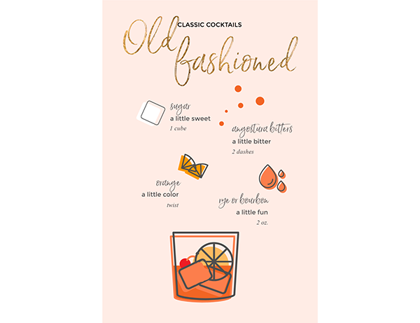
So what can info can these graphics present? All kinds of stuff. Employee onboarding. Recipes. Scavenger hunts. Computer setup. If you��’ve got a set process you need to describe, an ordered step infographic might be a great way to show folks how to get it done.
Tips for creating an ordered steps infographic
If you’re posting to Pinterest, vertical orientation is your friend.
Numbering steps can make your process easier to follow.
PicMonkey graphics you can use

Our Food & Drink collection is great for recipe infographics. Change the color, size, and orientation to match your design.
Statistics

Not a lot of people know this, but 73% of infographics simply present statistics. That may or may not be true, but you get the idea. This very popular type of infographic presents results from surveys or studies. It’s a great way to show numbers at a glance — perfect for a presentation, and much more engaging than a table of figures or a straight description of results.
Tips for creating a statistics infographic
Use a large, eye-catching font for your primary statistics.
If you’re presenting your infographic on its own, cite your sources.
PicMonkey graphics you can use

We’ve got lots of business, statistics, and financial graphics to choose from. These Infodoodles let you add a hand-drawn quality to infographics that are full of numbers and data.
Timeline

This one’s similar to the ordered steps infographic, but it usually includes more detail. Timeline infographics might show the process for a successful product launch, or maybe steps for meeting a goal or completing a detailed project. It’s not at-a-glance by any means — a timeline infographic is something you’d refer to multiple times throughout your process, sort of like a checklist. This is one to print out and stick on the wall so everyone’s hitting the milestones needed to complete the goal.
Tips for creating a timeline infographic
Break long lists of steps into groups for easier comprehension.
Detailed headings can help organize groups.
PicMonkey graphics you can use

Graphics from our Entrepreneurship collection are great for illustrating a process. You might also find what you need in Retro Mod Business and Flow Chart Symbols, depending on what look you’re going for.
Comparison chart

Android or iPhone? Sugaring or threading? Train or plane? You could spend several hours in a coffee shop loudly arguing with your buddies about the relative merits of each (no one will mind, really), or you could create a comparison chart. Lots of benefits for this — the whole visual thing makes compare/contrast easy, it scales easily, and it provides focus, which might keep the assistant manager from asking you to pipe down.
And as you can see from the example above, this type of chart will work with any data that can be presented in two columns. While the template is designed for comparisons, it’s also perfect for dos and don’ts.
Tips for creating a comparison chart infographic
Make sure your comparison is valid — compare apples to apples.
Be consistent with sentence structure and formatting across the chart.
PicMonkey graphics you can use

Our Travel & Transport graphics collection includes assets that can be used in a variety of infographics — pretty much anything involving a journey, the outdoors, business trips, or vacations.
