In case you haven’t noticed, collage is soooo hot right now. Like, eating a ghost pepper in Death Valley on a mid-July day kind of hot. Photo editing tools and effects have given this art form a techy makeover, and caused the introduction of a new term — digital collage.
All kinds of arty cool kids — from high schoolers to professional artists — are creating jaw-dropping images that bend your brain and make you rethink the definition of “collage” (in a really, really good way). We want you to be the best darn digital collage maker you can be, so here’s a look at some trends and tips on how to get similar looks with PicMonkey.
Less is more

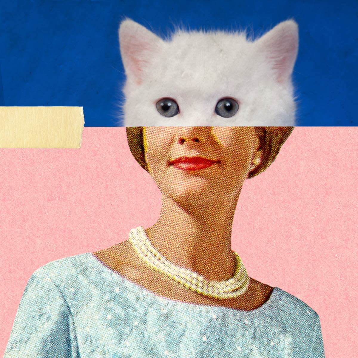
The first rule of digital collage: there are no rules in digital collage. Some call for oodles of images, and others make a big impact with only a few. There’s no right, no wrong, and no magic number of images, so try out different looks until you find the one you like best.
Tip: To get a two-rectangle look similar to this one, open the images you want to use in our photo collage maker. Get rid of the border by moving the Spacing slider in the Background tab all the way to zero.
Geometry and repetition

Make an ordinary photo into an extraordinary photo collage with repetition and geometric shapes.
Tips: Take a look at Shape Cutouts in the Frames tab to crop your photo into a shape in seconds. When you place your shapely image on top of your original, use the rotate handle to play with the orientation of your graphic.
Double exposure-y

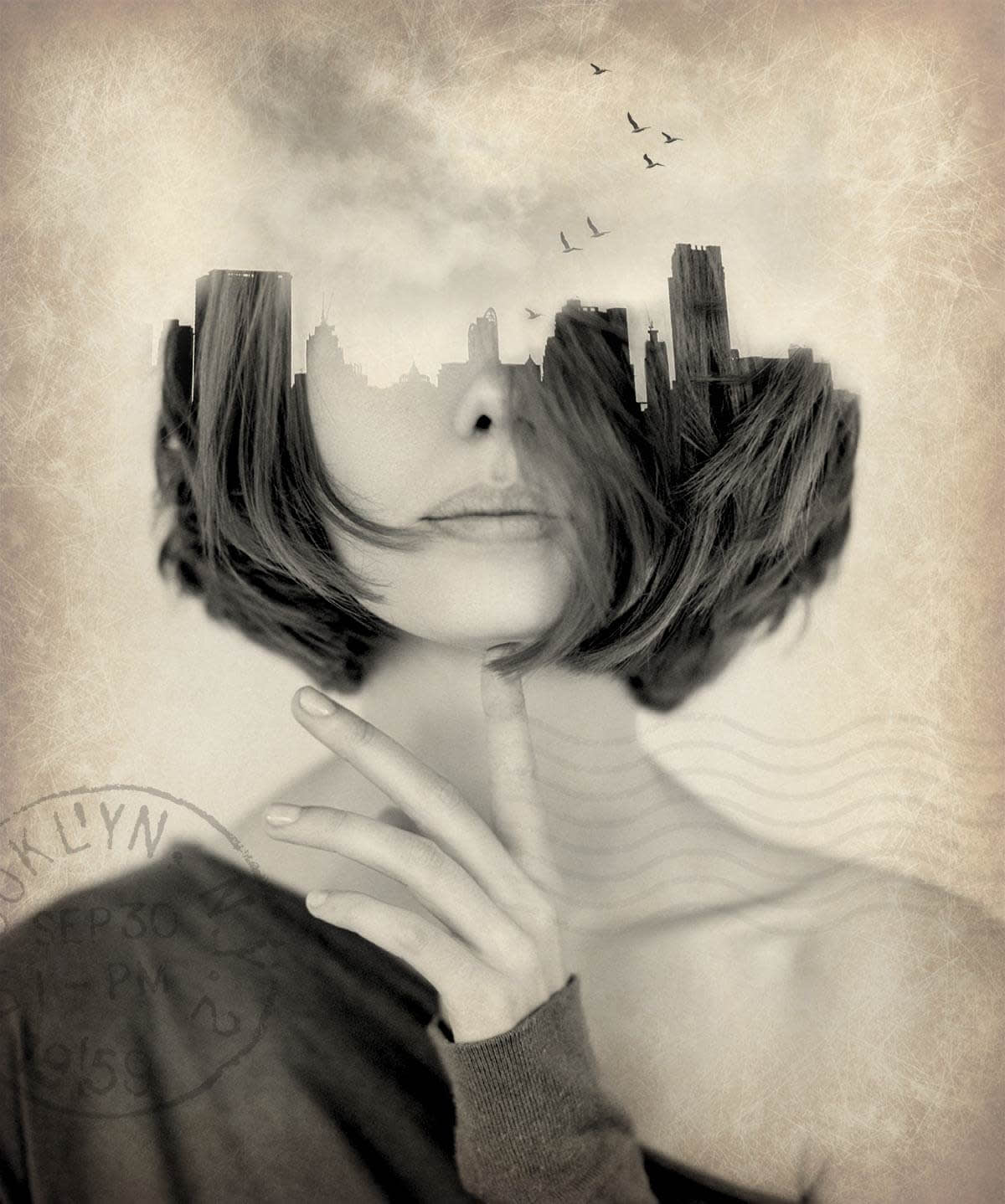
You’ve probably heard the term “double exposure.” This downright gorgeous two-in-one has been around basically since photography became a thing, and now we’re seeing it employed as a fundamental element of digital collage.
Start by combining the two base images of your collage into a double exposure (check out our double exposure tutorial for the low-down on how). Once you’ve created your double exposure image, open it in the Editor and add more cool stuff like the Postal graphic in this image, or Bats, from the Vampires theme.
Tip: Use the Layers Palette to rearrange your design elements - put a graphic under a photo, move text in between layers, etc...
