You’re scrolling through a job search site and there it is: Your Dream Job. You read the description and you’re getting excited. You seem to have all the required skills and relevant experience. You’re sure that getting this job will set you on a career path that will be life changing. But first, you need to write an exceptional resume.
When there’s so much at stake, sitting down to write a resume can feel daunting. But it doesn’t have to be that way. Choosing to start with a PicMonkey resume template will help you get started, give you a great design and format to work with, and set you up for success.

How to write a resume with a PicMonkey template
Go to Templates and search the resumes.
Select the one you like.
Click the Layers palette and select the text you want to change. Click inside the text box and type your text.
Click any graphic or background to change the color, size, texture and more.
Choosing the best resume format
The first order of business is choosing a resume format that will best showcase your skills and experience. Most people organize their resume in reverse chronological order, putting their most recent job first and listing all previous jobs in descending order after that. This is a great way to provide a bird’s eye view of your work history and give a sense of your progression over time. If you want to play it safe and give hiring managers what they likely expect, chronological is the way to go.
For some people, going with a functional format is a better bet. For example, if you have big gaps in your work history or change jobs a lot, organizing your resume by skills instead of dates will downplay those potential red flags. Or if you want to make a career change and lack experience in your job of choice, this would be a way to highlight your qualifications and relevant skills rather than your actual experience. Keep in mind, if you’re just starting out and don’t have a lot of experience, you shouldn’t use the functional format to hide that fact. Rather, be up front with the fact that you’re an entry-level candidate. Also, even when using this style of resume, you’ll need to put the years in which you obtained your skills.
Another option is to use a combination format, which utilizes both chronological and functional elements. This allows you to take the best of both worlds, presenting both your skills and certifications as well as your robust work history. You can put either your skills or your work experience first, depending on which one you want to highlight more.
Designing for readability and flair

The design of your resume will be critical to making it readable and visually appealing, and will help you make the best first impression possible. Therefore, it’s a good idea to begin with a professionally designed PicMonkey resume template. That way, you’ll already have your formatting and design elements set so you can focus on the writing part.
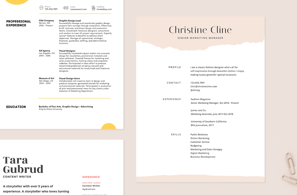
Don’t feel like you have to pack every inch of your resume with loads of information. Resumes shouldn’t be too busy or cluttered and should have a good amount of white space, so your reader isn’t overwhelmed and the content is easy on the eyes. And while traditional resumes are one column, two-column resumes are becoming more popular, since they allow you to organize your information better and help the reader navigate the page more easily.
Since resumes are text-heavy, playing with fonts is a great way to give yours a bit of style. Consider choosing a font that’s slightly out of the ordinary. And go ahead and do some font pairing by putting your name and headers in one font and the rest in another, complementary font.
Using color, graphics, or photos

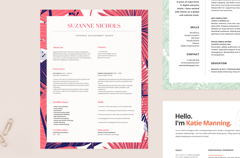
Adding a touch of visual interest to your resume is a great way to help it stand out and give it some personality. Using a bit of color is a good way to do that, since it’s not considered too outside the norm and can be done subtly. Consider putting just a few key elements in color, such as your name or the resume headers, or apply a colored border along the edges.
Using graphics can be as simple as putting a line under your name or a soft watermark in the corner. If you decide to take it up a notch by adding bolder, more prominent graphics, be sure to only do it if you’re sure that your target audience will not deem it too out of the box. Obviously, if you’re applying for an artistic or creative job, utilizing graphical elements in your resume would be more welcome than if it’s a more business-oriented job.
Incorporating a photo of yourself is more risky. Some hiring managers might disapprove and choose to toss your resume aside simply based on that. Additionally, putting too much emphasis on your physical appearance might be frowned upon by some. That said, there are certain situations where a potential employer will appreciate the photo, particularly if you’re applying for a modeling, hosting, or television-related job. If you do include a photo, it’s best to use a standard headshot, not a selfie or action shot.
Perfecting your words and avoiding mistakes

When writing your resume, avoid flowery language and instead be as succinct and straightforward as possible. Hiring managers just want the facts and don’t want to be bogged down by excessive language. They look at hundreds of resumes a day, so they want to be able to scan quickly for the information they need.
It’s a good idea to look at the job description carefully and identify the keywords your potential employer is using. Are they emphasizing a certain skill, type of experience, or college major? If so, you should use those same words in your resume so they can easily see that you fit the bill and have what they’re looking for. Additionally, businesses will often use automated tracking systems to scan resumes for these keywords.
Finally, it’s absolutely imperative that your resume not have any grammatical errors, awkward language, or typos. Even the slightest mistake will reflect poorly on you and make the reader hesitate. Because hiring managers look at so many resumes and have to weed out a large percentage of them, they’re apt to throw one out at the first sign of trouble, and a stray typo is definitely trouble! Rather than just reading your resume over a hundred times yourself, give it to a friend or three and ask them to go through it with a fine-tooth comb.
More resume tips and tricks
Experts suggest using hard numbers to quantify your achievements, such as how many people you managed, the number of projects you completed, or how much money you raised.
While putting an “objective” at the top of your resume was in for a while, it’s now out. Put a summary of your experience instead.
Make sure you start out strong, since hiring managers often only read the very top of resumes. Since the summary appears at the top, spend time making it great.
Don’t include obvious things, such as the fact that you know how to use basic word processing programs or that references are available upon request.
Use strong, active verbs when describing your experience and avoid weak, overused, or vague words.
Don’t lie on your resume and don’t exaggerate any aspects of your work, skills, or education. It might come back to haunt you, so it’s just not worth it.
