Did you know that the original Star Wars, with its sandcrawlers, epic space battles, and giant robots, achieved a look that captivated everyone who saw it using teeny-tiny models that were, at most, the size of toy cars?
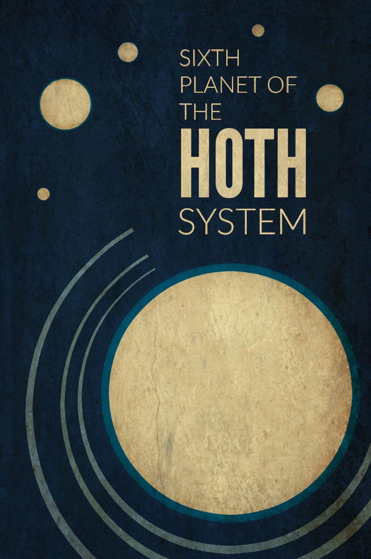
It’s true! And that’s the genius behind the films: the power of imagination. PicMonkey believes in doing grand things with simple tools, so I’ve designed my own minimalist tribute to Star Wars, in the style of vintage travel posters.

I’m going to walk you through my process for making these posters. Awaken your inner Force and create your own graphic with this step-by-step tutorial for the Hoth poster.
Set the background
Start in the Design tool. Set your desired canvas size, then choose a canvas color. I started with a rich blue so the icy planet Hoth will stand out against the sky.
Create arcs
We’re going to make partial circles to represent the orbit of Hoth’s three nameless moons. Go to Graphics and choose the circle under “geometric.” I made a large circle in a light blue color, and since I know I don’t want a uniform line, I’m going to copy/paste the circle on top of itself and select the background color. From here, I can adjust the thickness of the line any way I want. You can duplicate these for as many orbs as you’d like. I don’t want full circles, so I’m cutting them off using a square in the same background color. (I rotated the background-colored squares.)
Build planets!
Next, we’re going to add Hoth. I want it to stand out, so I’m selecting a light beige color and giving it a lighter blue stroke (that’s Color 1 in the Graphic palette). I know, Hoth is supposed to look icy blue! But the warmer glow I’m using gives it a nice punch; the outline will have to be enough. Once again, I’m going to copy/paste the circle and resize for the other five planets in the system.
Text it up
Choose your fonts, use color picker to match them to the planets, and play with the layout until you get it where you want.
Save it out
When you’re happy with your layout, save the image. I’m thinking it looks a little flat, so we’ll open it back up to add more textures and effects.
Texturizer time
Open the image (in the Editor this time) and add the textures you want. I chose Smudge textures for their instant “gritty reboot” feel. In the Texture tool, you can move your textures, scale, and adjust saturation or fade. I made my texture larger, faded it out, played with saturation and adjusted it until I got the look I was going for. The I added a second texture and used the effects brush tool over the planets and text so they didn’t get too dark.
Add effects
Last of all, I hopped into our one-click effects and magicked the Sith out of this image with a touch of Urbane. Done and done.

Boom.
Did we blow your mind?
