A lot of people like using Canva for their design projects. We can understand that — it’s got the name recognition, lots of templates, a bunch of stock photos, and people say they like using it. We’re not gonna argue with any of that, but we will say that PicMonkey’s easier to use and has features that Canva doesn’t. So let’s take a look at how switching to PicMonkey from Canva is gonna improve your life by helping you do better work faster.
1. Curved text
Yes, we’ve mentioned this one before, but it’s sooooooo easy to make text swoop and curve and meander in PicMonkey and sooooooo hard in Canva. Honestly, you can curve text with a click in PicMonkey. Totally, completely easy, and you don’t even need to read any instructions to make it work.
You can also curve text in Canva with a click. And a drag. And a resize. And a manual reposition. And a manual align. For each letter of the text you want to curve.
Seriously. If you want to make curved text in Canva, you do it one letter at a time, with manual positioning and adjustments. So if your company name is Super Splendiferous Spendables and you want to make a curved logo, get comfortable. And maybe meditate beforehand. And have some provisions nearby.
Pro tip: Use PicMonkey to curve your text.
2. Text effects
In addition to curving text, PicMonkey gives you a ton of other options for sprucing up your words. Drop shadows, inner shadows, outlines — create them with a click, and finesse them all you want for subtle or dramatic effects. And you don’t need to look up a tutorial — just click the effect you want and it’s done. If you want to fine-tune the look, play around with the adjustment sliders. They appear on screen as you’re tweaking, so it’s totally easy to get exactly the look that you want.
In Canva, well, this kinda thing is tough. You’re best off tracking down a tutorial. But know up front that creating a drop shadow is a four-step manual process that requires you to know how to turn off the snap to grid function so you can position your shadow. By hand. And if you want to outline your text in Canva, you can go through this process. We tried it. It made us yearn for the four-step manual drop shadow process.
3. Powerful photo editing
In addition to being a full-featured, intuitive design tool, PicMonkey is a powerful photo editor. We’ve got dozens of customizable, intuitive photo effects. Never heard of the Lomo effect? No problem. You’ll know what it looks like and how to apply it pretty much as soon as you click it. Want to get all photo-pro and work with exposure, maybe do some dodging and burning? You got it. Mess around with the color curve? Easy as dragging a point on a line. How about adding some imperfections to age the photo, or make it look like there was a problem in processing? Just click.

Do you want to apply the dreamy glow of the popular Orton effect to a photo? One click in PicMonkey will do it, and you can adjust the bloom by dragging the slider around. If you want to fine-tune a look for your brand or style, you can dig in and customize it. It’s really that easy in PicMonkey.
After spending a little time Googling Orton and Canva, it looks like it’s just as easy there. Ha! Kidding. If you can quickly create the Orton effect in Canva, no one’s written about it yet. So while Canva has some photo-editing capablilty and some third-party photo effects, their photo tool box is waaaaayyy lighter than ours.
4. Touch up

Seriously, you look marvelous. But photos and lighting can be unkind at times, so we developed tools to help you create a natural, fresh look for the people in your pics.
Photoscientists are close to determining why people get pimples in the presence of a camera, but until their research is done, you can use our Blemish Fix tool to give them the virtual boot. Same goes for that furrowed brow — a swipe with Wrinkle Remover can smooth things out.
Want to sparkle up your smile or add a twinkle (or different color) to your eyes? Get a bit of a tan? How about adding a little eyeliner, mascara, or highlights? You can do all of that and more.
There is only one way to do this kind of touch up if you’re working in Canva:
Close Canva
Open PicMonkey
Open a photo
Click Touch Up
Seriously. Canva has zero touch up tools. If you need to quickly and easily tweak a profile pic or headshot, PicMonkey’s the only way to go.
5. Real-time co-editing

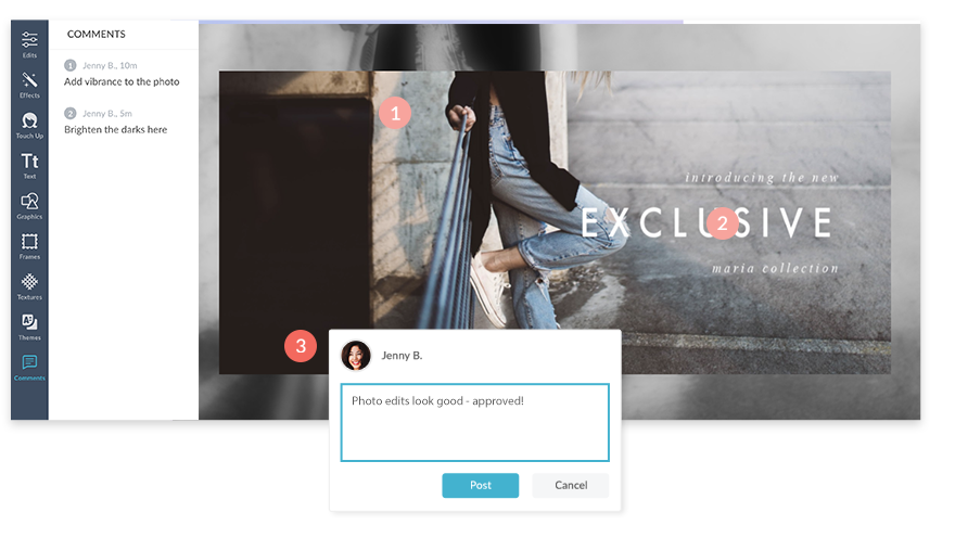
Canva has a teams feature that includes folders, permissions, and commenting. That’s … pretty good. But real-time collaboration? Actually working on a design with your team at the same time? For that, you’ll want to use PicMonkey.
You already know how intuitive and convenient it is to have your whole team collaborate in Google Docs all at once. Well, guess what? PicMonkey lets you use that same kind of functionality for images. Your designers can make them look pretty, your editorial team can add just the right words, and your project managers can keep tabs throughout the process. All within PicMonkey, all in real time.
All of your images are stored in the cloud, and you can control who has access and at what level. It’s great for remote teams, and starting a collaborative project is as easy as creating a new folder and inviting people to access it.
6. No hidden costs
No matter which PicMonkey subscription you have, you know up front what you get. Pay your monthly or yearly fee, and you get to use every element and feature that’s part of your subscription. Every template, every graphic, every stock photo is included.

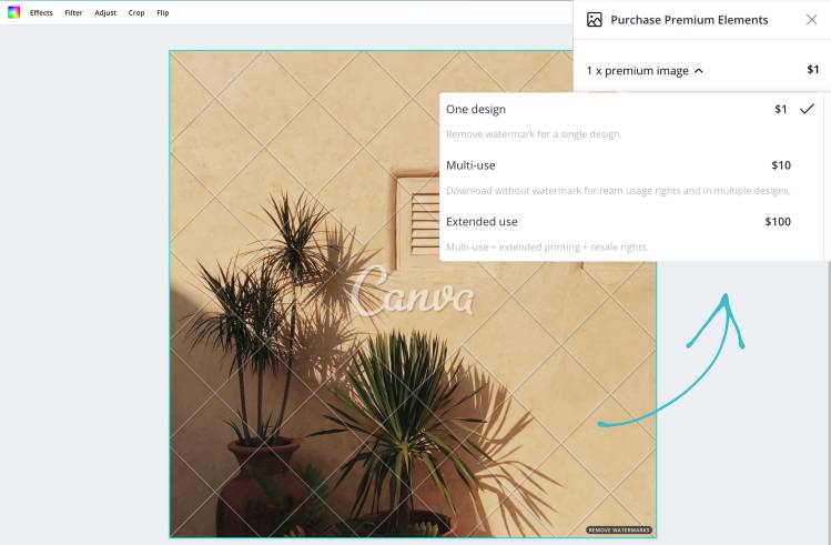
In Canva, things aren’t so cut and dried. While they do have a ton of free images and graphics, they have an additional ton that’ll cost you. A premium photo or graphic (also called an element) will cost you a buck to use. Or $10 if you want your whole team to use it. Or $100 for extended use rights if you’re going to use it outside of Canva in a project.
But hang on. Maybe you’re cool with spending a buck (or $10, or $100) for a pic you like. You see the thumbnail, you see the little Paid icon in the corner, and you know what you’re in for. And it’s only a buck (or $10, or $100)! But it ain’t just the stock photos, and you don’t always see the little icon from the get-go.
For example, you might find a nice presentation template you want to use. Once you open it, you’ll find an unwelcome surprise if you want to use some of its images — you gotta pay for them.
And just to be clear, we’re talking about pics in the Basic version of Canva. If you pay to upgrade to Pro, you get access to around 2 million free stock photos, which is a lot. But here’s a little disclaimer from a Canva Pro info page: “Note: Canva still offers a selection of paid media to ensure we offer users as much choices as possible.” Even without addressing the grammatical error in that sentence, that’s a bit disappointing — you still might have to pay for pics after upgrading to a paid Pro service. Ouch.
Not. In. PicMonkey.
Save money on an annual subscription
PicMonkey sounds pretty great, doesn’t it? It is. The only thing better than PicMonkey is PicMonkey at a discount. We’re offering our annual subscription at 25% off (compared to paying monthly) so you can create fabulous designs and save some dough.
Still on the fence? Try PicMonkey free for seven days, and we’re sure you’ll become a fan.
