What are the hot graphic design trends for 2020? Well, some of them might look a little familiar from the top trends of years past. But for 2020, they’re going to be even bigger, bolder, and better than before. Take a look at PicMonkey’s list of what the trendiest looks will be for the coming year and see what’s sticking around, what’s making a comeback, and what’s totally new. Keep in mind, all of these fabulous designs were created with PicMonkey!
1. Bright, bold colors
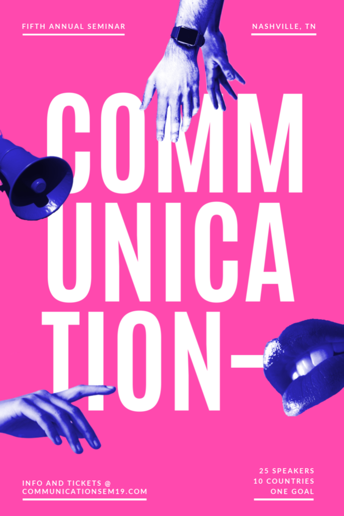
Brilliant, vivid colors have been a trend for a few years, and we predict that they’ll remain popular throughout 2020. But rather than throwing a rainbow of vibrant colors into your design, try going for a monochrome or duotone look. Using a single hue or pair of colors allows you to make a strong statement without any clutter. It’s also a great way to direct people’s attention to the most important thing at hand, whether that’s a piece of information you’re trying to convey or a product you’re trying to sell.
2. Gradients everywhere
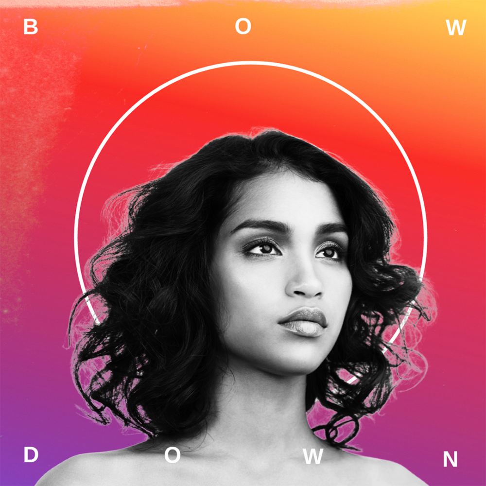
Another design trend that’s been around for a while and has no intention of going away is the gradient. But while designers have been using this color transition technique in their backgrounds and as an overall filter for some time, it’s being used more and more as a way to highlight specific elements of a design, whether it’s a particular graphic or a piece of text. Be sure to check out PicMonkey’s easy-to-use Gradient tool so you can take advantage of this trend.
3. Big, fancy fonts
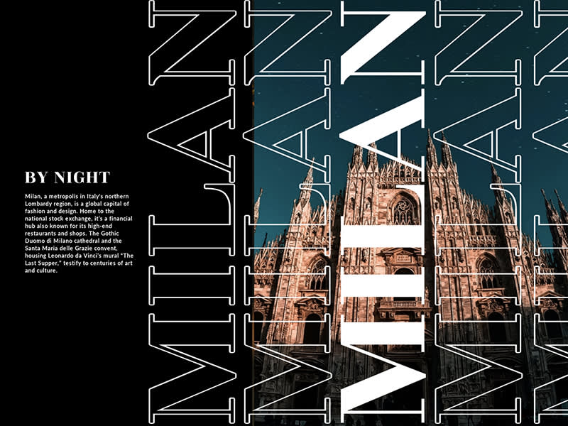
Another popular trend that’s getting a reboot in 2020 is big fonts. Massive, chunky, blocky, and bulky, big fonts are an excellent way to grab people’s attention with a strong, bold look. But while these fonts have usually been sans serif, minimalist, and ultramodern, the new looks of big text include serif fonts and even customized fonts with a bit of added flair. Designers are amping up their lettering with some well-placed graphical elements, subtle differentiation, and hand lettering. If you need to choose a font for your business, we’ve got some tips on finding a font that’s both easy to read and eye-catching.
4. Diversified masking
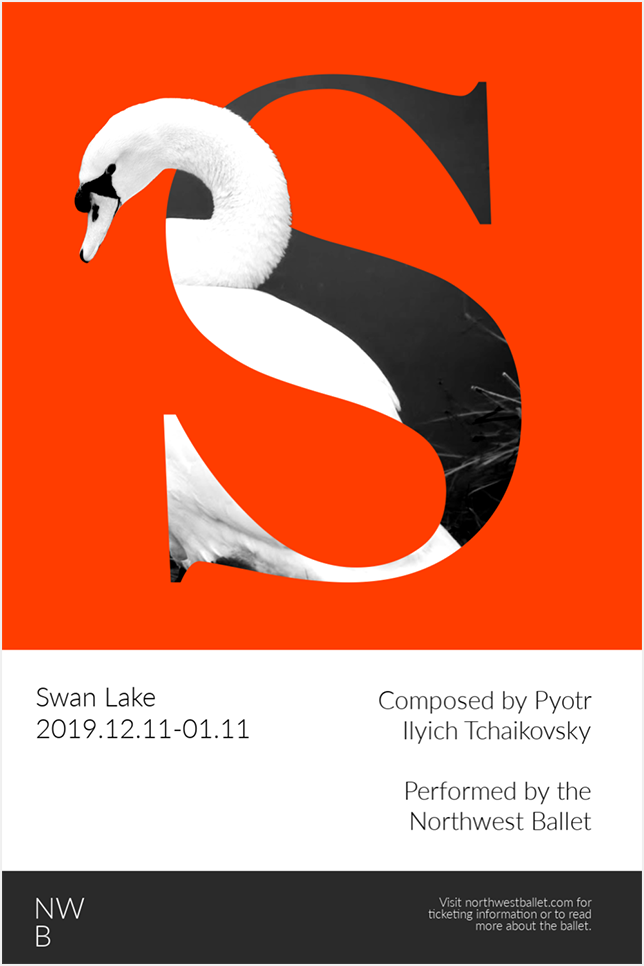
There’s nothing new about masking, a technique that allows you to layer images, cover parts of them, and place them inside of graphical elements. For 2020, we’re going to be seeing even more imaginative masking, particularly with those big fonts everyone is using. What better way to liven up your letters than to embed dreamy imagery inside of them? When it comes to masking, the possibilities really are endless.
5. Ripped from a scrapbook
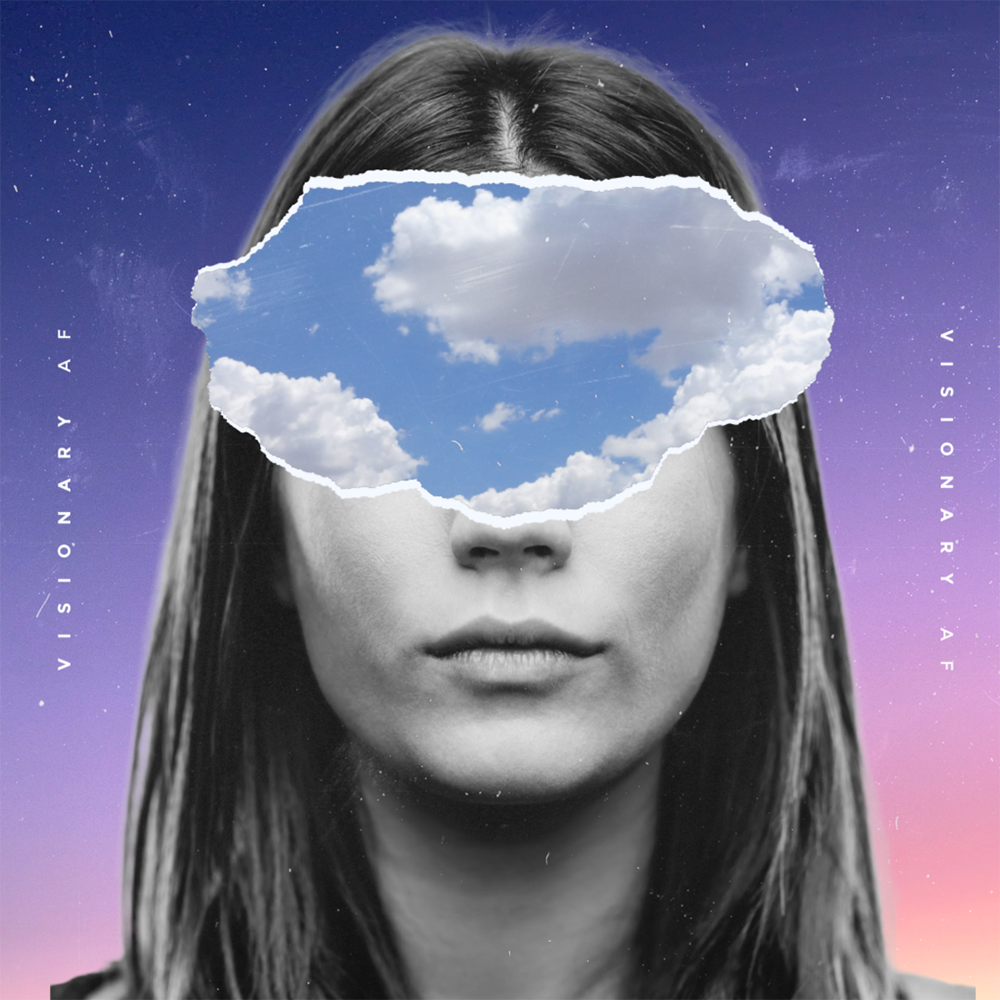
Collage is a popular trend that takes many forms. One of our favorites, and one we think will surge in 2020, is the scrapbook look. Just like in a real-world scrapbook, photographic images are layered with other elements, from stickers to ink drawings to dried flowers. Digitized tape and photo corners are used to give the illusion that images are part of a larger album. And paper rips can be added to make digitized photos look like they’ve been printed on paper.
6. Digital doodles
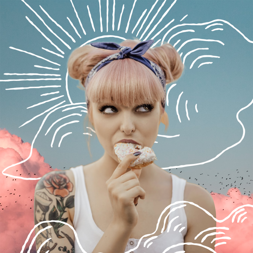
A quick and easy way to put a bit of fun, wit, or whimsy into your designs is by doodling on them. Doodles, drawings, hand-drawn graphics—whatever you want to call them—humanize your images, giving the viewer a sense of the person behind the design. We’re seeing this trend all over the place, from casual social posts to high-end advertisements. But don’t feel like you have to draw your doodle yourself. There are tons of predrawn graphics that have an off-the-cuff, freshly drawn look. And you can also use our Outline tool found in the Graphics palette to put a border around an object that looks like it was drawn with a marker.
7. Minimalist imagery
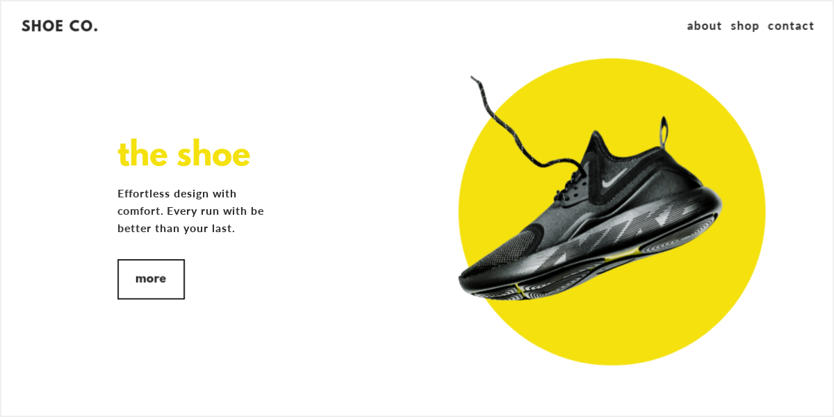
People are being bombarded by images and information all the time. If you want your message to be heard loud and clear, you might want to take the minimalist design approach. Instead of overwhelming your audience with complex text and lots of visuals, give them something simple and clean that they can quickly process—and act upon. One big advantage of minimalism in digital design is faster loading times and easier viewing on mobile devices.
8. Simple illustrations
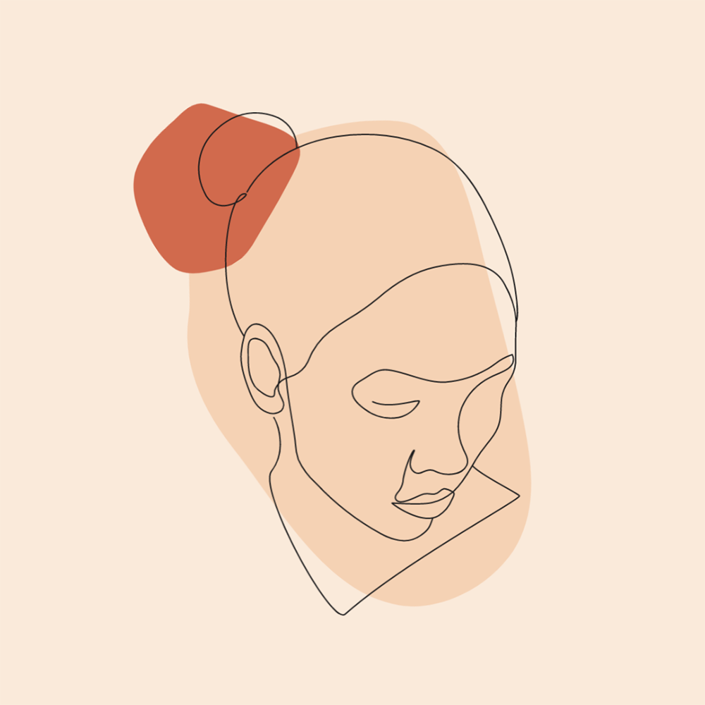
In keeping with the minimalist trend is the trend towards simpler illustrations. Graphics created with clean lines and blocks of color, straightforward and uncluttered, can convey a strong feeling and a clear message. Void of detail and looking like they’ve been drawn by hand, these simple illustrations offer a more relaxed, informal style that can help engage the viewer and inspire them to take action.
9. Vintage photography
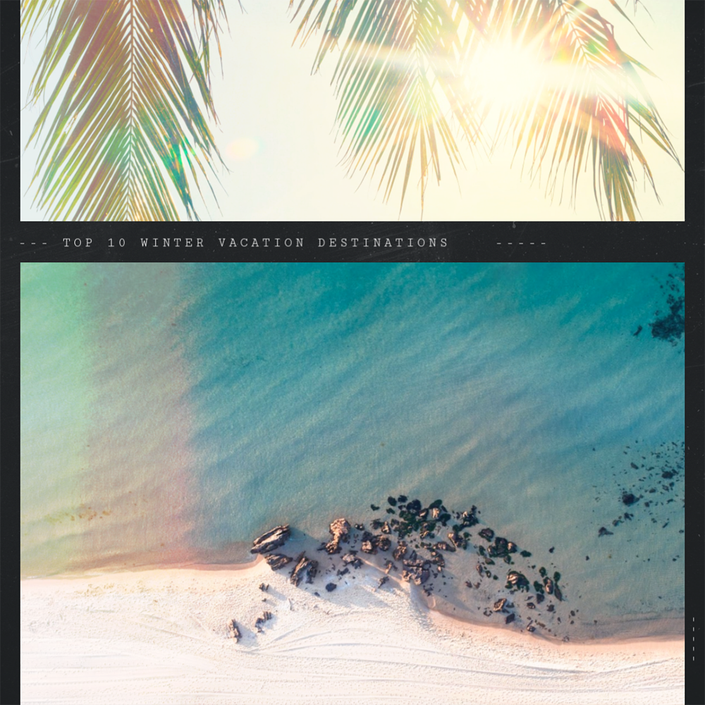
What makes a photo look and feel “vintage”? It might be the old VW bus or the mid-century modern furniture in the shot. Maybe it’s the subtle sepia sheen or the muted lighting. Perhaps the model is wearing a particular type of jeans that haven’t yet come back in style or their haircut harkens back to a bygone time. It could be the filmstrip border that makes the image look like it was taken with a non-digital camera. Whatever the technique, images that look old are definitely a hot, new thing. You’ll find a bunch of cool effects to make your new images look old under the Camera Look category in the Effects tab. Be sure to check out Polaroid Film, Daguerreotype, Sepia, and Yester Color.
10. Isometric design
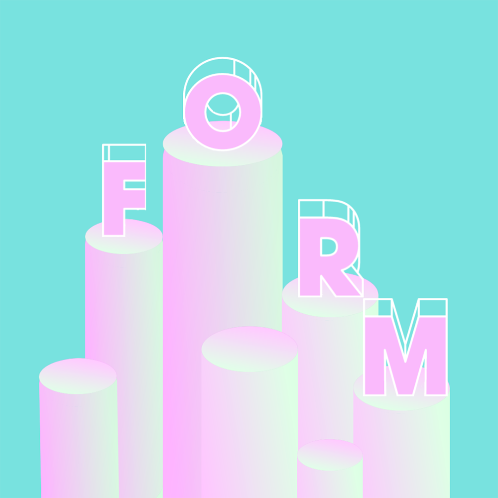
Isometric design sounds complicated but is really quite simple: It’s creating two-dimensional graphics that look three-dimensional. Isometric methodology allows you to make graphics that are more realistic and have more depth, and you can use them on everything from websites to advertisements to printed materials. Experiment with perspective, color, shading, and shadows to create your 3-D images. It’s a lot easier than it appears! Or just grab some premade 3-D graphics, like Marquee Letters, Banner Vectors, and Flower Bouquets.
