Flat is the vanilla ice cream of the text world—classic, and most of the time, it gets the job done. But who wants vanilla all the time? Enter text effects, the hot fudge, whipped cream, and maraschino cherry for your word sundae. We’ve whipped up three delicious ways to give your text the special treatment: Drop Shadow, Inner Shadow, and Knockout. You can customize each effect with six different sliders, which would be the nuts on this text sundae, or sprinkles for design lovers with nut allergies.
Learn about all that good stuff below, and open the Editor to play along at home.
How to find and use text effects
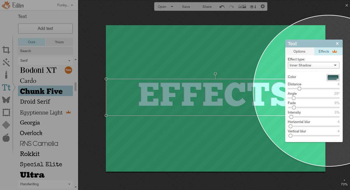
To locate PicMonkey’s text effects:
In the Editor, find the Text tab on the left-hand side.
Choose your font and click the Add text button at the top of the panel.
Type your wise words into the text box and adjust size, fade, alignment in the Text palette that appears over over your canvas.
Click the Effects button on the Text palette.

Choose the the effect you want from the dropdown menu on the Text pallette: Inner Shadow, Drop Shadow, or Knockout.
Customize your text effect with the six sliders and color picker. Marvel at your stupidly good-looking words.
The color picker and sliders are super fun to play with. Here’s what they do:
Color: The color picker applies a color to the shadow appearing next to your text. You can choose a color from the grid, get specific by typing in a color’s hex value (or should we say val-hue?), or use the eyedropper tool to pick a color from any other place on your image.
Distance: This determines how far the effect is from your text. Keep it close by sliding left, and give it some breathing room by sliding right.
Angle: Rotate the effect around your text. The degrees are noted at the top right above the Angle slider.
Fade: Allows you to adjust the transparency of your effect. Crank the slider right to go ghostly.
Intensity: The name says it all—this is how intense and crisp your effect appears.
Horizontal Blur: Smears your shadow across your text horizontally.
Vertical Blur: Smears your shadow across your text vertically.
You can adjust all six sliders and color with each of the three effects, which are:
Text effect 1: Inner Shadow

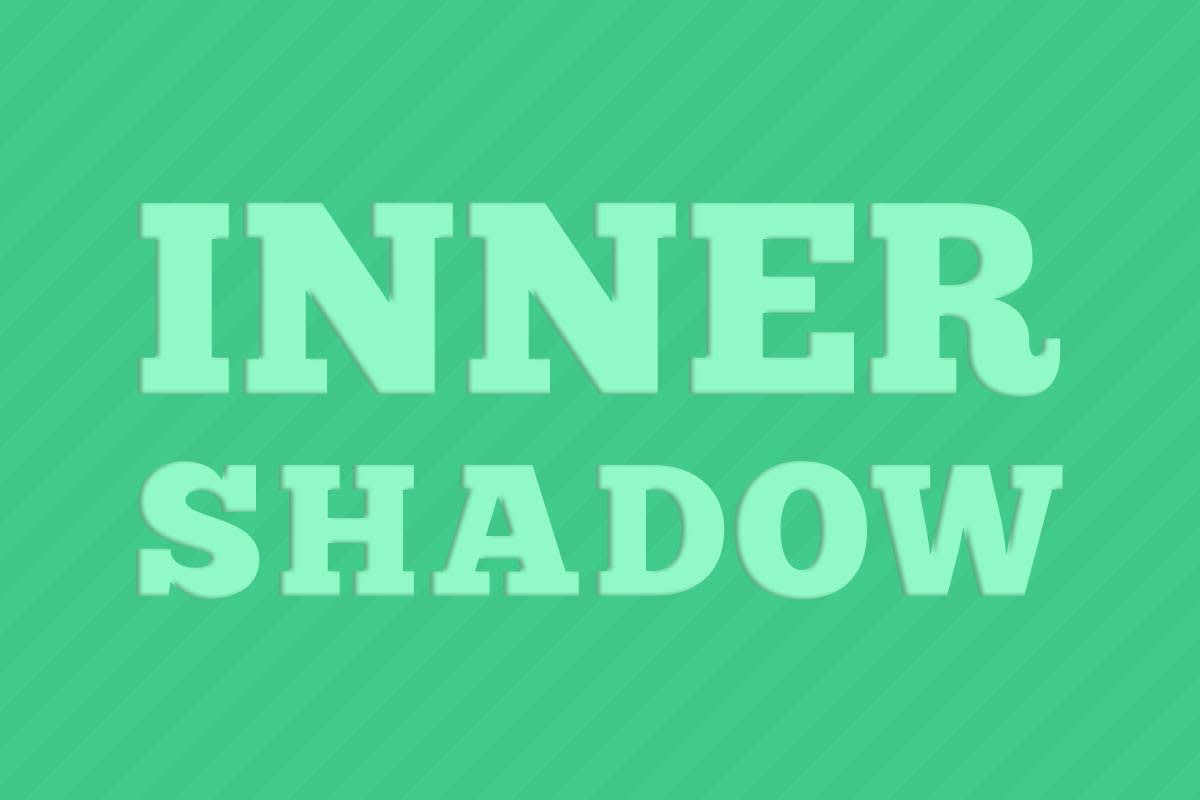
Wanna give your text a letterpressed, stamped look with the click of a mouse? Meet Inner Shadow, the effect that puts shadows inside your letters.
Pro tip: To get a letterpressed/stamped look like this one, select hues for your text and effect that are in the same color family (warm tones with warm tones, cool tones with cool tones). Also, slide the distance, vertical blur, and horizontal blur sliders to the left.
Text effect 2: Knockout
LL Cool J’s momma must have been talking about letters when she said “knock you out”—cuz this look is the bomb. The Knockout effect turns your text transparent, so that your background shines through. For an engraved look, add a bit of a shadow by increasing the Distance slider.

Pro tip: Looking to design a watermark for your images that doesn’t obstruct too much of the view? Head to the Basic Edits tab and click the Transparent Canvas box, under Canvas Color. Add your words, apply the Knockout effect, and you’re ready to click Save.
Text effect 3: Drop shadow
Drop shadow makes it easy to get eye-popping, 3D-ish text. Go for subtlety by keeping the distance slider closer to zero, or crank it up for some drama. Contrast makes this effect stand out, so go for lighter text and a darker effect color, or vice versa.

Pro tip: Use the arrow keys to make small adjustments to the Distance, Angle, Intensity, Horizontal Blur, and Vertical Blur sliders.
