
To answer the question currently tiptoeing its way across your frontal lobe: Yes. people use Twitter. A lot . Which means, like any other social media platform, Twitter can boost your brand. And, just like any other social media platform, achieving pinpoint accuracy in your profile’s image sizes can be a...chore. Luckily, we’re good at chores, so here’s the ultimate lowdown on finding the right Twitter header size and using PicMonkey’s editor to make your profile sparkle.
Create a Twitter header image with a pre-sized blank canvas
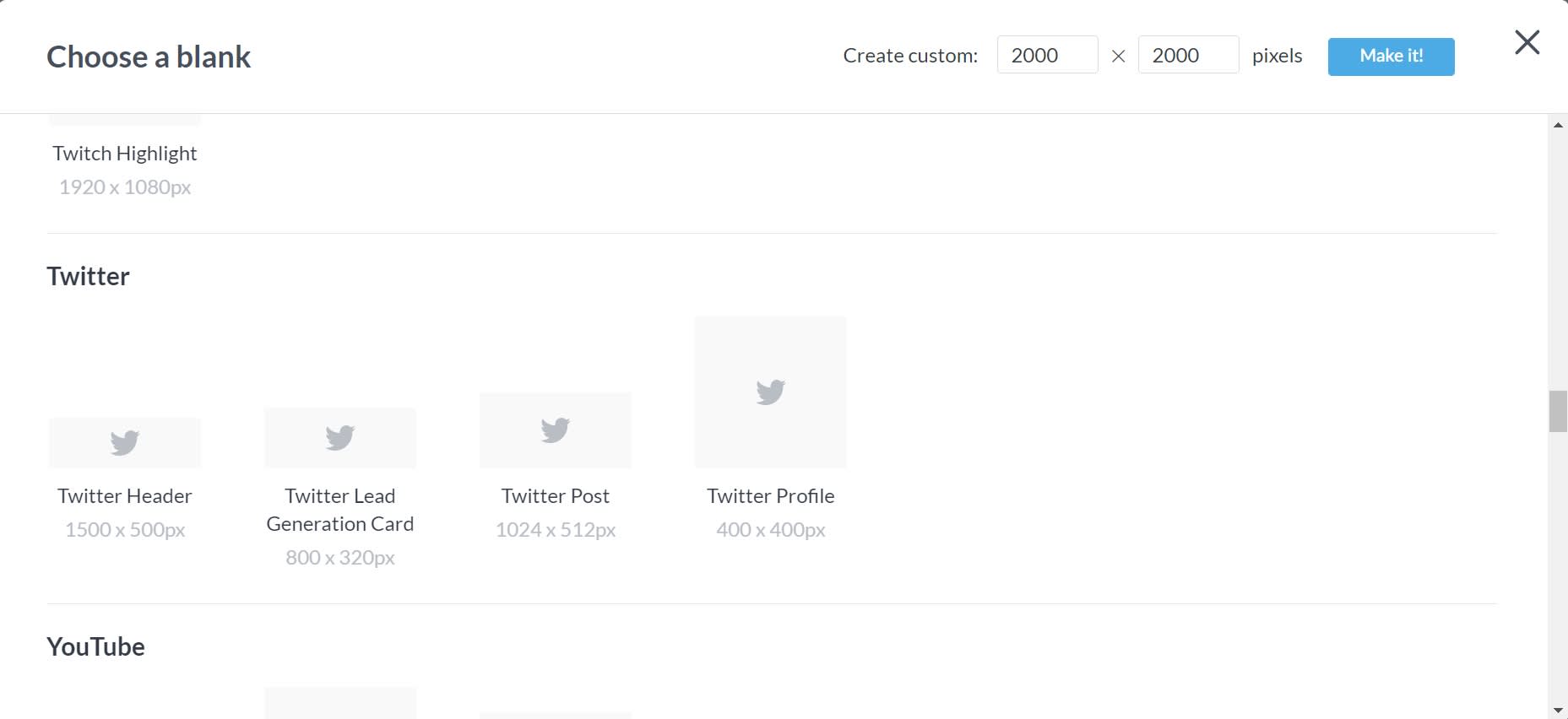
If you’re seeking the complete experience and starting from scratch, use one PicMonkey’s pre-sized blank canvases. The beauty of these is in their name: pre-sized. We’ve done the grunt work. Now you can design by adding photos, graphics, and text! If you're already in the editor, just click Create new > Blank Canvas > Twitter Header.
Crop an existing image to the right Twitter header size
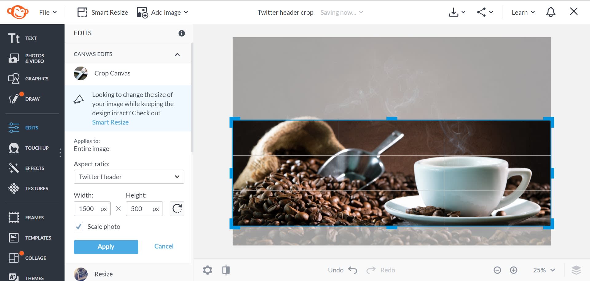
Everything in life comes with its own set of challenges. Twitter is no different. For headers, you need a high-quality image sized to Twitter’s recommendation: 1500 x 500. But if you find yourself with an awesome picture that’s in no way, shape, or form the correct size, you can use PicMonkey’s Crop Canvas tool to get it right.
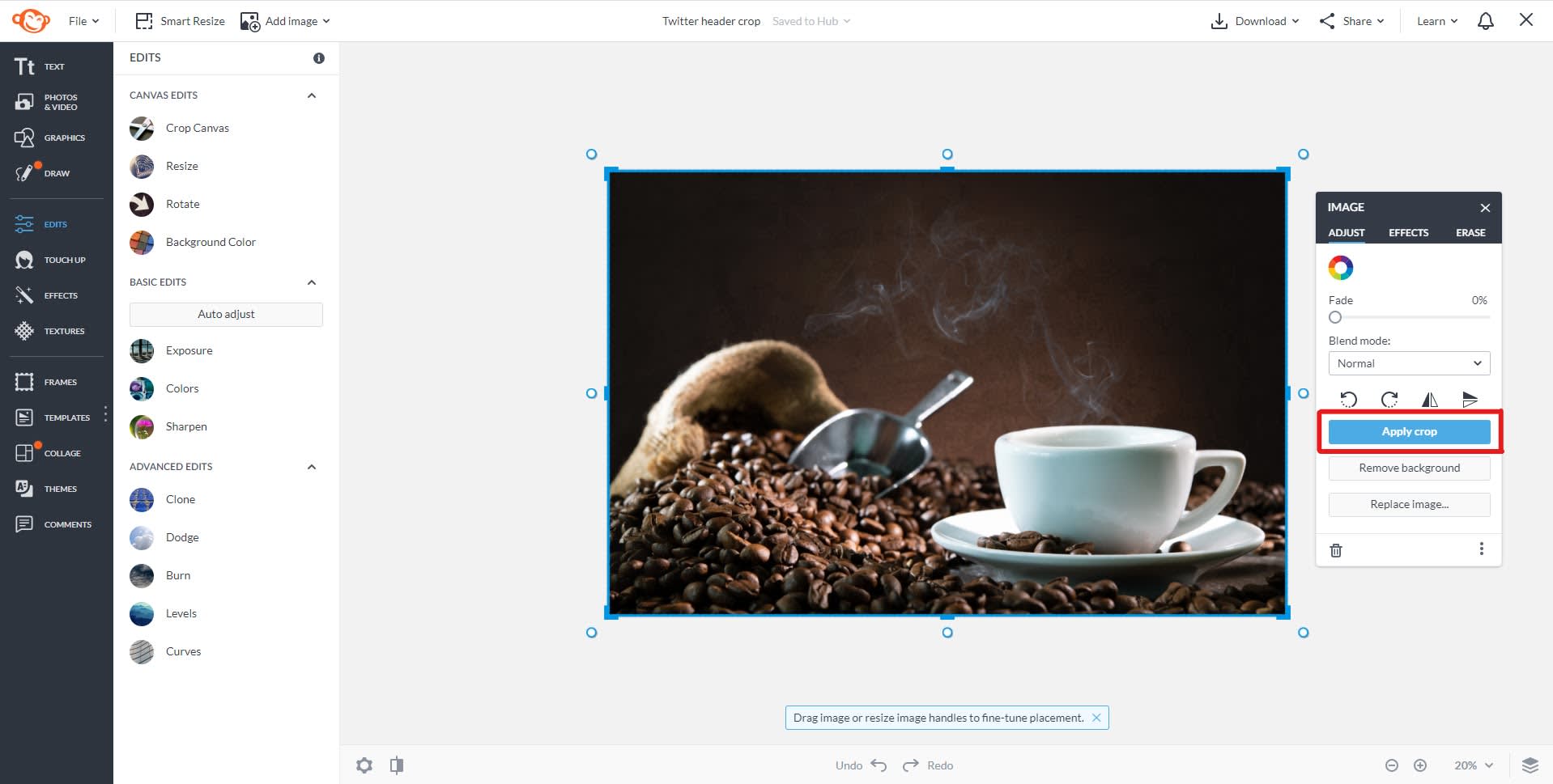
After uploading your high-resolution image to PicMonkey’s editor, click Crop Canvas and set your aspect ratio to Twitter Header. A magical grid will then appear, which you can use (by clicking its corner handles) to drag to position. Find the focal point of your image, click Apply, and celebrate your perfectly sized banner photo.
If your image is already the right aspect ratio but larger or smaller dimensions, you may want to simply resize it. Click Edits > Resize.
Make a Twitter header image with a design template
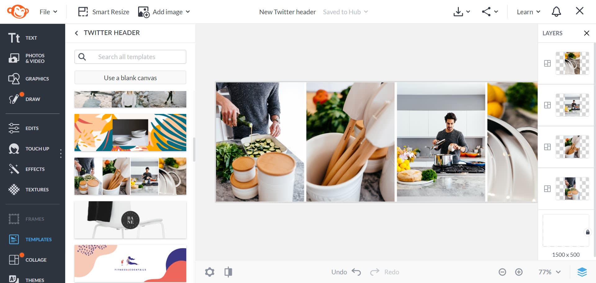
If you’re not looking to start from scratch, we have a stellar collection of Twitter templates, good for any business or brand. Using a template sets you up for success from the get-go. And you can always customize with images, graphics, fonts, etc. We encourage you to do so.
Already in the editor? Go to Templates and search Twitter Header.
Using Smart Resize to output your image to other sizes
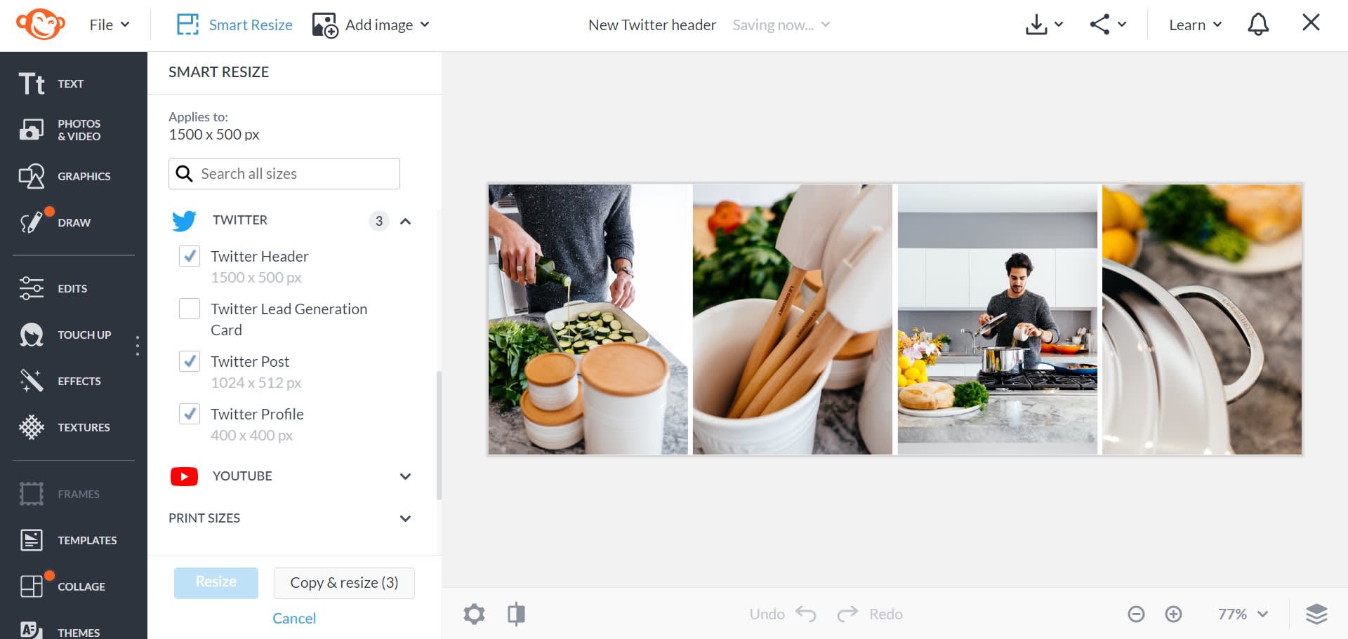
When you become a PicMonkey Pro subscriber, you get access to our Smart Resize tool, the answer to any and all of your problems (well, image sizing-related problems…).
Smart resize lets you turn one image into multiple images, instantly. Simply click Smart Resize, check off the other sizes you desire, and then click Copy & Resize. The original image and its new sizes appear in your Hub, PicMonkey's cloud storage, ready for you to post or download.
More Twitter photo sizes (2021)
| Social media image type | Dimensions in Pixels |
|---|---|
| Twitter Header Photo | 1500 x 500 |
| Twitter Profile Pic | 400 x 400 |
| Twitter Lead Generation Card | 800 x 320 |
| Twitter Post | 1024 x 512 |
� Need sizes for other social media accounts?
Twitter header design tips
Having the correct image size is just the beginning. Make your design pop with our tips below.
1. Be mindful of the safe zone
You might’ve noticed a section of the diagram at the top of this article labeled Profile Picture Safe Zone. You guessed it — that’s the area where it’s safe to say your profile picture will hang out. So, expert designer, what does this mean for you? Design around it. Never put anything important in that bottom left corner. In fact, you should always feature your most important design elements in the center. We also recommend centering or right aligning any text.
A centered design also helps on the mobile front. Desktop images display differently on mobile devices. And while we all know what happens when we assume, do it anyway: Assume that a lot of Twitter users will come across your profile on their phones or tablets. A design intended to attract eyes toward its center will look good on desktop and mobile.
2. Brand your design
Whether you start with a blank canvas and get your Picasso on, or choose one of our templates to lend a helping hand, branding your design is important. All of our templates are easily customizable. Use images, graphics, fonts, and colors that match your brand. While stock photos come in handy, look for ways to make your design stand out. A company or brand-specific image can do just that.
Lots of businesses struggle with brand cohesion across social media platforms. The best way for your audience to know who you are is by showcasing it. Check out our Branding 101 Guide for more useful tips.
3. Quality over quantity
This is a biggie. When in doubt, err on the side of minimalism in your design. Truthfully, you don’t have a whole lotta space. You want a memorable image that speaks to your brand, and it should be visually driven. It’s okay to include a tagline if appropriate, but there’s really no need for a lot of words.
And in that same sense, there’s no need for a graphic emporium. Something clean, something professional, and something that says who you are will always be better than the We-used-everything-just-because design.
