PicMonkey's stock photo library is powered by Shutterstock, so you have millions of pics at your fingertips. Wanna see how it all works? Check out How to Use PicMonkey’s Stock Photos and Enhance Your Designs With Free Stock Photos and read on for hot tips for choosing the exact right photo.
Finding the right stock photo for your brand can be a huge pain in the neck. First of all, there are millions to choose from, so where do you even start? And secondly, even if you do manage to narrow your search, often the resulting images are cheesy, stiffly posed, or labeled improperly.
Enter: brand marketing guru and former graphic designer Pamela Wilson of Big Brand System, who offered her clever ideas for quick, easy, and confident stock photo searching in a recent webinar: Choosing Perfect Stock Photos for Your Marketing Project . Below are her top five tips for becoming a stock photo chooser extraordinaire.
1. Understand permissions and legal usage of stock photos
Although stock photos may be offered through a “free” service, they can still come with usage restrictions or copyright terms, so be sure to read the fine print. (Find more info on this in 10 Resources for Free Stock Photos.) Some sites offer 100% royalty-free images that are free to use, while others may offer free pics that require crediting the photographer.
If you pay for stock photos, you still need to be aware of the usage terms. Just because you shelled out $30 for that image doesn’t necessarily mean you can use it for a commercial purpose.
2. Identify the emotion you want to communicate

Your image should tell your brand story, so what emotion do you want to convey with the stock photos that you choose? Jot down a few emotions—happiness, confidence, joy, remorse—and type those adjectives into your stock photo editor. Check out the photos that come up as a result and narrow down your choices from here, such as choosing only black-and-white photos or images without people.
You may be asking yourself, “How on Earth do I make associations between my type of business and an emotion?” What sorts of emotions go with tax accounting, for instance? Or a travel agency? Pamela says focus on how you want your customers or clients to feel when they complete a transaction with you�—relief and confidence after their taxes are filed, or a sense of peace and relaxation while on the bucket list trip they booked through your agency.
3. Understand how your stock photo site functions
Knowing how your favorite stock photo search engine functions is a huge part of finding the right images. Does searching for “cow” and “cattle” bring up different results? Can you further refine your search term with descriptors, such as changing your search from “office” to “people + office”? Some sites allow you to search for photos by horizontal or vertical orientation, how many people they contain, and if those people are old or young, male or female. Knowing the tricks of your stock photo editor can help narrow down your search.
On this topic, Pamela says to keep two things in mind:
The first photos in your results will often be the closest to your search terms.
Try adding alternate or additional terms to narrow your search.
4. How to identify posed vs. candid photos
Pamela says that to avoid the reviled “cheesy stock photo” feel of, well, your stock photo. Look for images that seem to capture a moment in time, especially when searching for photos with people in them. Avoiding photos that seem too perfect or “posed” will help convey your brand as authentic.

How to tell a posed photo vs. a candid photo
| Posed: | Candid: |
| • The photographer looks to have arranged things in the photo. | • Subjects appear unaware that they’re being photographed. |
| • The subjects appear to be “doing something” specifically for the camera. | • The photos capture the spirit of the moment and convey emotion. |
5. Avoid visually busy photos
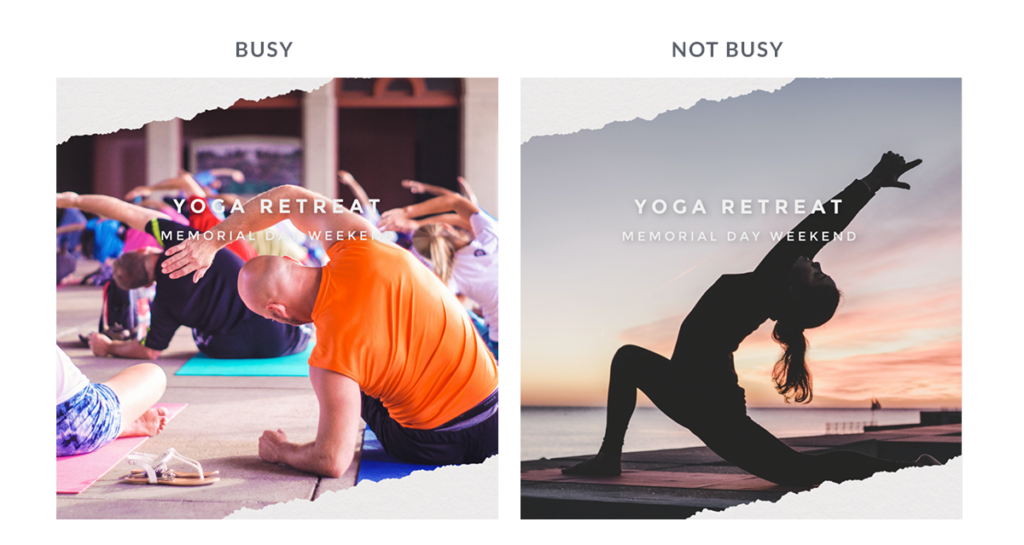
If you plan to add text or graphics to your photos, search for pics that have enough negative space to include these additions without your overall composition become too cramped. What’s “negative space”? It’s blank space around the subject of the photos and it lets your eye “breathe” because it’s not full of competing subjects vying for your attention.
Are you creating posts primarily for social media? Then you’ll do well to select less busy images. In the example below, you can see how text looks more obvious on the less busy photo on the right.

Another reason to avoid busy photos? They don’t show up well on small devices, like the social media scroll on a smartphone.
Ready to design something? Hop into PicMonkey and explore Shutterstock's gorgeous stock photo collection — we're sure you'll find exactly what you need!
