Websites play an important role in introducing your brand to the world. Because they are often the first encounter potential clients will have with your business or service, it’s so important to make your site memorable. One way to add that little bit of extra, eye-catching je ne sais quoi is to customize your site using graphics.
Practically anyone can make a site nowadays, which is awesome, but not everyone can creatively use custom graphics. We’ve got eight ideas of how to stand out using these little pieces of art on your website, and we’ll show you how to get a uniquely branded look, too.
1. Website banner graphics

Website banners are the welcome mat and front door to your interweb abode rolled into one inviting image. They give a sense of what you’re all about—photos of trees if you’re an arborist, say, or perhaps a melange of abstract design if you’re in the artisan trade.
Keep it simple with shapes

Customize this template: Bootcamp in a Box
Go simple with a shape graphic in your website banner. Try starting your design with a photo, add a graphic (here we used a Deconstructed Blob), and then text on top for a look that’s so fresh, and so clean.
Add a dash of design with brushstrokes

Customize this template: Get Me Out of Here
Using our brushstroke graphics set, we added two Casual Brushstroke graphics to our canvas, then applied a gold foil texture to them.
You can easily replicate this look by following these steps:
Choose a blank canvas size and open in PicMonkey (1600 px wide is safe).
Select a stock photo from our library for your background.
Browse the Design section of Graphics and choose one that appeals to you.
Making sure your graphic is selected in the editor, head to Textures and choose one to apply.
Add your text to the middle and you’ve got a pro-looking banner!
Suggested graphic sets for website banners
2. Navigation Icons

Graphics can make for cool little navigation “buttons” at the top or the side of your webpages. Visually, they should relate to their destination (think a house icon for homepage), and/or be relevant to your brand (think an airplane for a travel blog).
Business icons
In the example above, we used a number of line-drawing graphics from our Graphics > Business category, changing the color scheme to blue and white so all the icons would match.
Pictures of your products

Using figurative pictures of your products is a visually appealing way to incorporate your brand into your website. If you have a plant shop, you may want to use graphics from the set Lifestyle > Succulents & Such. Or if you own a restaurant or cafe, be sure to browse the Food and Drink graphics category.
Abstract designs

For a modern, artsy look play with some of our design graphics to create a nav bar that is both informational and interesting. Try graphics from within the Design > Artsy Blobs category to create a nav bar; layer graphics on your canvas and adjust the Fade slider so you get that cool semi-transparent look.
Suggested graphic sets for navigation icons
3. Bulleted lists
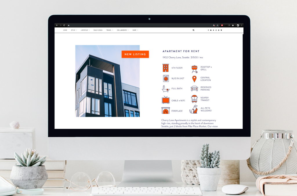
We love numbered lists and all, but sometimes you want to lay out the info in a more interesting way—enter icon bullets! Using graphics to represent ideas, much like in a navigation bar, lets your website visitor quickly scan what is on offer. In this example for a vacant apartment, a potential renter can clearly see what is included in the lease: “Picture of dog, dogs ok…barbecue, okay I can grill there,” and so forth. Other ideas for bulleted lists?
Graphics-as-bullets work great for restaurant or bar offerings, or to accompany any menu—like a spa or salon. They can also help visually organize a list of services, publications, or store locations.
Another reason to use graphic bullets? They are helpful in communicating information to those who may speak another language—say, international tourists considering your vacay rental, or scanning your menu for something to imbibe after a long day of sightseeing.
Suggested graphic sets for bulleted lists
4. Call to action buttons
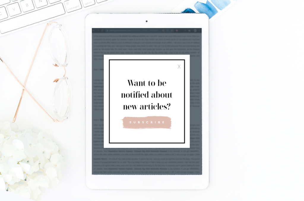
When you need to spur your website visitors to take some action, there’s nothing like a button to entice users to “push here!” You can use almost any shape for a button, however a good ol’ rectangle is the gold standard—but that doesn’t mean it needs to be boring! Be sure to add a drop shadow to your button so it gives the illusion of, well, being a pushable button.
Suggested graphic sets for CTA buttons
5. Give blog photos a dash of extra
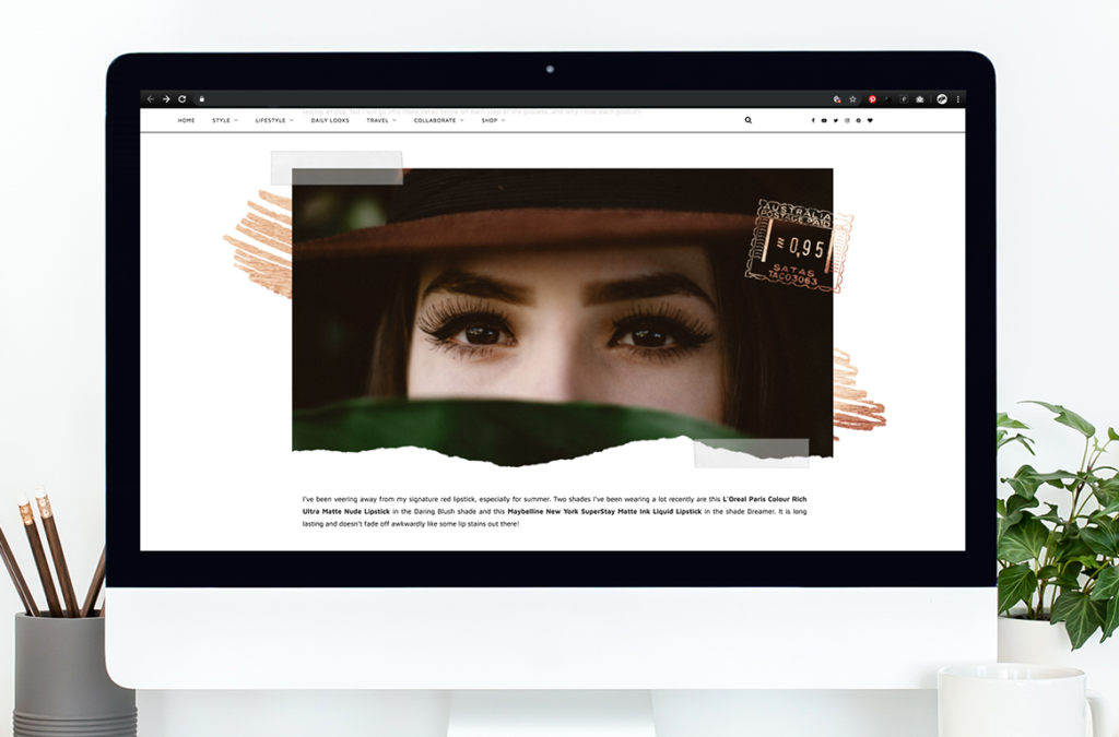
Why post a plain photo, when you could post a design? Zhuzh up your website or blog photos with a few well-placed graphics.
Get the handmade, dare-we-say, scrapbooky look

Liven up your blog pics with just a couple quick graphical additions and edits. Take some vacation-ish pics from our stock photo library, layer them, and apply a couple tape graphics with the fade increased so they are somewhat transparent. We finished it off with some simple shape graphics and text.
Frame it up

Some pics deserve a little extra love, so add a few graphics to make them extra special. For this example, we used two ripped paper edge graphics, a dotted rectangle graphic underneath, with a banner on top—perfect for adding a title or a saying.
Add a playful sketch

Combining photo-realistic with a sketch sends a playful, think-outside-the-box message. You can erase parts of our graphics so they fit into a photo just perfectly—like we did here, in the Graphics palette we chose Erase and removed the bottom of the sun graphic. If you erase too much of your graphic, just switch to the paintbrush mode in the Graphics palette and paint your graphic back onto your canvas.
Suggested graphic sets for photo add-ons
6. Graphic watermarks for photos
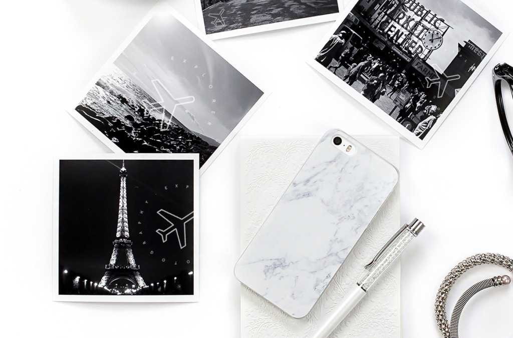
You can use graphics to make a watermark for your photos—it’s that very subtle overlay that claims a pic as yours in case someone tries to nab it. We have a whole tutorial about how to make and use one: Create a Watermark for Your Images.

Combining a simple wreath graphic with text makes for a sweet watermark to stamp on your photos. If you’re a professional (or hobbyist!) photographer, you may want something more professional-looking. Use your own logo, or opt for a copyright or trademark graphic as in the pic below.

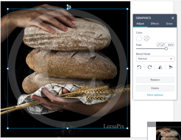
If you really want to watermark your work, you can place a graphic over the entire photo. Stretch your graphic to cover the picture (our graphics are vector-based so you won’t lose any resolution), then pump up the Fade slider in the Graphics palette to make the graphic transparent enough to see the photo, but still obvious enough that no one could claim it.
Suggested graphic sets for watermarks
7. Links to social channels

By now, these little icons are ubiquitous: logos linking users to Facebook, Twitter, Instagram, and YouTube from your website are everywhere. You gotta have ‘em. Fortunately, PicMonkey has multiple styles to choose from so you don’t have to settle for the same old same old. Browse the selection and find one that most closely matches your brand—i.e. Opt for clean lines if you’re a buttoned-up professional business, and maybe try more of a smudgy icon in black if you have an edgier operation.
Suggested graphic sets for social media links
8. Call out features with “meat stickers”
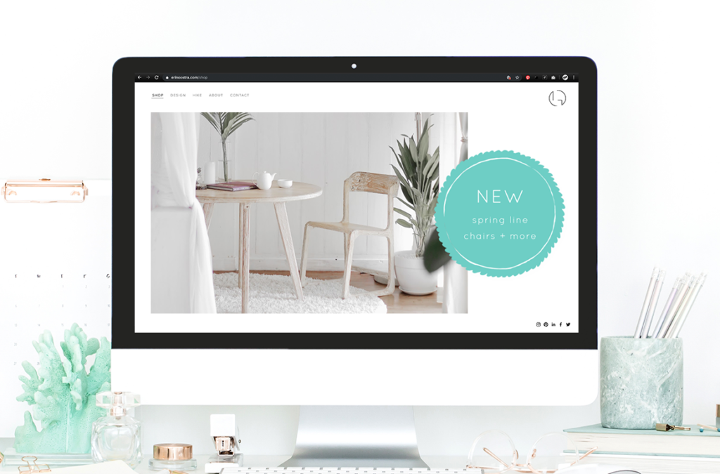
Graphics are a great way to draw your website visitor’s attention to a sale, a new item, or to demarcate a special category of a menu or catalog. Sometimes called “meat stickers” because of the classic bright orange sale stickers you’d see on packs of steaks in a butcher shop, these little graphics are perfect for calling out something you want your customers to see.

Etsy and Shopify users take note! Call out new offerings with a graphic on your product photos, or use one to advertise a sale. Restaurant owners, let your customers know about new menu options on your website with a graphic that is on-brand.
