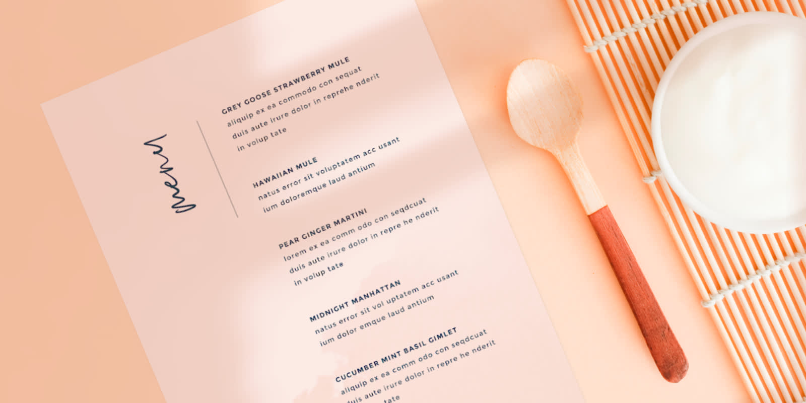
A menu is a printed or online list of the food, drinks, or services a business offers. Understanding how to make a menu not only gives customers a sense of which options are available at your establishment, but it also helps support your brand.
A poorly-designed menu can truly impact your business and profits; the color scheme, font choices, layout, and more have a profound effect on the customer’s menu browsing experience. Learning the ins and outs of design psychology can be the difference between an eye-catching menu that drives sales and one that is difficult to navigate.
Designing a menu can be an overwhelming and time-consuming process, especially if this is your first go-around. PicMonkey takes the guesswork out of making a stunning menu with endless menu templates to get you started and inspired.
Simply follow these easy 7 steps (and tips!) to bring your business’s menu to life and make a menu that sells.
1. Jot down and categorize all menu items
Before jumping into the creative design process, a good menu starts with listing and categorizing all menu offerings. Spend ample time in this step to get your menu started off on the best foot.
Categorize menu items by type (appetizer, salads, services, etc.) or dietary restrictions to help your customers to easily make a decision when glancing over your menu. The less time spent on the decision stage, the better.
Arrange your menu in the Golden Triangle
The Golden Triangle is a phrase that menu designers use to refer to the three focal points that customers tend to browse first.
Middle. Customers typically look at the middle of your menu first, making it the perfect spot for specials or popular items.
Top Right. The second place customers tend to browse is the top right corner of the page. Menu items such as entrees or main course items (if you’re a restaurant) should live in this area.
Top Left. Opposite of the second point, most customers tend to also glance at the top left corner, making it an ideal location for appetizers and smaller plates.
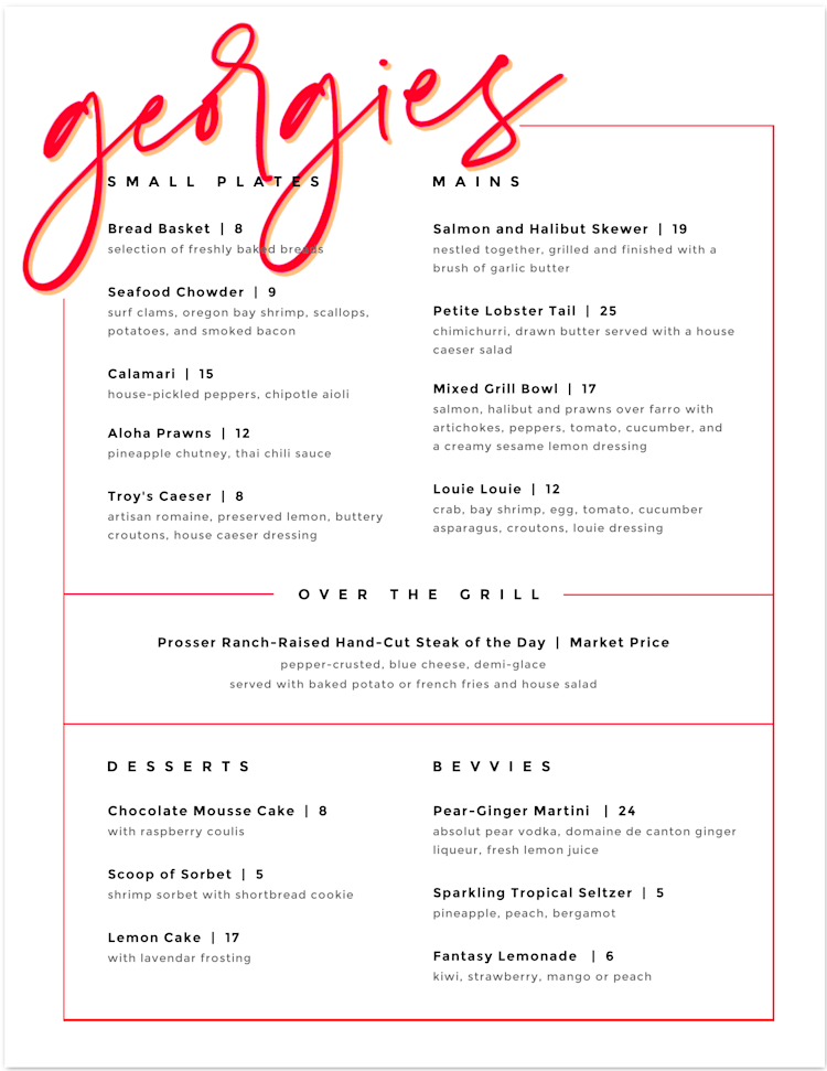
Like this design? Customize it yourself in PicMonkey.
When categorizing and sectioning out your menu items, be specific. For example, many restaurants will use specific sections for protein type or acronyms for gluten-free, vegetarian, dairy-free, or vegan to assure customers that those menu items meet the specifications of that diet.
2. Put together menu item descriptions
In addition to categorizing your menu items, having a concise yet appetizing description is crucial to educating your customers as to the different elements within a menu offering, leaving room for as few questions as possible.
If you’re promoting a dinner special, list the item’s ingredients but also its overall texture and taste. The food description “a classic grilled cheese” leaves much to interpretation while “grilled sourdough bread with cheddar, mozzarella, and pepper jack cheeses, with a tangy dipping sauce on the side” adequately describes and elevates a traditional menu item.
If you’re offering a service, such as within the beauty and spa industries, try to be as specific as possible when describing the service so customers know exactly what they’re getting.
Once you have the bulk of your menu thought out and categorized, it’s time to open up PicMonkey and begin making your menu and bringing it to life.
3. Create a blank canvas or select templates
Conjuring up a menu from scratch is not an easy process; there are so many design elements to consider such as canvas size, typography, colors, photography, and the layout.
If you’re interested in starting with a blank canvas, click Create New > Blank Canvas from the PicMonkey homepage, then select your ideal menu size in either inches or pixels.
Since many menus are printed out, it’s best to have a size in mind. Here are a couple of common menu sizes:
Lunch Menu: 8.5" x 11"
Dinner Menu: 8.5" x 11", 8.5" x 14", or 11" x 17"
Drink, Dessert, Beauty/Salon Menu: 4.25" x 11", 4.25" x 14", or 5.5"x 8.5"
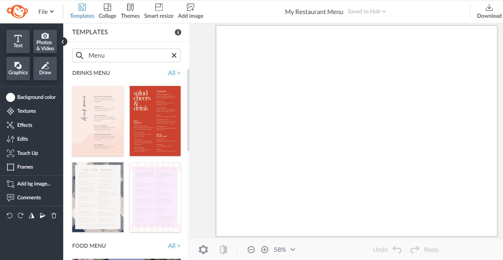
To give you inspiration up front, PicMonkey also has several menu templates to choose from Simply click Templates on the top toolbar and search "menu."
4. Upload branding elements and photography
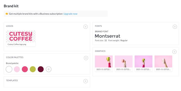
If you’re equipped with branding elements — such as a logo, graphics, brand fonts, color palettes, and photography — then all you need to do is import them into your Brand Kit.
PicMonkey’s Brand Kit feature is a one-stop shop for compiling all your branding assets, streamlining your menu design process, along with other marketing materials.
Incorporating graphics and photography of your menu items is a surefire way to highlight any popular menu offerings and allow customers to accurately visualize the menu item. But, if you’re going to include photography, only use high-quality imagery — as low-quality images can dampen the mood of your menu.
PicMonkey’s graphics library is also chock-full of stunning graphics that can draw customers’ eyes to popular menu items.
5. Customize your text and layout
This step is where the planning stage of your menu process comes in handy. Add text boxes to your menu with the Text tab, or edit the sample text from a menu template. Start adding in each category or section of your menu with a catchy but simple title and accompanying descriptions and prices for each menu item.
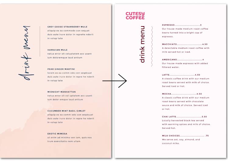
When in this step, be sure to be thoughtful about how your customers may glance at your menu. Is each section clear and concise? Is there a section that has more menu items than others? Take this time to assess the layout and appearance of your menu.
In addition, keep your menu as simple as it can be and choose an easy-to-read sans serif or serif font as the description text while using a handwriting or modern style as the section titles.
Incorporating a successful font pairing into your design will take your menu to the next level.
6. Choose your color scheme
Color truly has a profound effect on any design — especially menus. Pastel hues, like the pinks and greens below, behave differently than browns, oranges, and other earthy tones will; pastel reads as feminine and buoyant, while earthier tones are friendly and inviting.
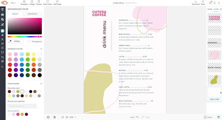
Think about the message you’re sending with just your colors alone. Does your menu’s color palette reflect your brand and menu offerings?
Learning how color impacts your menu design is crucial. For example, the colors used in a beauty spa menu, such as cool blues and greens, wouldn’t be as fitting in an Italian restaurant’s menu, which would feature warm reds and yellows.
The mood and tone from warmer reds and yellows differ from the mood and tone that are conveyed with cooler blues and greens — understand the difference with our detailed guide to color theory.
7. Proofread and download!
Before you hit share and download, it’s time to proofread the design of your menu. Ask yourself a few more questions before hitting the road and printing your menu:
Is this menu consistent with my brand and menu offerings?
Does this menu read easily, or is it difficult to navigate?
Are all of my prices, menu items, and item descriptions accurate and free of errors?
If you’re satisfied with the end result of your menu, then hurrah! You’re ready to download as a PDF (a Pro feature), JPG, or PNG.
Ta-da! Once you’re ready for printing, be sure to choose high-quality cardstock or cover stock over typical printer paper for maximum durability.
