“She was so mad she saw red.”
“When it rains, he feels blue.”
“They were green with envy.”
Color can kindle emotions, soothe us, alert us — even annoy us! It’s one of the most accessible aspects of design, yet it’s also a deeply complex and technical subject. Let’s take a brief informational swoop into color theory so you can use its principles and tactics to make compelling color choices for your designs.
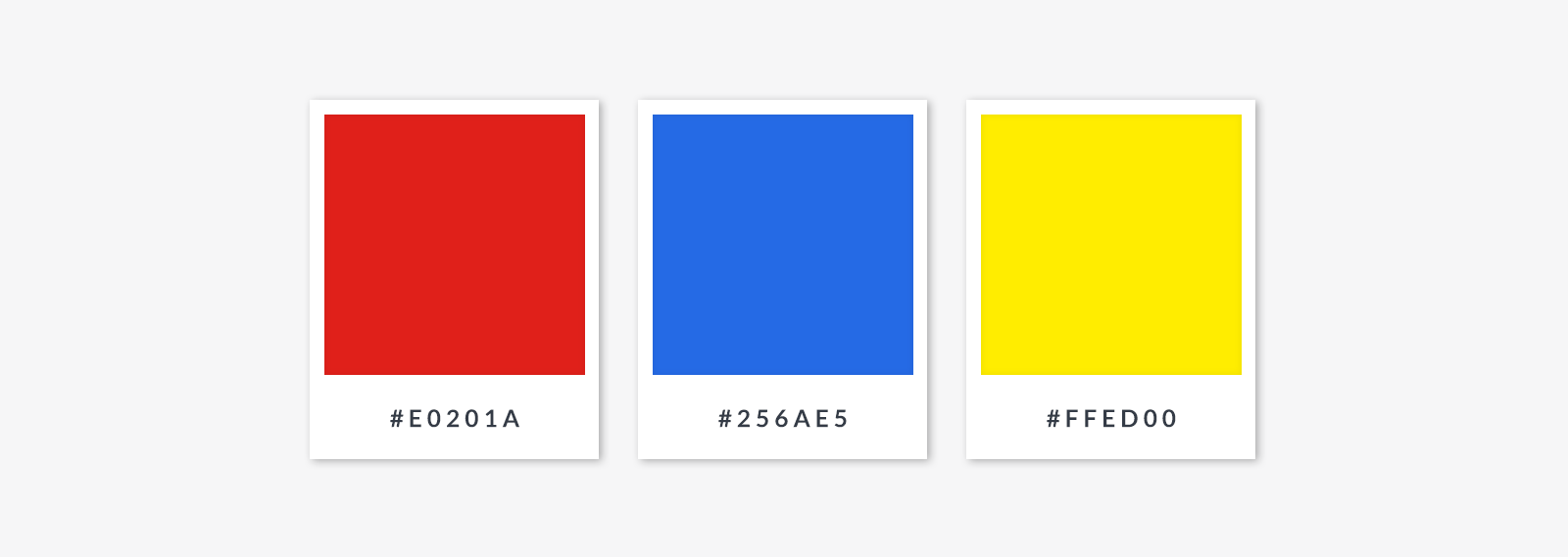
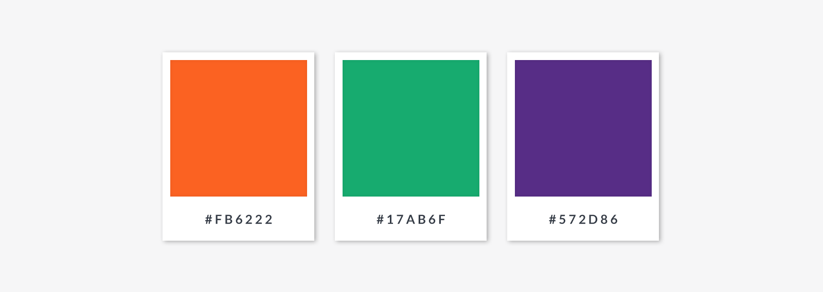
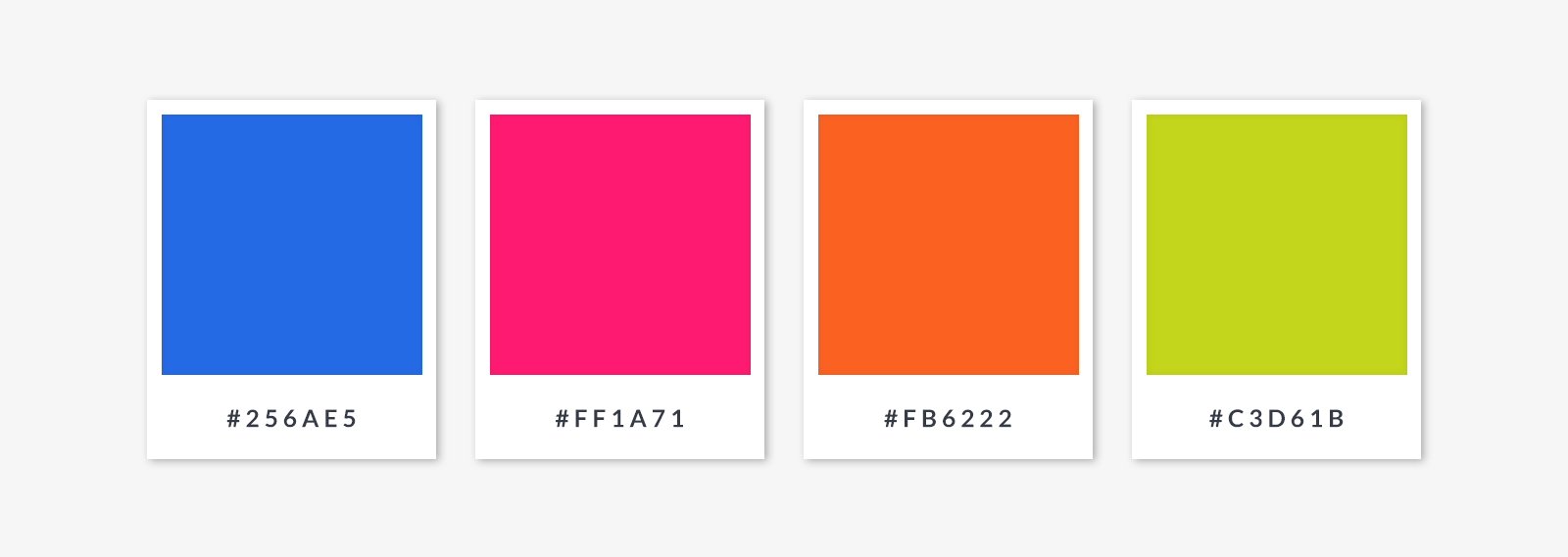
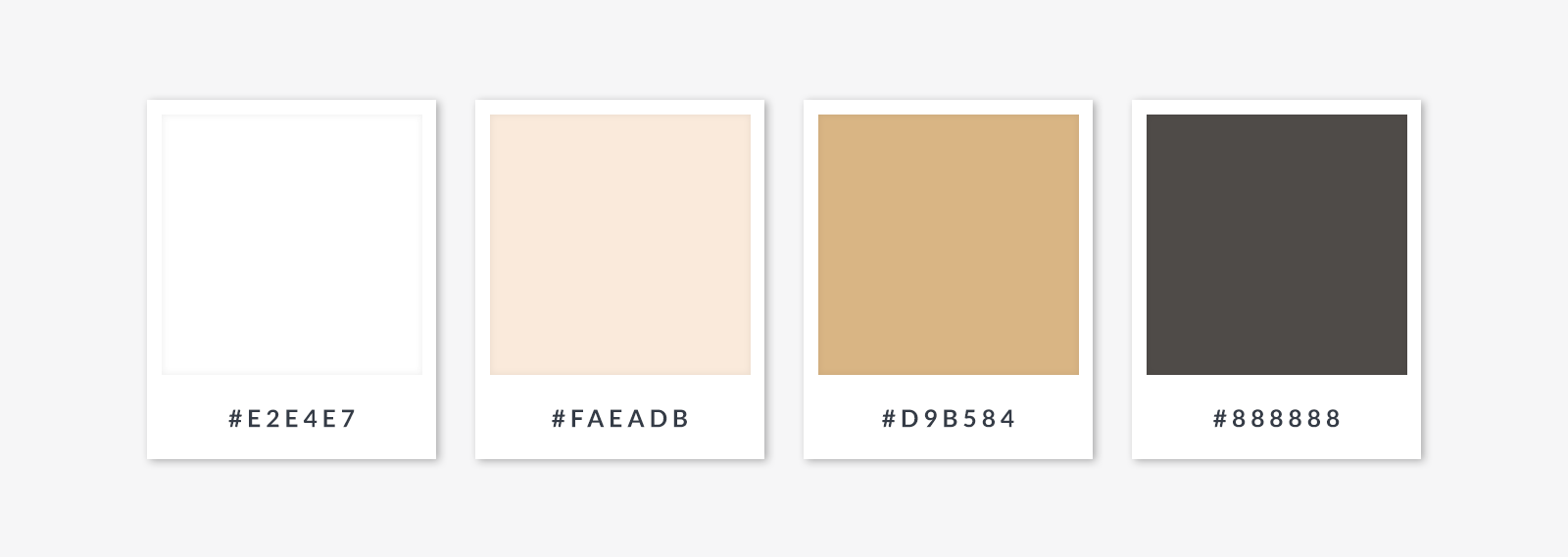
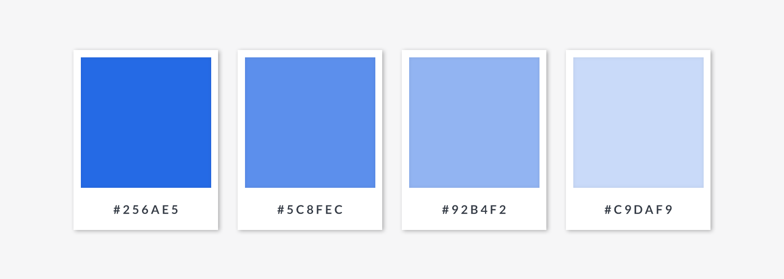
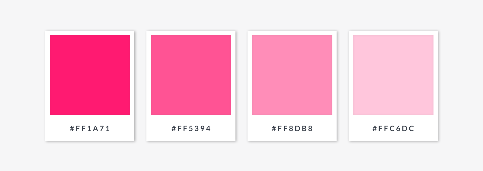
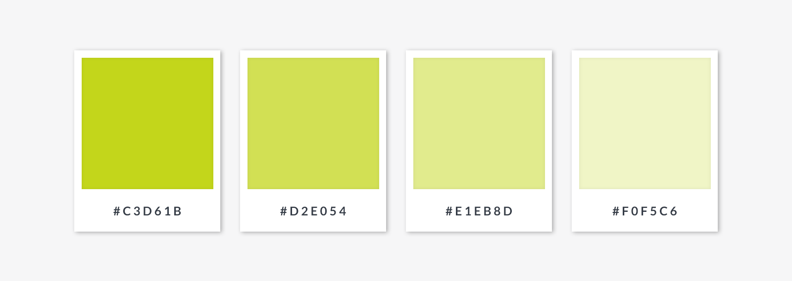
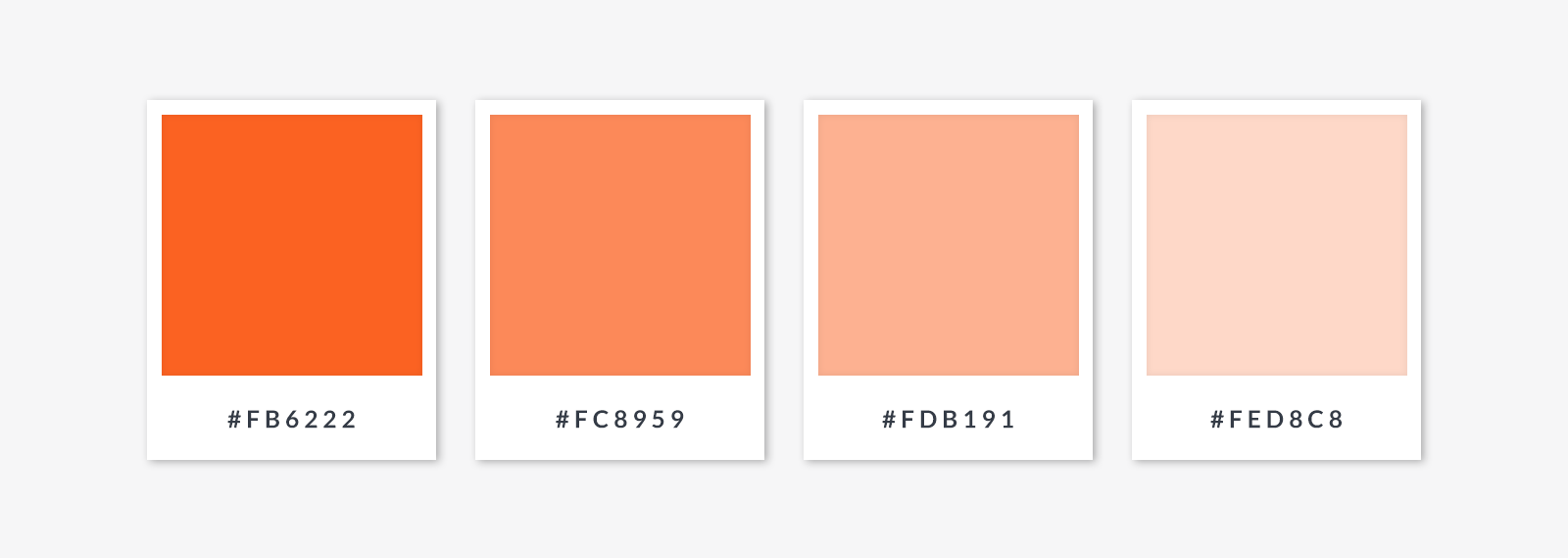
If you're researching color for a project, we’ve included some sweet palettes for each section and added six-digit "hex" codes for those colors. Grab a pen and jot down the ones you like, or introduce them to your good friends, Ms. Copy and Mr. Paste.
Get to know the color wheel
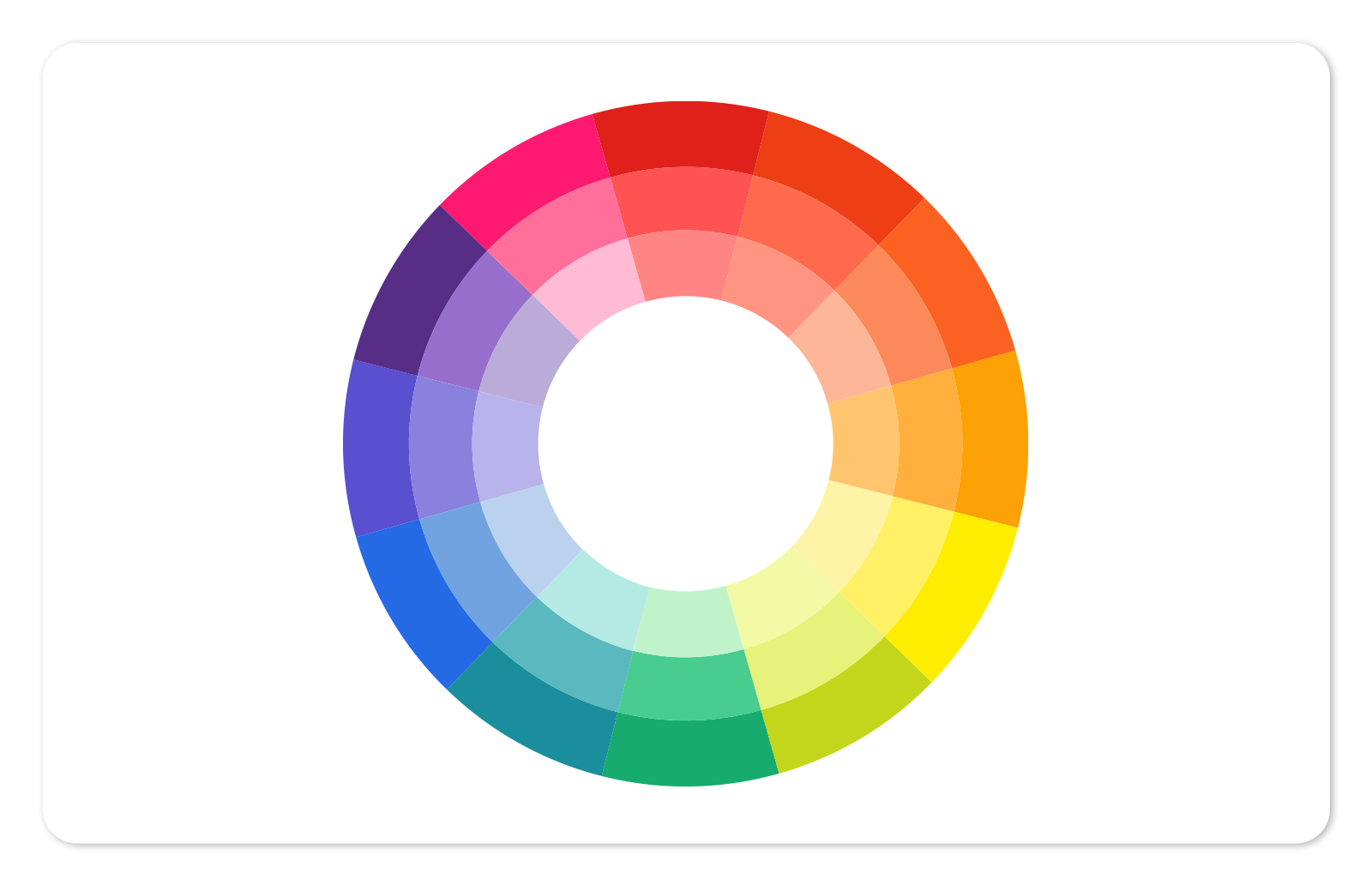
This traditional 12-spoke color wheel might look simple, but it actually took one of the greatest scientists of all time, Sir Isaac Newton, to invent it back in 1666. Essentially, it shows colors arranged around a circle to indicate the relationships between them. This color wheel is still the standard for art and visual design, and uses an RYB (red-yellow-blue) color model, but there are others (CMYK for print, and RGB for screens).
Primary colors in the RYB color model
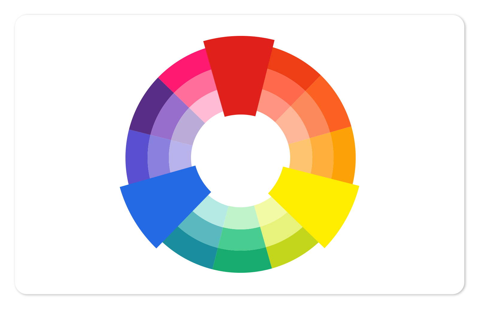
In the traditional color wheel, there are three primary colors from which all other colors are derived: red, blue, and yellow. Because these colors are seen as core building blocks, they can be used together to communicate themes of simplicity, reliability, and strength.
Secondary colors in the RYB color model
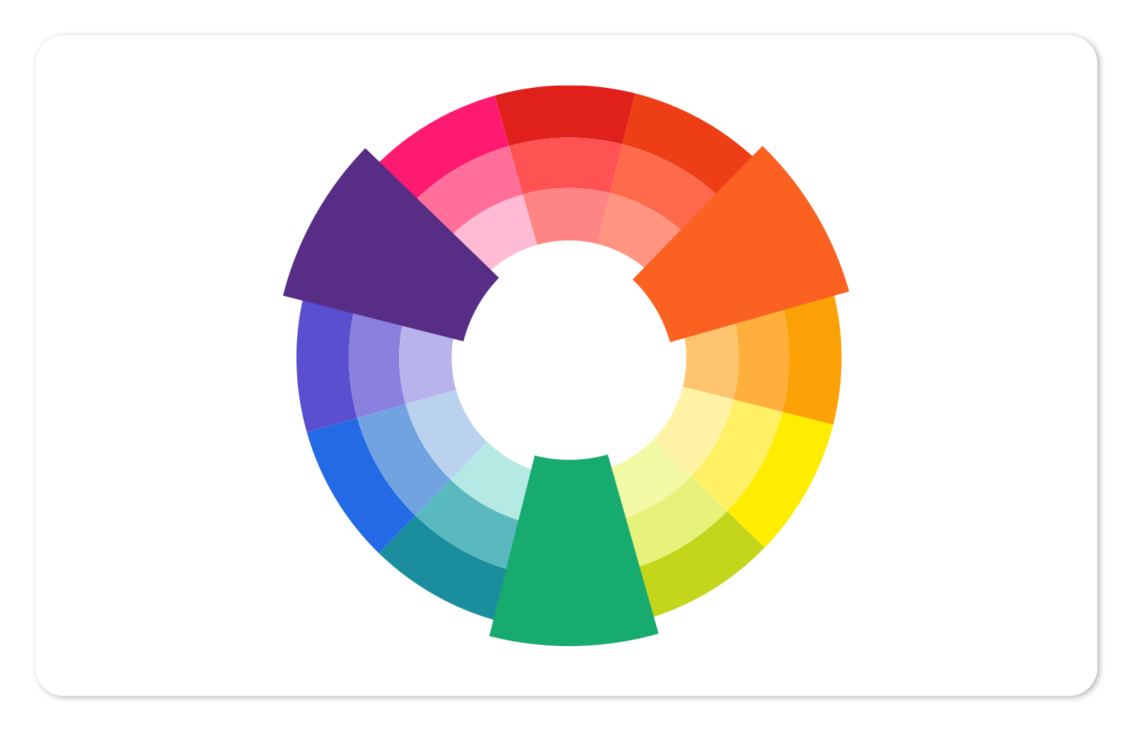
Mix two primary colors together and you have a secondary color. Secondary colors in this color model are orange, purple, and green.
Tertiary colors in the RYB color model
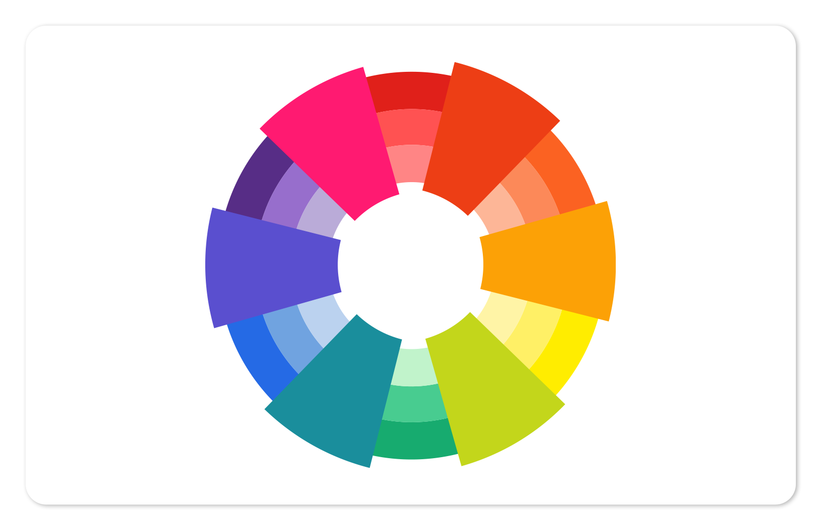
There are six tertiary colors that are formed from mixing a primary and a secondary color. Tertiary color schemes contain colors that are sometimes called "two-name," but they contain more of the primary color than the secondary color.
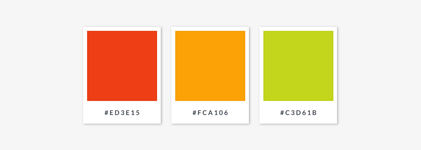
Some people refer to red-purple as magenta; red-orange as vermillion; blue-purple as violet; blue-green as teal; yellow-orange as amber; and yellow-green as chartreuse.
Using color harmony to guide your color choices
When choosing a color scheme one approach you can try is to choose colors that harmonize well, naturally. The idea of color harmony is that the combination you create is perfectly balanced with the right amount of contrast. The goal is to come up with a design that isn’t too bland but not too discordant either.
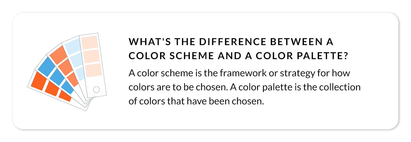
Choosing the best colors for your designs is all about what you want your colors to say. Take color symbolism into account. On top of working better with some colors than others, each color — no matter where it falls on the color wheel — carries its own meanings that extend across time and cultures.
Here's more on choosing appropriate color schemes. If you'd prefer instant inspiration, see our compilation of 100 unique color combinations.
How to choose analogous colors for your designs
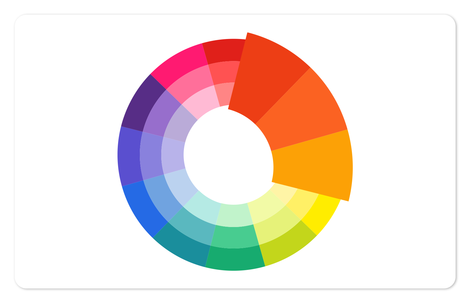
Analogous colors sit side by side on the color wheel. Using these colors together creates a soothing, serene feeling because the colors naturally match. Think of fall leaves: a rush of reds, oranges and yellows. To avoid putting your viewer to sleep, though, you can use black, white, or gray for contrast, or add a complementary color to your scheme.

How to choose complementary colors

Another path to harmony is to combine complementary colors, which are located directly opposite each other on the wheel (purple and yellow, for example). These color combinations have the maximum amount of contrast, yielding an exciting, vibrant design. Just be careful not to overuse this method, or else your design might be too grating.

How to choose a triadic color scheme for your designs
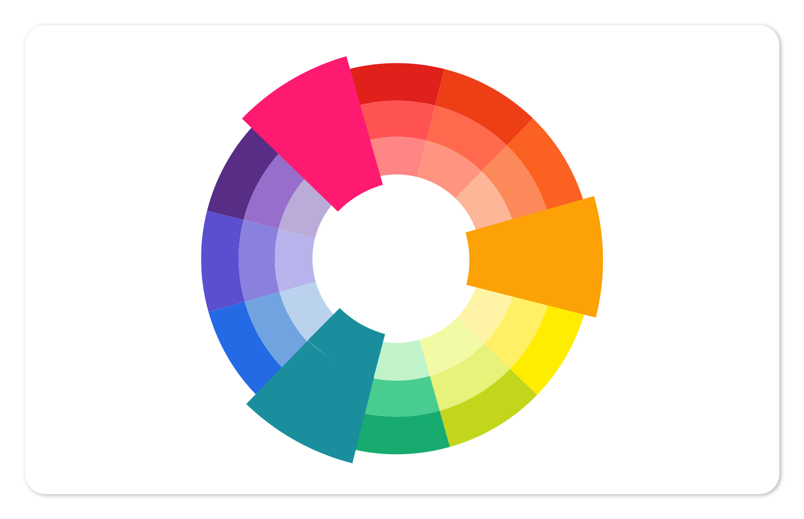
Triadic color schemes are made of three colors spaced evenly from each other, forming a triangle on the color wheel. It's important, with triadic color schemes, to choose one color to be the lead color and let the other two function as supporting players. This keeps the design from being too frenetic, and helps create pathways for directing attention where you want it.

Working with a split complementary color scheme
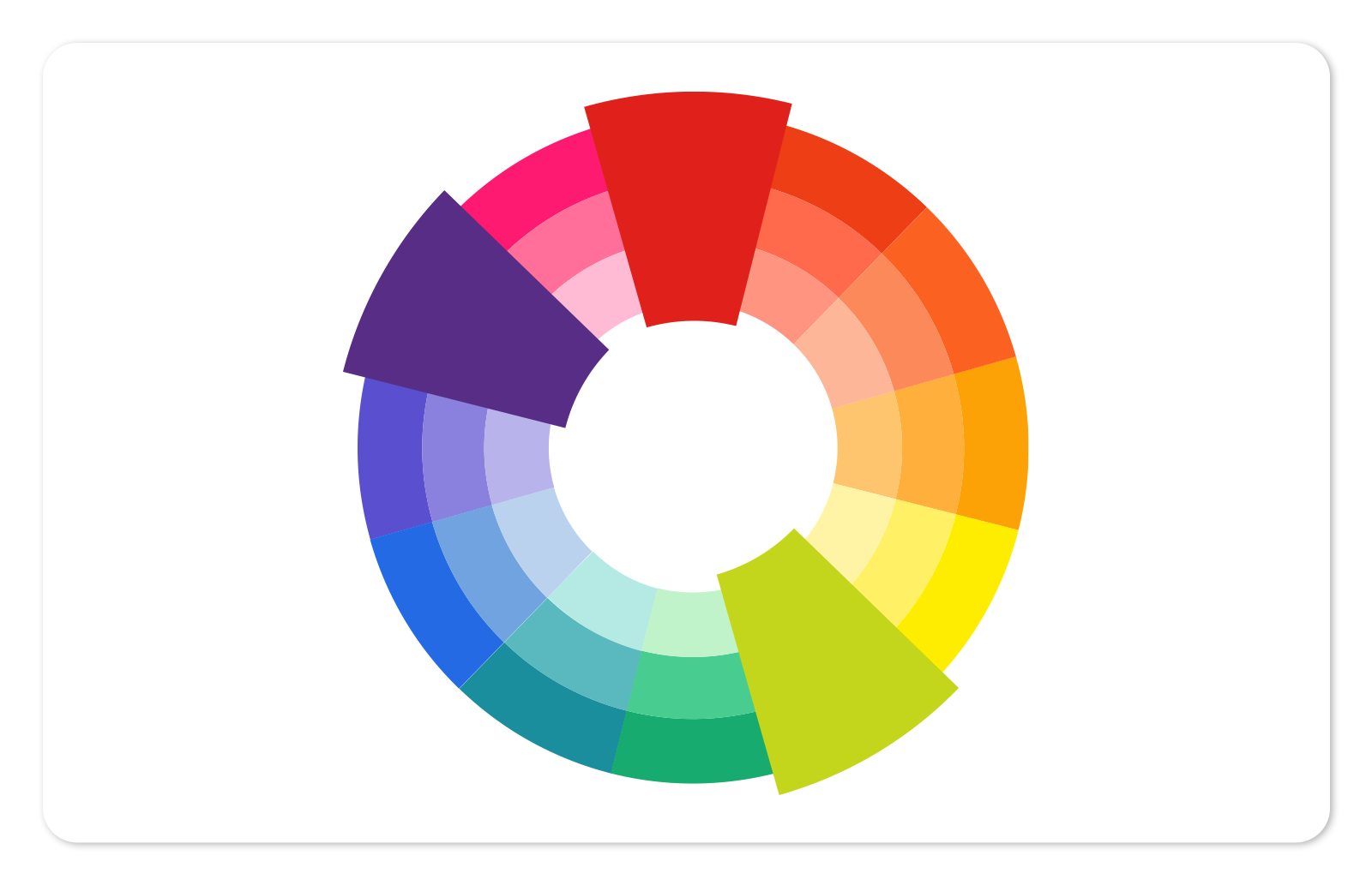
The split complementary color scheme is a winner for beginning designers because it's hard to get wrong. Begin with one color, and look across the color wheel for its direct complement — instead of choosing that color, pick two analogous colors on either side of it. So, for example, if your first color is yellow-green (AKA: chartreuse), look across to red-violet, but choose violet and red as your second and third colors.
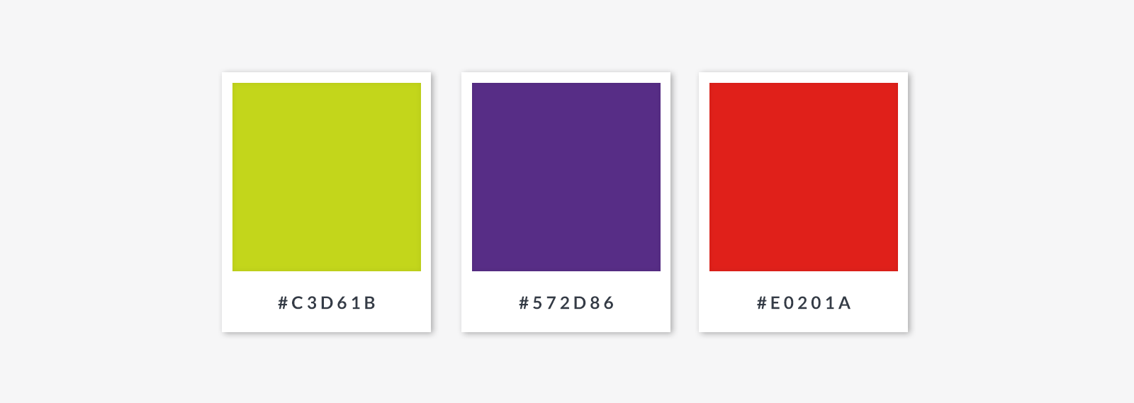
You don't need to choose analogous colors that are only one tick apart from the direct complement; as long as they are the same distance away from the direct complement, it works.
Choosing a tetradic color scheme for your designs
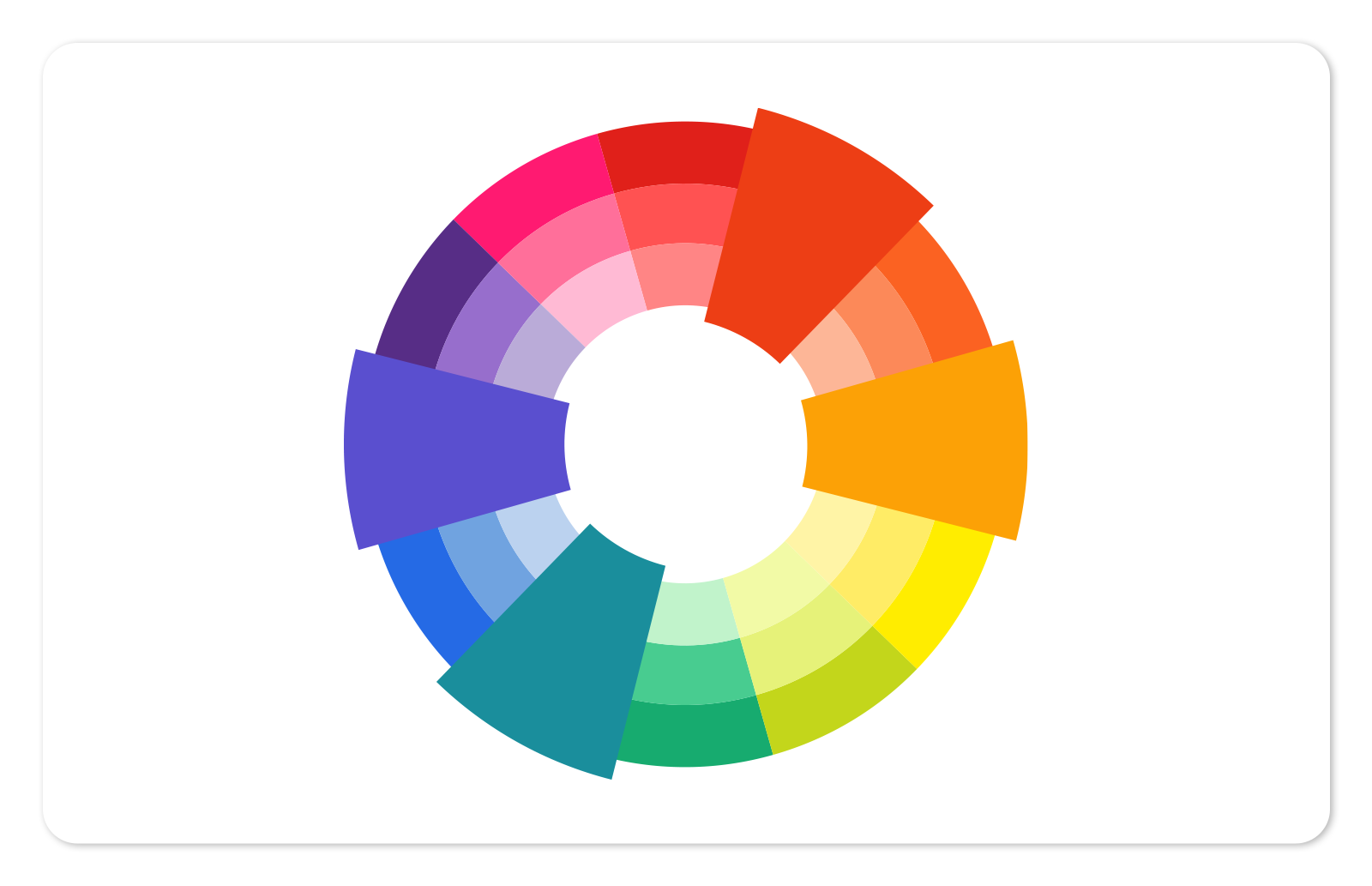
If your color scheme involves four colors, it's tetradic (the prefix "tetra" means "four"). For a rectangular tetradic (also called "double complementary") color scheme, choose two complementary pairs. Because the pairs are opposite one another on the color wheel, they provide nice contrast, but you'll want to monitor the balance between warm and cool colors. You can do that by choosing whether to emphasize warmth or coolness, and then just use the opposite colors more sparingly.
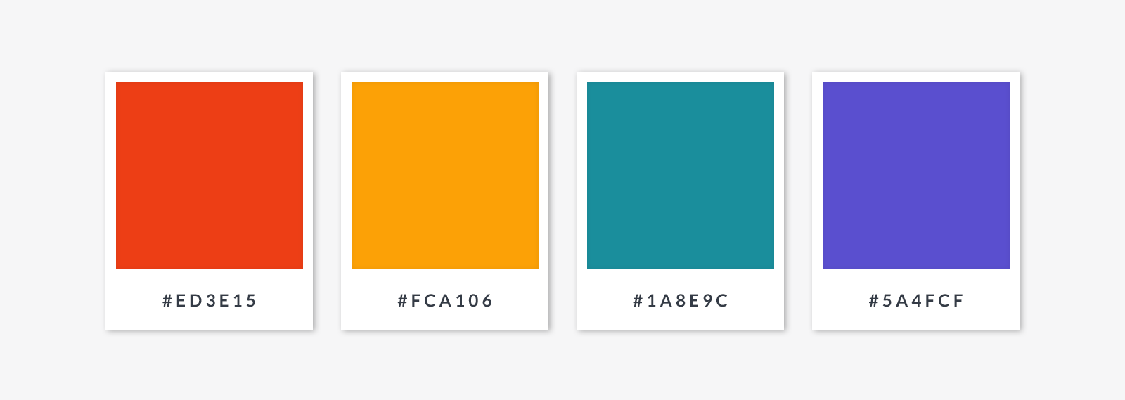
Choosing a square tetradic color scheme
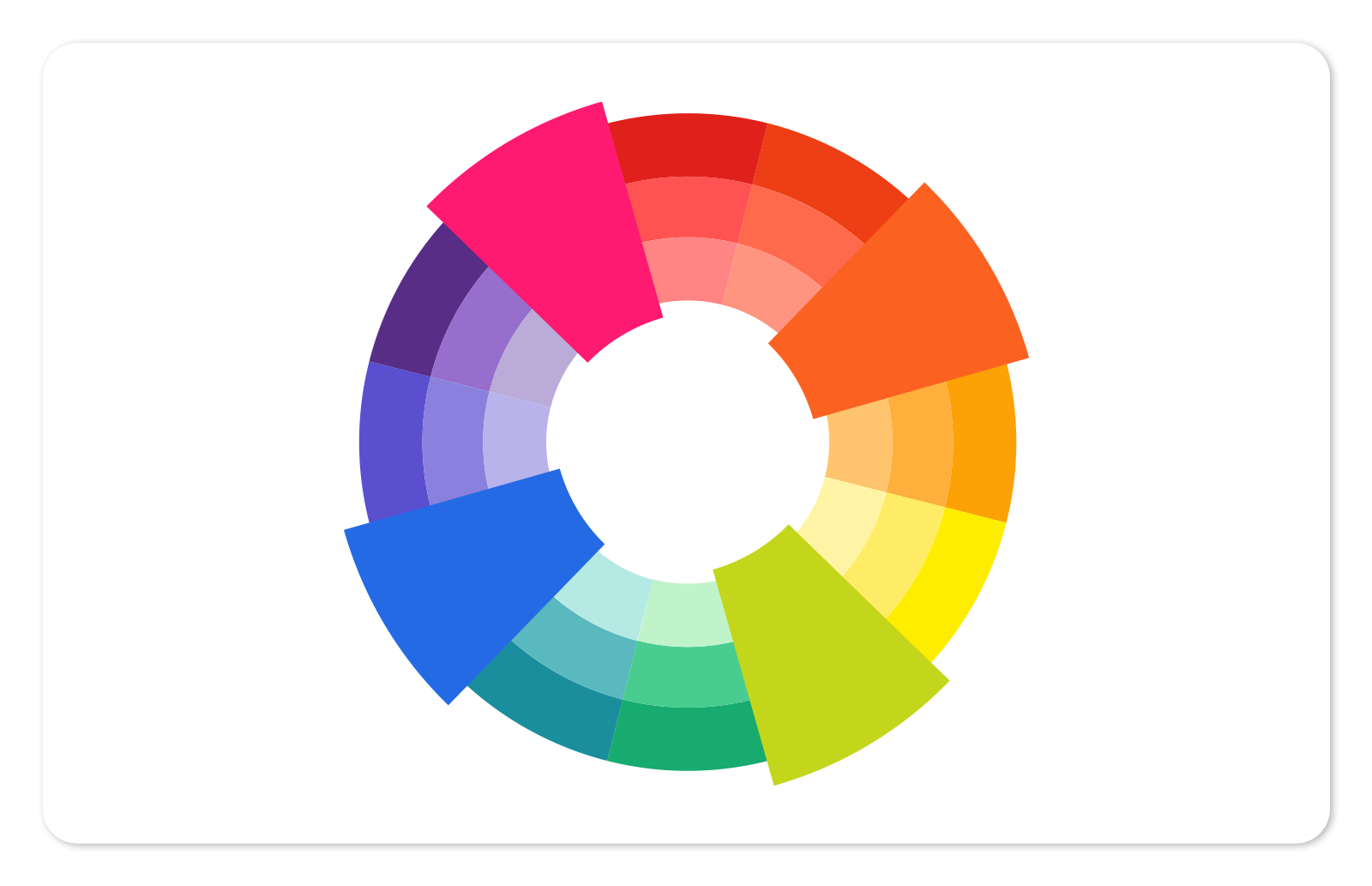
A similar but slightly different approach is the square color scheme; each color is evenly spaced around the color circle, so there is equal tension between all of the colors. In your design, you can pick one of them to be dominant and use the others as accents.
How to choose colors by tonal range
The color wheel, as we've portrayed it here, shows pure hues on the outside of the wheel. Pure hues are the most saturated version of a color — they're brilliant, intense colors, all with similar values. To use only pure hues in a design could jump on your viewer's last nerve. Instead, you can make liberal use of the tints, shades, and tones of those hues.
What are tints, shades, and tones?
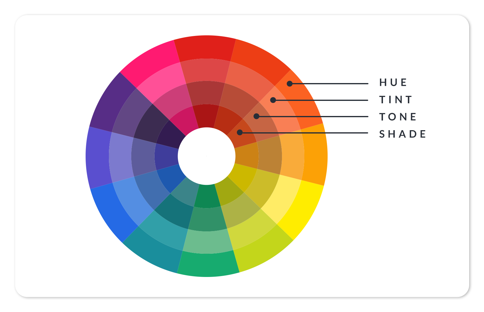
Tints, shades, and tones are variations on a hue, created by combining a pure hue with black, white, or both.
Add white to a hue, and you get a tint, which is less intense and less saturated. These are also called pastels (see below).
Add black to a hue, and you'll create a shade, which is a darker, richer, more intense color.
Add black and white (gray) to create a tone of that hue.
Designing with mid-tone colors
Mid-tone colors are midway between light and dark. Although you can create a muted color scheme entirely based on mid-tones, you can also choose a color palette that focuses on mid-tones with a single, saturated hue as an accent color. Or you may want to pull other design levers like size, movement, or shape to bring focus to an otherwise subdued design.
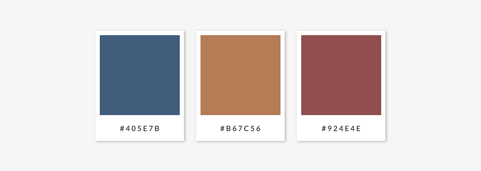

Mid-tones can offer an elegant look, not too loud and not too quiet. They make for great fall and winter colors, especially if you're aiming for a delicate holiday design that forgoes the vibrancy of traditional Halloween orange and black, or the similarly vibrant red associated with Santa.
Choosing pastel colors
Also called "tints," these colors are pale versions of saturated hues. Pastel colors are a cultural touchstone that reappear every few decades (50's kitchens, 80's Miami Vice episodes, 2000's Wes Anderson films) and invoke soothing, light-hearted vibes. Because pastels are made from all the primary, secondary, and tertiary colors, you can combine them using analogous, complementary, split complementary, etc, color schemes, or add a bit of gravitas with a richer accent color.
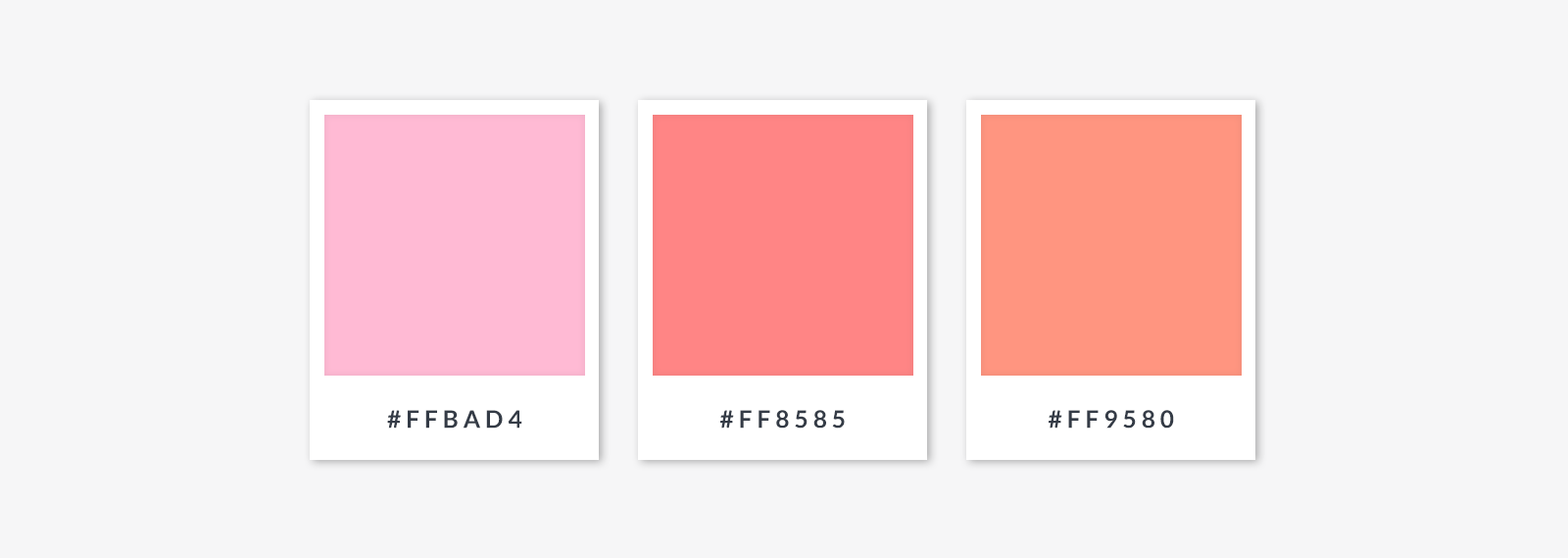
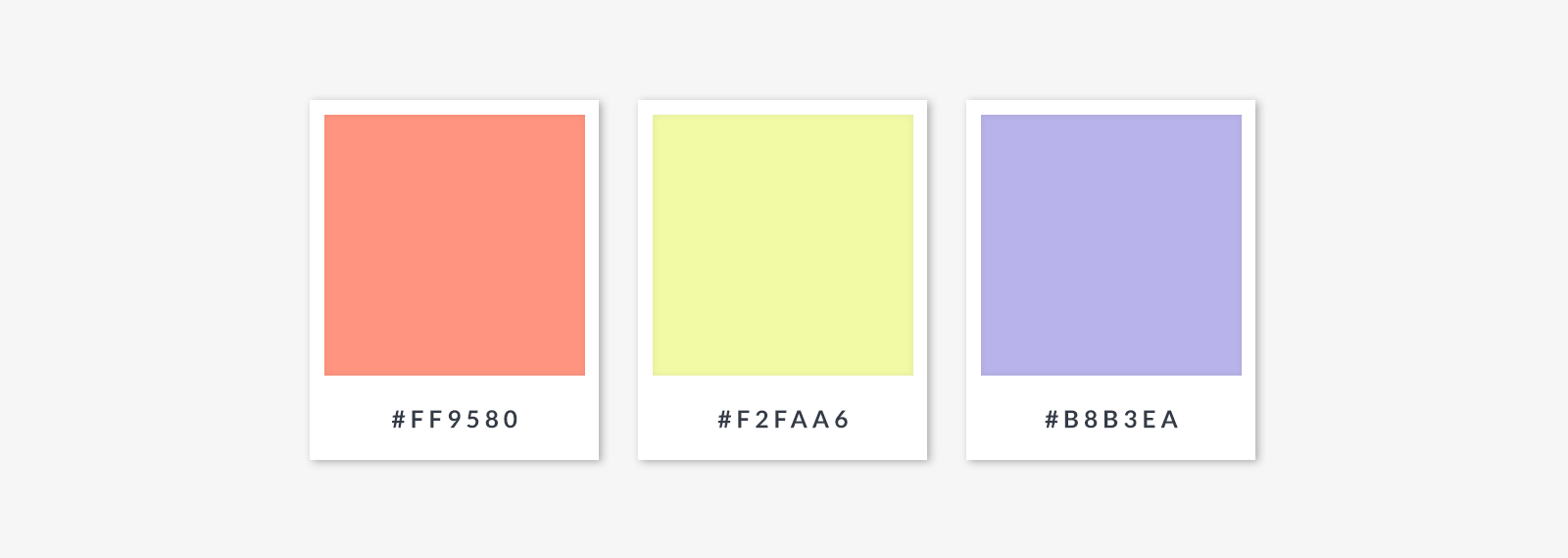
Learn (and see) more in our guide to using pastel colors.
Choosing neutral colors
Also called "achromatic," neutrals are colors that lack a strong hue. The most common neutrals are gray, black, white, brown, tan, and off-white. Just like mid-tones, neutral colors combine nicely with a bright accent color, or work together to create a muted color scheme. Some neutrals can take on aspects of the colors they are situated next to, so bear that in mind.
How to choose warm colors and cool colors
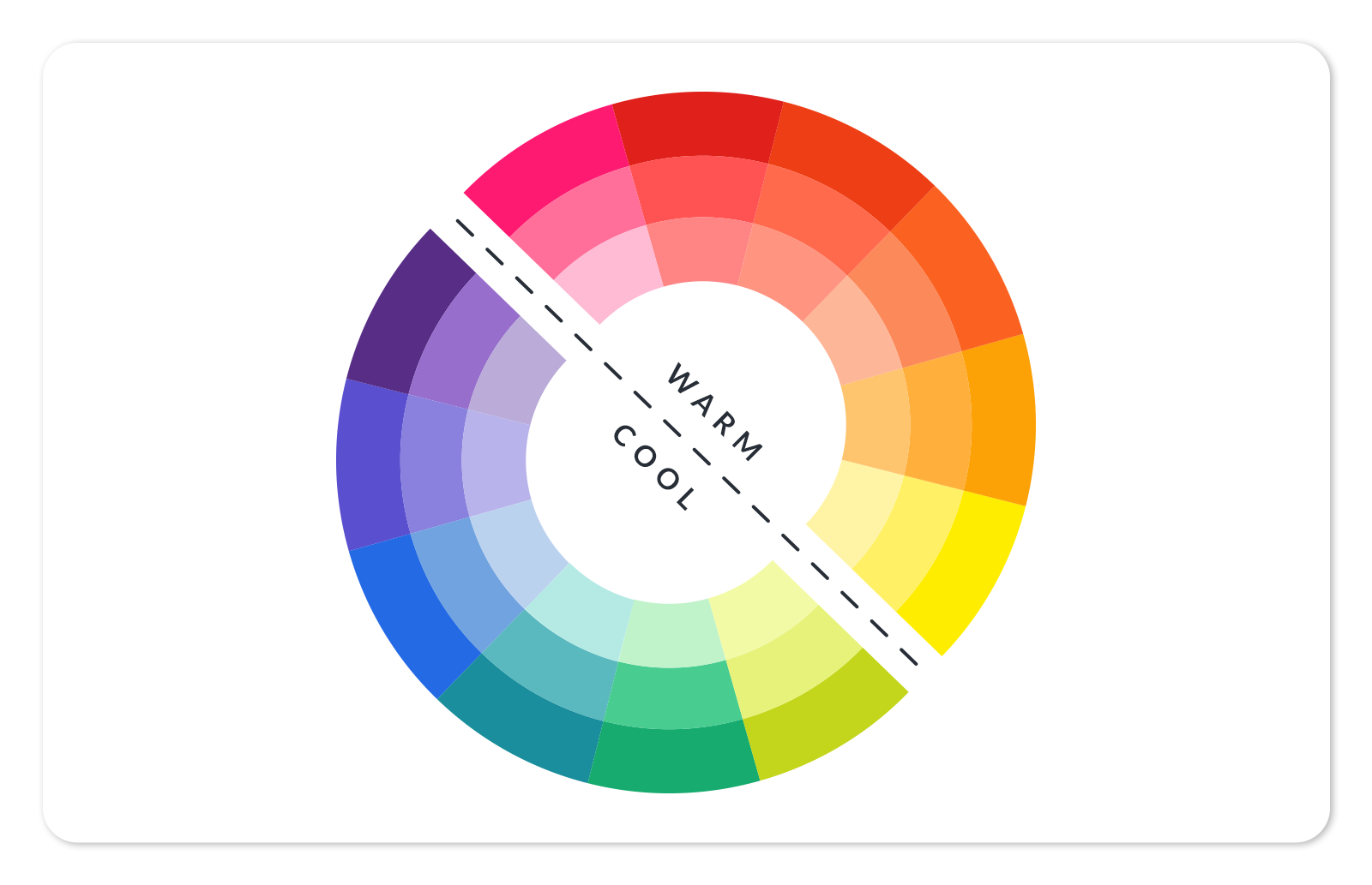
If you bisect the color wheel with a line down the middle, you’ll have warm colors (red through yellow) on one side, and cool colors (blue-green to blue-violet) on the other. This basic grouping is often associated with the natural world, with "warm" colors reflecting daylight or sunset, and "cool" colors reflecting water and sky. There's some disagreement about the exact division between warm and cool colors, when it comes to greens. Some color wheels will show both a warm green and a cool green. Makes sense!
Designing with warm colors
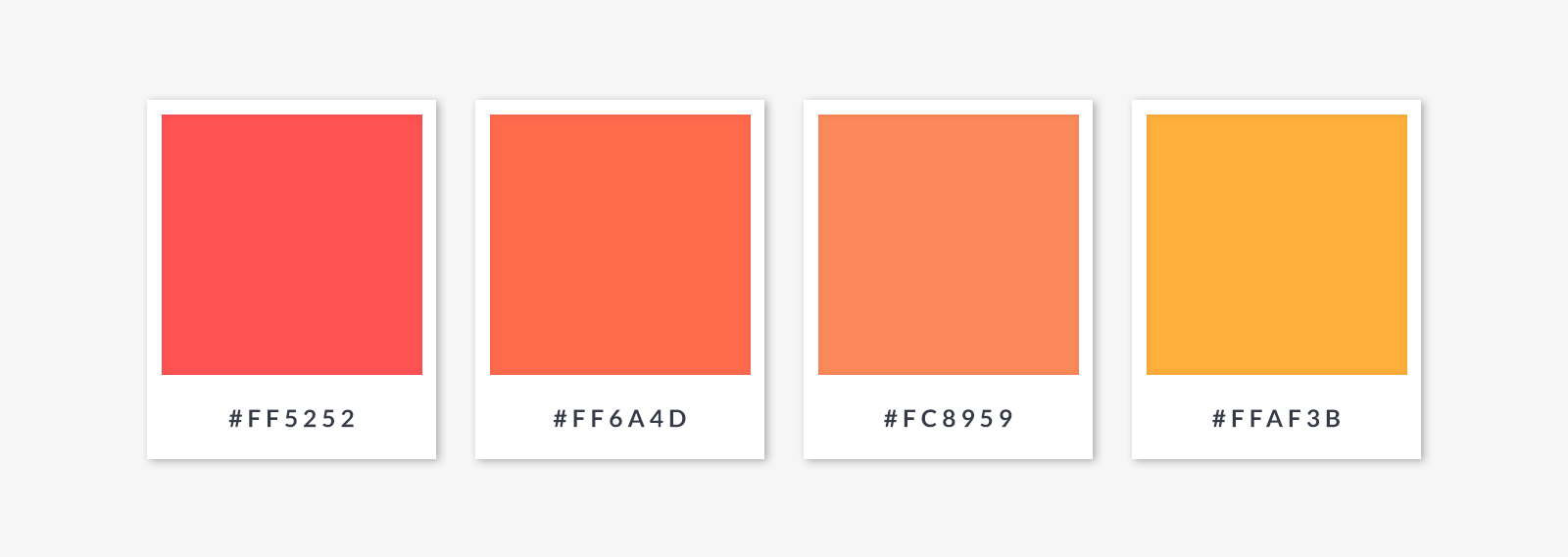
Warm colors appear to "advance" in a design, which means they appear longer, larger, and appear closer to the viewer. To create contrast, you can combine a bright, warm color with a complementary color, which will be a cool one. Warm colors are thought to invoke feelings of excitement, energy, and passion.
Designing with cool colors
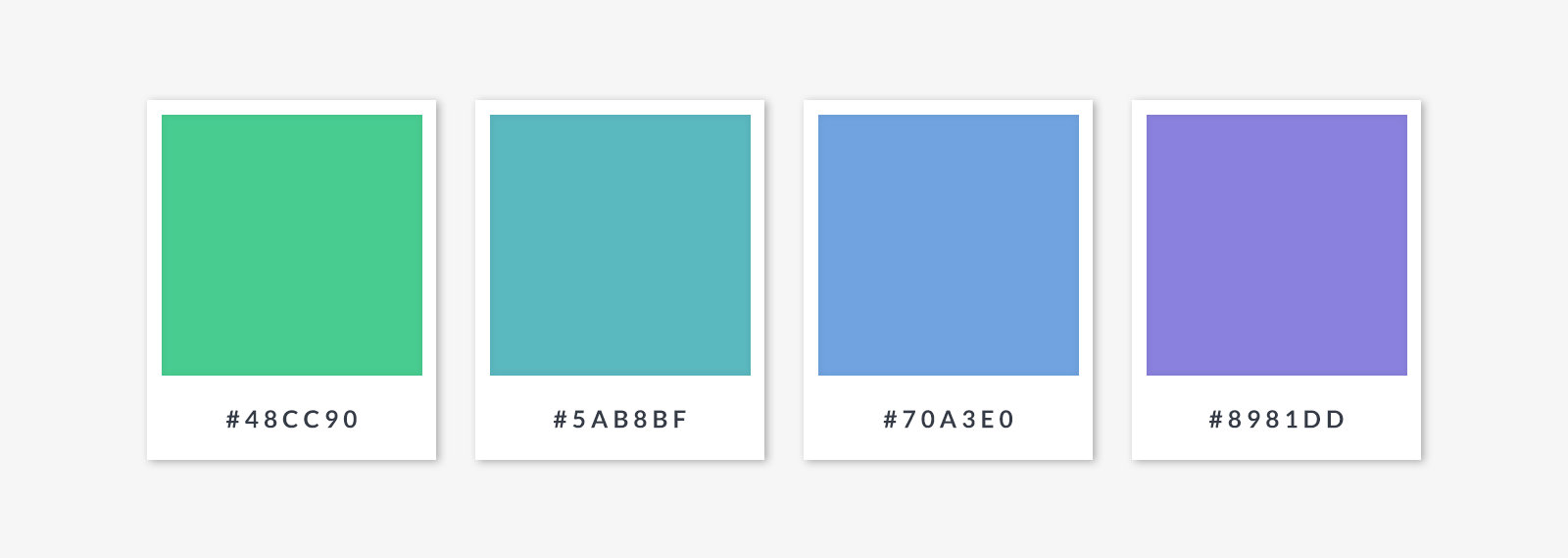
Cool colors create feelings of calmness and trustworthiness. They are often seen as "receding" — they make things seem further away. To create contrast, you can combine a cool color with a complementary color, which is by necessity a warm one.
Creating a monochromatic color scheme
A monochromatic color scheme is based on a single hue, with variations made by changing its saturation. Sometimes referred to as "tone-on-tone," designs with this color scheme can be seen as either a) elegantly simple or b) a dramatic statement piece, or both. As with other color schemes, monochromatic shades of a single hue look nice with a pop of contrasting color here and there. It becomes especially important to lean into other elements of design to provide contrast and focal points.
Final thoughts: Are black and white colors?

There's a debate about this, but in respect to design, we vote "yes." Britannica provides a science-heavy explanation — the short version is that black and white are not on the visible spectrum of light waves so do not count as physical colors.
Still, we know how important the two are. They convey mood just as much as other colors and when used effectively, can create striking contrasts in your designs.
Even though they might not be colors on a technical level, white is a combination of all hues, and you can combine red, blue, and yellow to get black — so we'll roll with that.
Now that you've got color theory in your back pocket, learn how to specify colors you've chosen using hex codes, complementary color pickers, and more. Or you can get your colors from a color palette generator that derives colors from a photo.
Do you want to feel allllll your color feels before choosing a few? Then click your merry way through the kajillion colors in our color pages — it's like a disco party thrown by a rainbow, inside a kaleidoscope. Speaking of — gradient colors, anyone?
