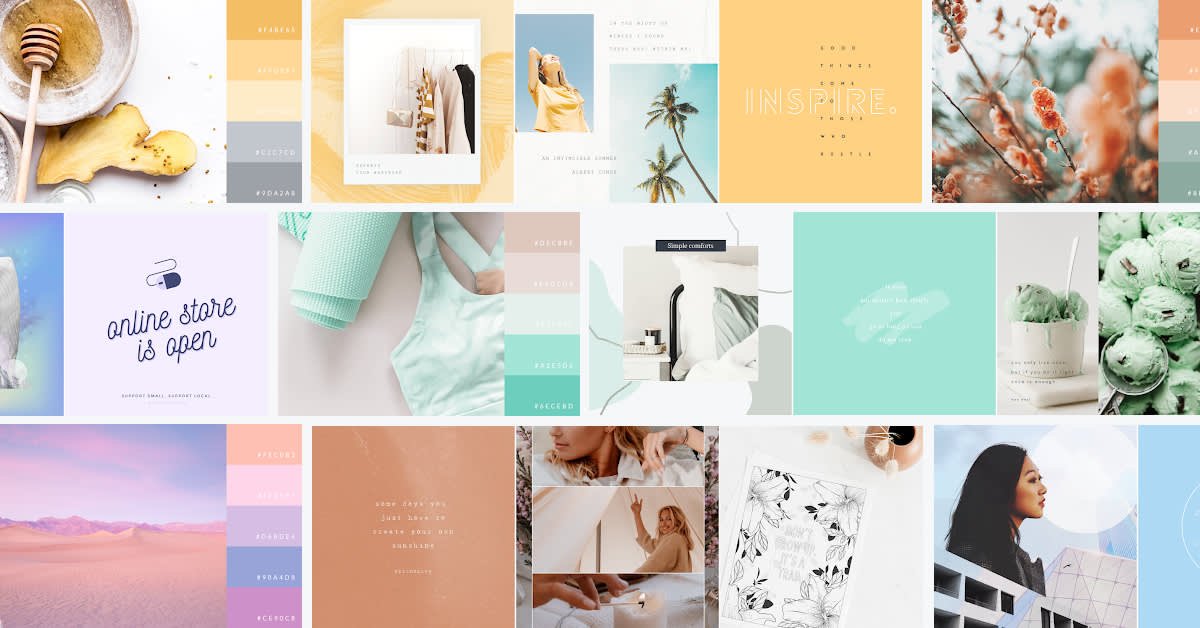
Color theorists, unite! It’s time to make the case for pastel colors (and, spoiler alert: it’s a strong one). However, you don’t need to be a color theory aficionado to appreciate pastel colors and their place in the design world. It’s true, pastel colors are often associated with Easter or gender reveal parties, but their usefulness stretches far beyond painted eggs and balloons full of softly colored confetti. Let’s review what pastels are and why you should use them, then we’ll leave you with a bunch of quality examples of pastel colors at play.
What are pastel colors?
The easiest way to distinguish pastels from other colors is by thinking of them as “paler” tones of existing colors. If you really wanna jump down the color palette rabbit hole and get techy with it, pastel colors have a high HSV value and low saturation.
It’s common to hear pastel colors described as being “washed out.” This is because they’re created by taking existing colors and throwing a whole lotta white into the mix. The greater the white, the paler your finishing tone. Common pastels include baby blue, pink, mint, peach, mauve, and yellow.
Why should I use pastel colors?
It’s no secret that effective color usage lets you speak directly to your audience. Different colors elicit different feelings and emotions. Understand these, and you’ll have a better idea of what types of colors to use in your designs.
Since pastels offer warmth and softness, it makes perfect sense why they show up during springtime. The severity of winter has passed, making way for hope and new beginnings. And with their lessened saturation, pastel colors lend themselves well to creating calm and soothing summertime vibes.
Blue pastel colors
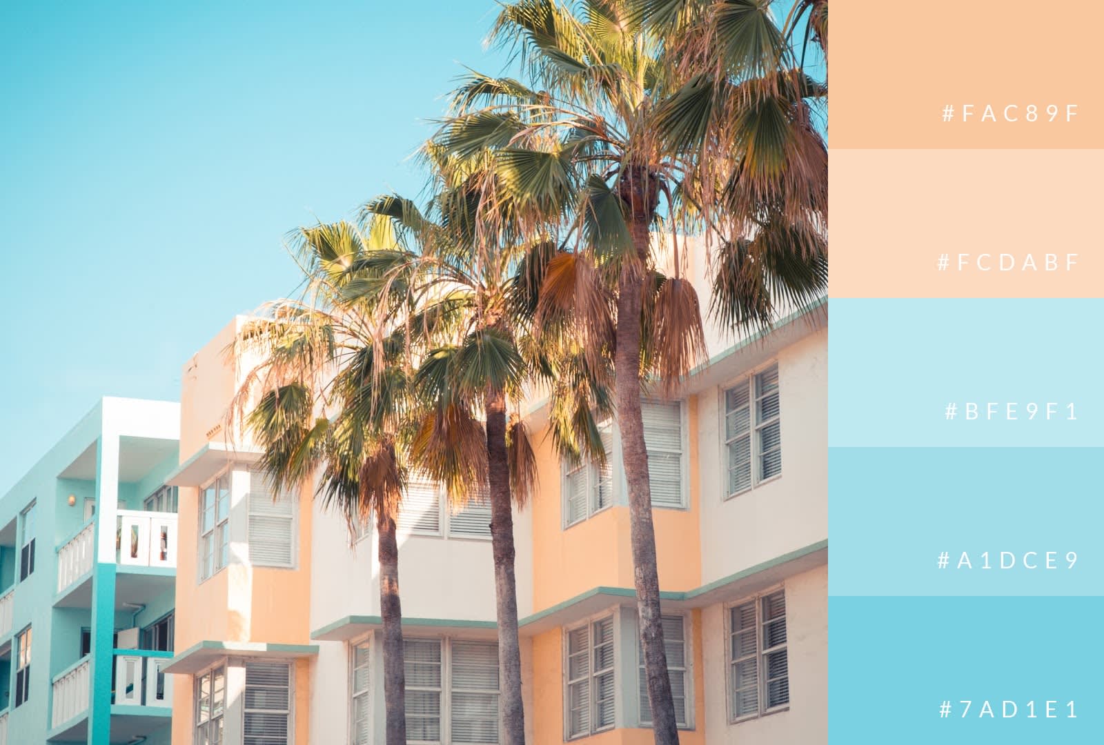
There’s something serene about pastel blue of any shade, which is why it’s a popular choice in the spring and summer seasons. Important, too, is to pair pastels with complementary colors, like in the image above, where shades of blue play with both white and peach tones. This is great, because any sort of coldness that might come from the blue is rescinded thanks to the refreshing white and warm peach. Together, these colors could create a summertime look in Siberia during the winter if they really wanted to.

Browse more pastel blue design templates
Since blue is all about calmness and serenity, it works well with a variety of designs. As we mentioned, it plays with white like a lifelong friend. It’s a powerful color for branding, especially when you want something delicate and welcoming. And don’t discount using a light blue with more vibrant colors to draw in your audience, like in the “When were crayons created?” pop quiz example.
Pink pastel colors
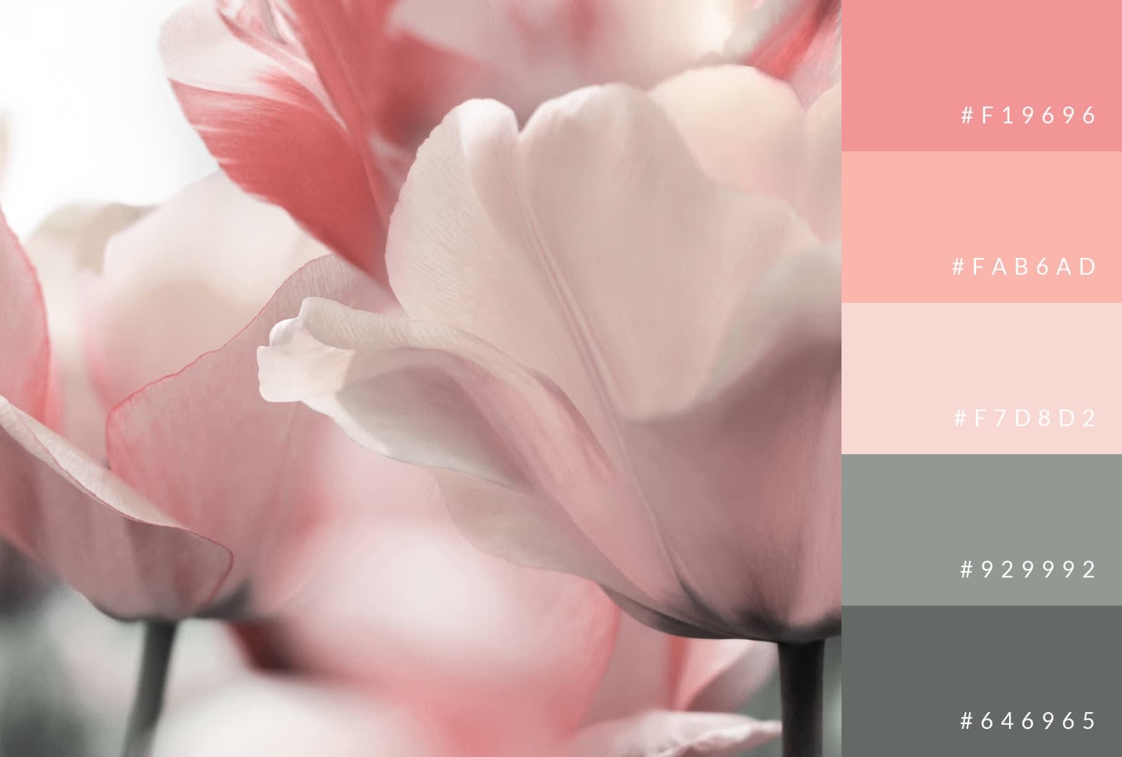
Pink is a romantic color, and its pastel variants are no different. Its dominance in the world of floral arrangements has helped etch this romantic narrative into stone. Not a bad narrative to have, either. Pinks elicit love, happiness, togetherness—all feelings that have a place in our lives every day.

Browse more pastel pink design templates
For brands, there are plenty of creative ways to use pink. A super light pink paired with solid white creates a refined and minimalistic look. You can also opt for total contrast. We see this in the Luma Blue design, where a much deeper shade of pink (almost peach-like) plays off black and white, resulting in an incredibly elegant visual. Like baby blue, pink works well for announcements and other interactions with your audience, where the goal is to disseminate information and encourage action in the most welcoming way possible.
Mint pastel colors
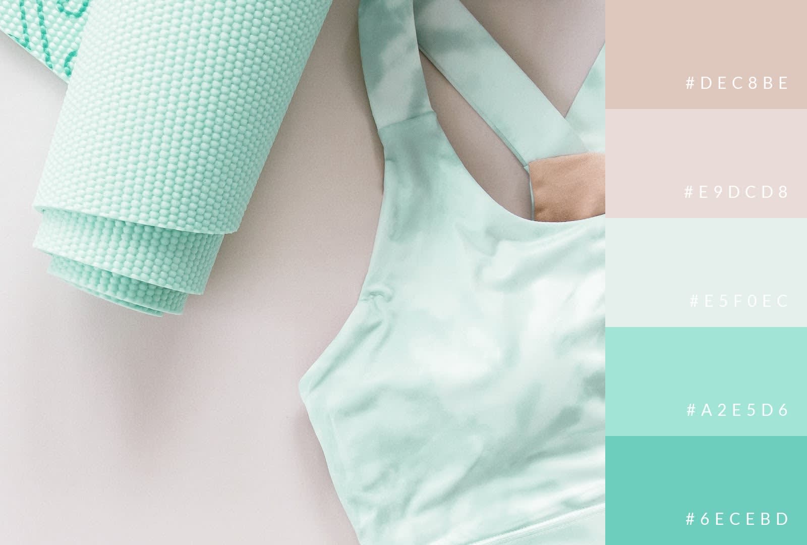
You don’t have to like mint chocolate chip ice cream to appreciate the color mint’s use in designs (although, are there really people in the world who don’t like that flavor?). In many ways, a minty color mimics the real-life purposes of the plant itself. We use mint as a complemental ingredient in cooking, same as we use minty colors to complement designs. Mint is also used as a refreshing component in some toothpastes, just like the color adds a clean and refreshing look to images.

Browse more pastel green design templates
You have plenty of options when incorporating mint into your design. Use it for striking contrast against more neutral colors. Experiment with a light tone of mint set against a darker one. Or take advantage of literal mint usage, as seen in the mint chocolate chip ice cream design. Given that ice cream is already perceived as a refreshing product, the minty color just adds to the idea.
Peach pastel colors
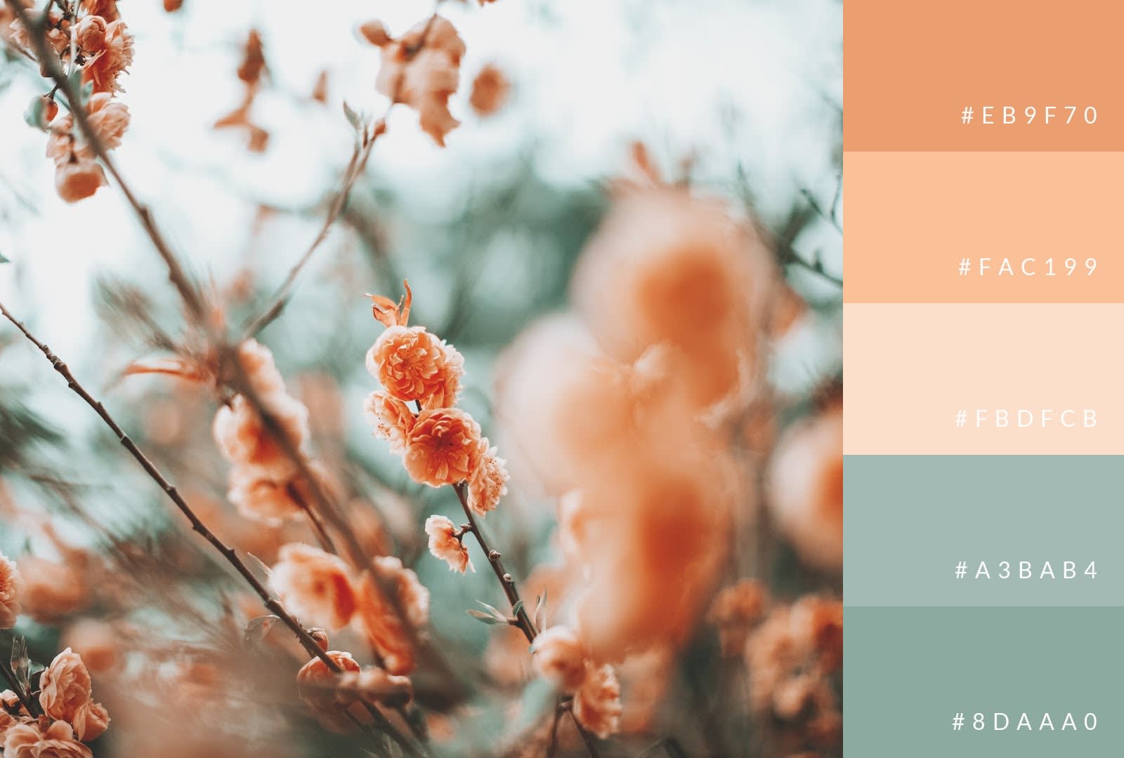
Peach is another springtime favorite. The color is linked to friendship, warmth, and joy (though perhaps not as loud as its orange sibling). Peach blends particularly well with blue, but also plays nicely with other dark colors as seen above.

Browse more pastel orange design templates
Peach can be used as a background, but it works even better as an accent, adding a subtle and refined touch to a design that’s heavy with contrasting colors.
Purple pastel colors
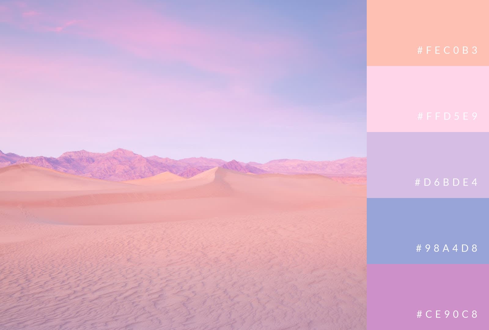
Purple is an exceptionally powerful hue, offering a smorgasbord of shades. Considering its connection to the sky, it works very well in landscapes, adding touches of mystery and intrigue. Its classic (non-pastel) color symbolizes royalty, power, and ambition. Keep in mind, though — half of all purple is blue, so you can use its pastel varieties to develop a calm and soothing look.

Browse more pastel purple design templates
A darker pastel purple functions well as a background. A lighter purple works too, just be sure to contrast your colors appropriately like in the “online store is open” example. Our favorite use of pastel purple is in the middle design, where subtle shades have been peppered in with other pastel colors and a rich blue to create an image that is both provocative and mystical.
Yellow pastel colors
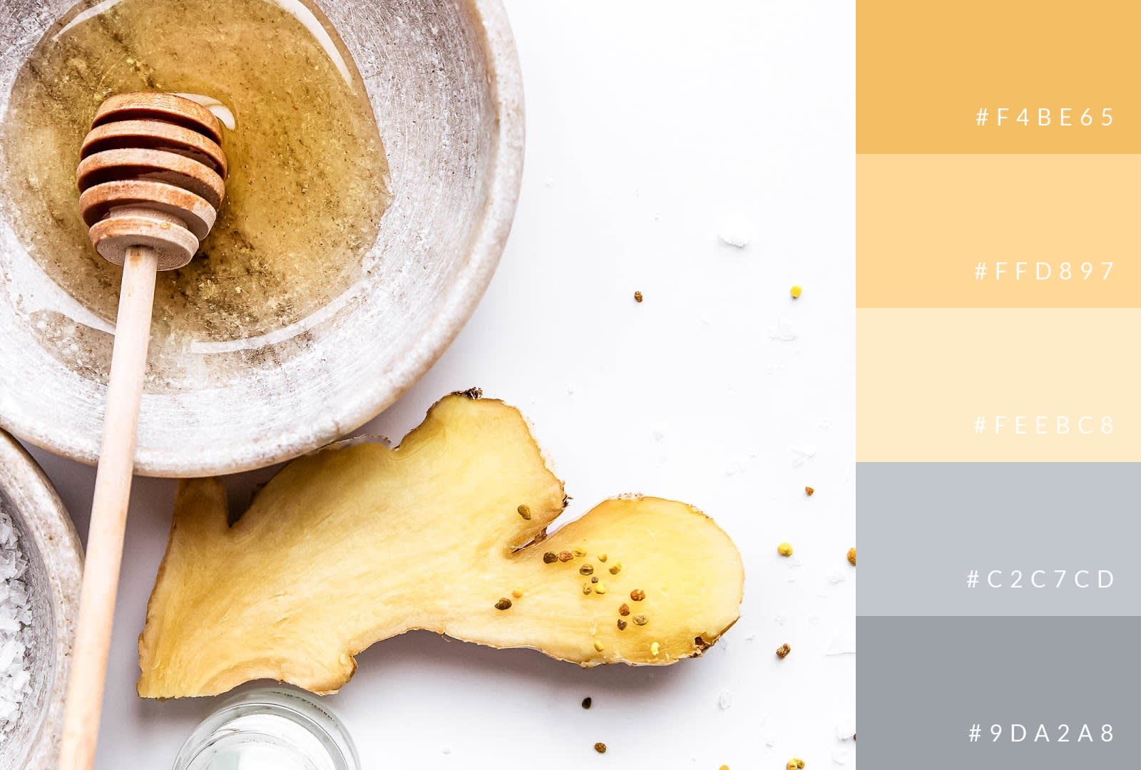
And then there was one. There’s no denying the happiness and joy that travel with the color yellow in any form. Its variations also create luscious imagery, such as with the design above. Yellow can stand on its own or work as an accent color. In our bowl of honey’s case, yellow’s varied tones separate it from an otherwise neutral color pattern.

Browse more pastel yellow design templates
If you’re looking to create something with a summertime feel, yellow should be somewhere in your final palette. Use it as a background to another image like in our first example, or capture the sunshine with yellow as an accent to other friendly colors like blue and white. Pastel yellow also has the benefit of being able to pair with black and not immediately make your audience think of bumblebees.
5 Design tips for using pastel colors
You’re almost ready to go forth and prosper with pastel colors, but we’d be remiss to not leave you with a few pastel design tips.
1. Choose colors that complement your brand
Your brand is your law, so no matter what colors you use, make sure they complement your brand. Don’t force pastel colors just because you want to use them. They’re lighter in tone by default. It’s kind of like what we’ve gotten with Marvel and DC films over the past decade. If you took the tone of Justice League and tried to insert it straight into The Avengers, it wouldn’t work. Same goes for colors — if you think pastel colors match your brand, then use’em up! If you don’t, then...don’t. Just getting started with your brand? Check out our post on how to create a brand board.
2. Embrace the phrase “less is more”
Fun fact: “less is more” was actually popularized by a German architect named Ludwig Mies van der Rohe in describing his aesthetic. Turns out the phrase works in pretty much every facet of life. We’re not saying you have to channel minimalism into every one of your designs, but sometimes soft is way better than loud. You be the judge. If you’re stuck in the mud with which way to go, look back at some of the designs we covered, and notice how they effectively employ minimal pastel colors.
3. Experiment with applications for pastels
Pastel colors are everywhere. Just like you might A/B test product advertisements, why not experiment with how you use pastels? See what works, see what doesn’t. Familiarize yourself with color theory and, when you’re ready to choose your colors, ask yourself: What do I want my audience to feel when they look at this image? Your answer will dictate the colors you choose.
4. Avoid pastel clichés
Pastels are popular and gorgeous looking, but you want to be careful about how you use them. Way back at the start of this post, we mentioned pastels’ relation to Easter and all things babies. With this in mind, make sure you choose your pastel palette with intention and don’t accidentally create color combinations that will immediately make people think of something they’ve seen again and again. It’s like if we woke up one day and said, “You know what? We’re going to rebrand as McMonkey and blatantly steal McDonald’s logo.” Obvious legal issues aside, it wouldn’t work because every time anyone saw the golden arches, they’d think McDonald’s. Just like when people see a light blue/pink combo and think babies.
5. Pair pastels with other colors
We showcased this a lot in our examples. Pastels work beautifully with other colors, especially darker and/or more vibrant tones that create stark contrasts. When you contrast colors effectively, you emphasize the focal point of your design, but can also create real visual interest. In other words, striking contrast will turn heads fast.
