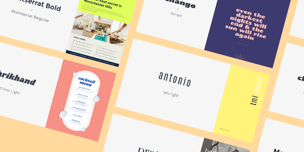
If font pairings have long felt like the Kobayashi Maru test, then you’ve come to the right place. Having the right font pairs are a mega important element of any stunning design, and they don’t have to feel like a no-win situation — quite the opposite. In this post, we’ll introduce you to the basic know-how behind font pairings and provide you with a treasure box full of font pairing examples for any occasion.
Font pairings at a glance
In addition to the slew of examples we’re gonna throw your way, be sure to read one of our other dynamite font-centric articles, How to Use Font Pairings Like a Pro, as it dives into the finer details of font meet-cutes. Until then, here are a few basic “What You Should Knows” before we jump into design inspo.
Fonts versus typeface
Before you can pair fonts like a pro, it's important to know the difference between fonts and typeface. Typeface refers to the particular lettering design. For example, the default typeface for Google docs is Arial, whereas for Microsoft Word is Calibri. Within those typeface styles, you can adjust the Arial or Calibri font to 12-point italic, bold, underline, etc. In other words, the font characteristics are changeable within the typeface style.
Contrasting font pairs
Understanding font versus typeface is helpful when choosing contrasting font pairs. Just like contrasting colors, there is a place for contrasting fonts in design. You can technically contrast the typeface as well as the font — that is — the design style as well as the sizes, widths, spacing, and other font characteristics. Some examples of contrasting font pairs include:
Vidaloka + Roboto (Serif and Sans Serif typeface)
Oswald + Raleway (Sans Serif typefaces)
Playfair Display + Cormorant (Serif typefaces)
As you can see, contrasting fonts can exist within the same typeface family. So, whether you're making menus, birthday party invites, or planning a professional event, having contrasting fonts can diversify the design and prompt intrigue.
That said, just like you probably wouldn’t put cinnamon and dill together, certain fonts don’t mix. Matching fonts can be a bit of trial and error, but there are also a few ways to guarantee a stronger match. For example, while contrasting font pairs do exist among the same family, serif and sans serif do also balance each other out. Using fonts within the same category can prompt a refined visual.
And keep this in mind: More fonts typically don’t make for a better design. Two and you’re golden, three and you’re still in the safe zone. Adopt four or more fonts into your design, though, and things are going to start looking zany. Now that you've got the basics down, let's orient you to PicMonkey's text tools.
You'll notice in PicMonkey’s text tool that you have access to six main font types — or font families. These are:
Serif: Fonts in this category have either a footer or minor flourish. They’re perfect for a distinguished look.
Sans Serif: Sans = without, so no footer or flourish. These fonts offer a clean and modern look.
Handwriting: As their name suggests, handwriting fonts are designed to mimic one’s handwriting. Because of this, each variation is distinctly different.
Script: When you think of script fonts, let your mind wander to elegant or special occasions. They’re perfect for wedding or shower invitations.
Display: These fonts bring the show to showtime. They’re often big and bold, meant for grabbing attention.
Monospaced: Think of monospaced fonts as a nod to the typewriter days of old. Use one, and you can expect to create an old-school or classic feel with your text.
Now for those font pairing examples...
Font pairings for events
1. Wedding program
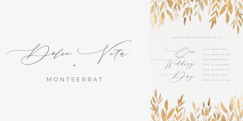
Customize a wedding invitation template with Dolce Vita + Montserrat
This wedding program is very much a case of “opposites attract.” Dolce Vita acts as an elegant headline font and, when paired with Montserrat (sans serif), the result is a modern and sophisticated final look.
For more on wedding invitation examples, check out: 10 Luxe Wedding Invitation Examples to Get a “Yes” from Guests.
2. Graduation invitation
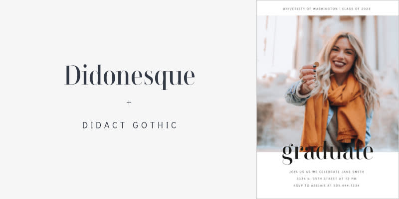
Customize a graduation invitation template with Didonesque + Didact Gothic
Part of any good font pairing is its readability, which is an A+ in this example. Didonesque, a large serif font, is bold and authoritative by design. Didact Gothic is a sans serif, both tall and slim, resulting in a balanced look.
3. Certificate
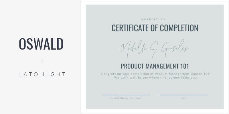
Customize a certificate template with Oswald + Lato Light
Oswald and Lato Light are meant to function as one. Together, they create a clean look, no matter the sizing of the Lato Light font.
4. Baby announcement

Customize a baby announcement template with Bombshell Pro + Gordita
Announcements are a perfect opportunity for fancy-fancy font pairs. Bombshell Pro, a bold script font, pairs nicely with Gordita (sans serif) to keep the design organized. For some extra fun, you can experiment with textures in the editor and achieve unique looks. This design’s Bombshell Pro font uses a glitter texture for added pop.
For more on using PicMonkey's top-notch textures, check out: Getting the Most Out of PicMonkey Photo Textures.
5. Wedding announcement
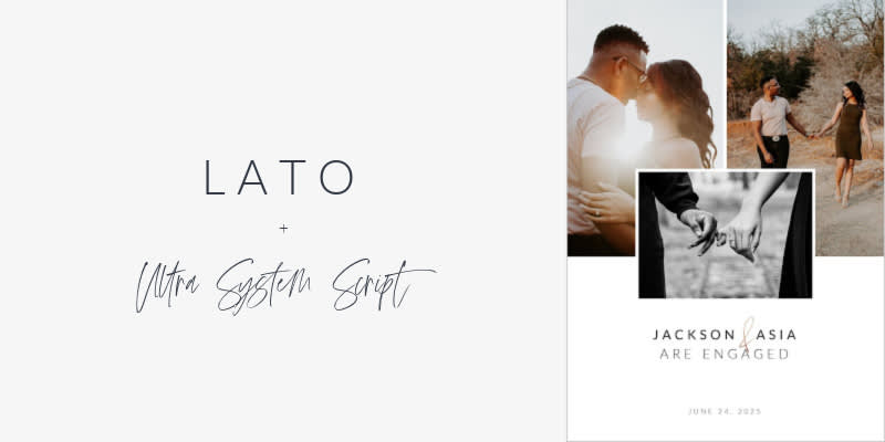
Customize a wedding announcement template with Lato + Ultra System Script
Similar situation here in terms of fancy font pairings. Lato and Ultra System Script combine for a modern look with a bit of personality, thanks to the script ampersand.
6. Birthday invitation
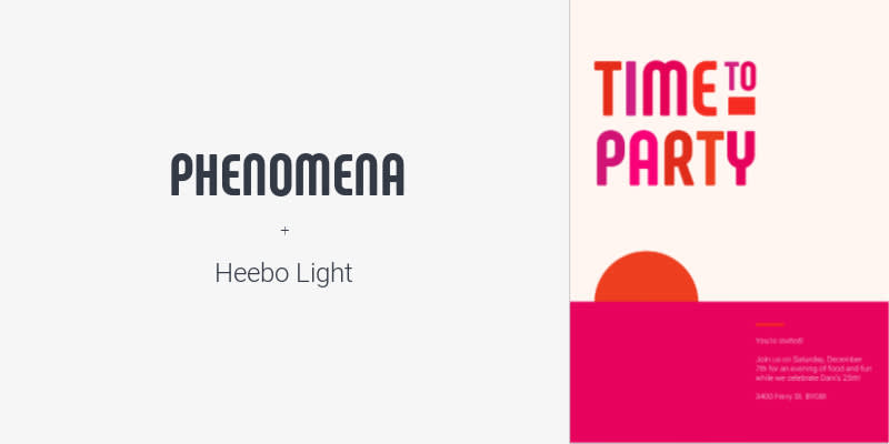
Customize a birthday invitation template with Phenomena + Heebo Light
Phenomena is a bold, attention-grabbing font choice. Pair its bodacious personality with something quieter like Heebo Light for quick distinction and easy reading.
For more on making standout birthday invite designs, check out: Birthday Invitation Ideas and Tips for Every Milestone.
Font pairings for business
7. Business card
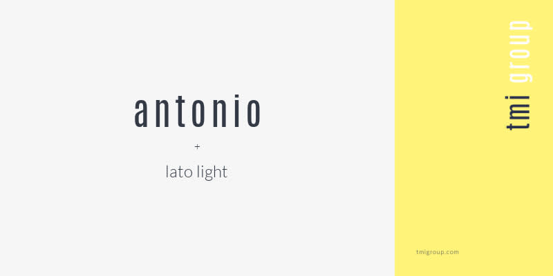
Customize a business card template with Antonio + Lato Light
Business cards are all about striking the right balance between captivating and professional. Antonio and Lato Light are both straightforward sans serif fonts, but if you play with sizing and density, you can easily create contrast.
For more on finessing business card designs, check out:
8. Resume

Customize a resume template with Rozha + Montserrat
Resume fonts can be tricky. You want text that’s pleasing to look at, but you also need to maintain consistency across the page. One answer? Rozha and Montserrat. The former serif font works great as a bold introduction to who you are (so, only use it for your name). The latter is easy on the eyes and, similarly, easy to read. It lends itself well to larger chunks of text.
9. Presentation
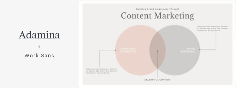
Customize a presentation template with Adamina + Work Sans
Opt for authoritative and easy-to-read font pairs when putting together professional presentations. Adamina and Work Sans accomplish this. Not only are they modern fonts, they combine for a distinguishable look in a design.
10. Real estate flyer
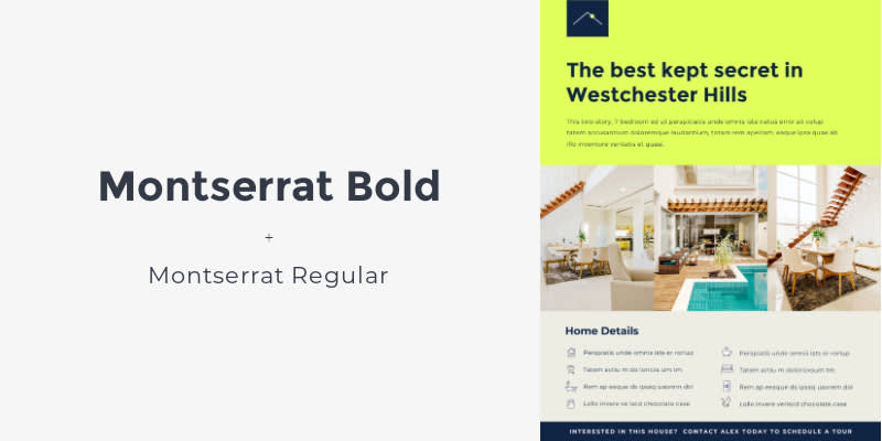
Customize a real estate flyer template with Montserrat Bold + Montserrat Regular
No, we’re not cheating the game here. You can pair the same font...just make sure they slightly contrast. In this case, Montserrat Bold pairs with Montserrat Regular. Since, technically speaking, they’re the same font, it’s a match made in heaven, and the bolding helps create differentiation while still offering a refined look.
11. Menu
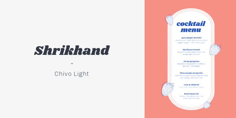
Customize a menu template with Shrikhand + Chivo Light
Menus are ripe for fun and visually attractive font pairs. Shrikhand and Chivo Light is a case of bold display font meets simple serif, resulting in a clear and appealing menu.
For more on masterful menu-making, check out:
12. Email

Customize an email template with Didonesque Display + Montserrat Regular
Yes, you can use font pairings in email! This is particularly relevant when sending marketing materials that are meant to garner clicks. Pair appealing fonts with similarly appealing visuals. Didonesque is an elegant serif font, in all caps and tracked out for a modern look. Montserrat Regular helps keep readers engaged and able to easily read all the deets.
Plus, you can use cursive font pairings, script font pairings, or script and serif font pairings to master an email signature design that leaves lasting impressions.
Font pairings for social media
13. Instagram Question post

Customize an Instagram Question post template with Bird and Thorn + Raleway
Social media is all about engagement, and the best way to keep followers captivated is with eye-catching content. Use font pairs in your designs to help accomplish this. Bird and Thorn + Raleway create a friendly and playful font pair. Bird and Thorn is especially helpful in distinguishing where story viewers should fill in their own info.
14. Instagram post
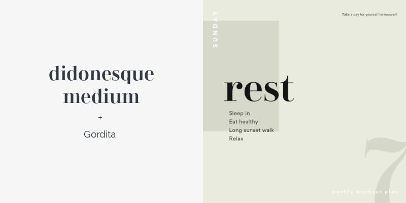
Customize an Instagram post template with Didonesque Medium + Gordita
The right font pairs can help your social content stand out, not just from an engagement standpoint, but from readability. Since users will most likely interact with your posts and stories from their phones, it’s best to opt for fonts that create distinction when paired. Didonesque Medium and Gordita do just that.
15. Facebook quote story
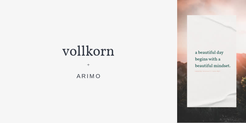
Customize a Facebook story template with Vollkorn + Arimo
Facebook quote stories and posts are popular content on social media platforms. Vollkorn and Arimo maintain a modern look, while providing that serif / sans serif balance.
16. Instagram fashion story
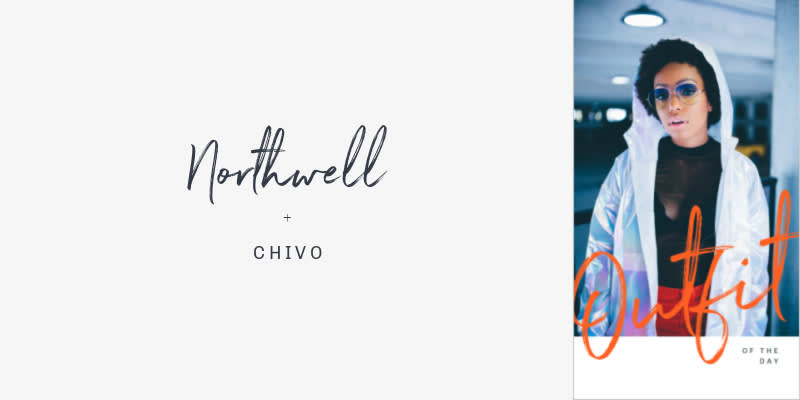
Customize an Instagram story template with Northwell + Chivo
If you're looking for a script font pairing that's also artsy, Northwell + Chivo is your perfect match. Customize font colors for a vibrant and attention-grabbing look.
17. Instagram quote post
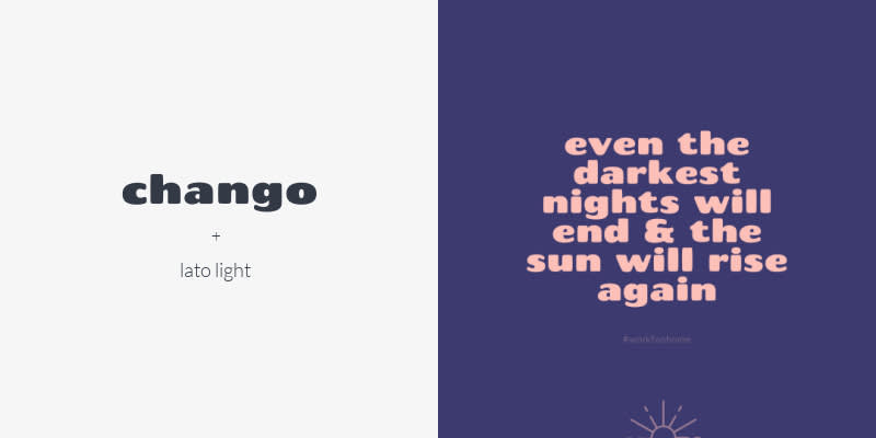
Customize an Instagram post template with Chango + Lato Light
Chango offers maximum visual stimulation. Use it for a quote post, then pair with Lato Light for a subtle hashtag.
18. Facebook post
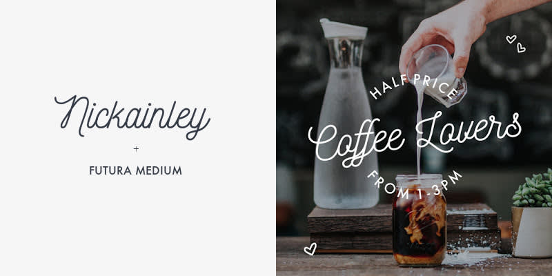
Customize a Facebook post template with Nickainley + Futura Medium
If you're needing a cursive font pairing, go for Nickainley + Futura Medium. On its own, Nickainley is a unique cursive headline, opting for modern instead of an antiquated look. Because it has a fun personality to it, it pairs well with a simple sans serif font like Futura Medium, which works well to communicate pertinent information.
Font pairings for marketing
19. Pinterest pin
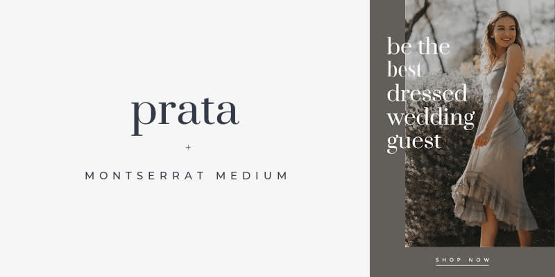
Customize a Pinterest pin template with Prata + Montserrat Medium
It’s in your best interest to use large headlines on Pinterest. And since serif / sans serif fonts are always well-balanced pairings, Prata and Montserrat Medium go hand-in-hand.
20. Facebook ad
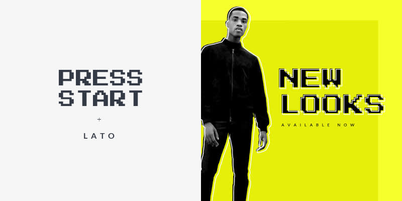
Customize a Facebook ad template with Press Start + Lato
If you’re designing a Facebook ad, you need something captivating and scroll-stopping. Press Start is a unique display font, well-suited for tech-based ads. Pair with Lato, a modern sans serif font, for detail-focused ad copy.
21. Instagram carousel ad
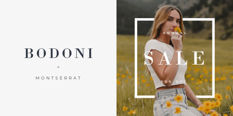
Customize an Instagram carousel ad template with Bodoni + Montserrat
Bodoni is an authoritative tracked out (letter spacing) serif font, which makes it the perfect choice for social media ads. Montserrat pairs well for a finished look.
22. Postcard
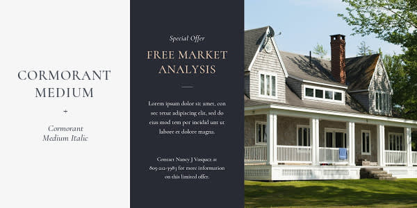
Customize a postcard template with Cormorant Medium + Cormorant Medium Italic
If using postcards as part of your marketing collateral, pair two versions of the same font together for easy scanning. In this case, Cormorant Medium and Cormorant Medium Italic.
23. Brochure
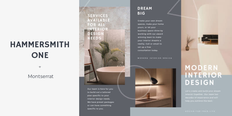
Customize this brochure template with Hammersmith One + Montserrat
Like a postcard, you want any printable brochure (or digital, for that matter) to offer an easy reading experience. Hammersmith One is a serif font; pair with Montserrat for clean copy throughout your brochure.
For more on inspired brochure-making, check out:
24. YouTube Thumbnail

Customize a YouTube thumbnail template with Black Jack + League Spartan
YouTube is all about NOISE. Black Jack and League Spartan are bold and, when customized with various colors, super vibrant. No matter what, always consider a script / sans serif pairing for YouTube. It helps create something that’s balanced, but still striking and, if you want, flashy.
For more on making stand-out YouTube thumbnails, check out:
Font pairings for organization
25. Class schedule

Customize a class schedule template with Bungee Shade + Open Sans
An easy way to make a school schedule fun — Bungee Shade and Open Sans. The former adds a little flavor-flave to your design, while the latter keeps things clean and readable.
26. Personal schedule

Customize a schedule template with Silver South Serif + Silverline Script
Why throw your personal schedule onto a boring yellow legal pad or in a notebook? Give yourself some personality on the page that matches who you are off it! Silver South Serif and Silverline Script pair well together when the latter is used sparingly. Notice it here — a single word that adds all the contrast we need to the design.
27. Calendar
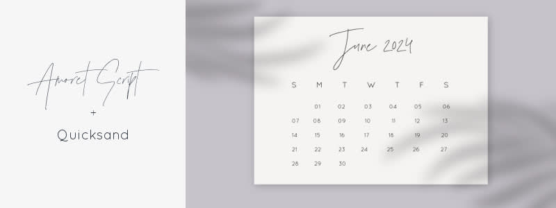
Customize a calendar template with Amoret Script + Quicksand
Customize your calendar with Amoret Script and Quicksand. Using a script font for your main headline text gives the calendar a personal touch. Quicksand is a thin and rounded font, which makes it look clean on the page and easy to read.
28. Content planner
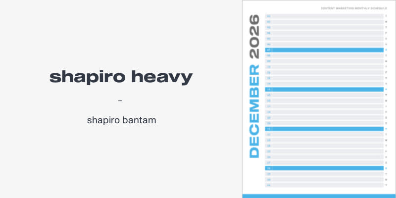
Customize a planner template with Shapiro Heavy + Shapiro Bantam
When content planning, delineate your planning sections with a bold sans serif font like Shapiro Heavy. Then keep things in the family with the distinctive Shapiro Bantam.
29. Lesson plan
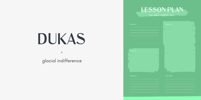
Customize a lesson plan template with Dukas + Glacial Indifference
Personality is the name of the game when using organizational tools. You know — look good, feel good, accomplish great things. In this design, Dukas adds personality, while Glacial Indifference is used so that the body text is clear.
30. To-do list
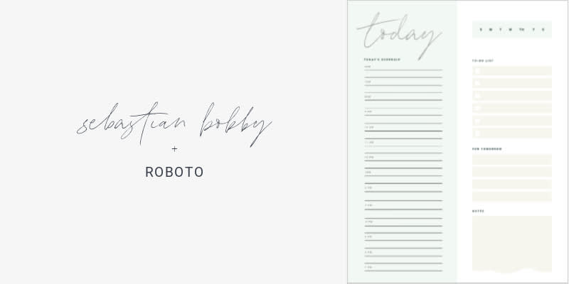
Customize a to-do list template with Sebastian Bobby + Roboto
Much like a customizable calendar, your daily, weekly, or monthly to-do list can benefit from a personal and friendly vibe. Achieve this by pairing Sebastian Bobby with Roboto. It’ll develop that familiar personal touch, while also keeping your design modern.
Font pairings in PicMonkey

For a quick start with font pairings, try one of our designer-crafted text layouts. These bad boys and gals are ready to go as soon as you grab one of 'em. And while they're all pre-selected font pairs, you can still customize them to your heart's content. Ultimately, your stylistic choices simply require your intuition. Don't worry about making the "wrong" choice — it won't be if it feels right.
Lastly, matching fonts is important for any design endeavor, especially if said design relates to your branding. PicMonkey Pro Subscribers can create a brand kit for brand fonts, colors, and logos that are frequently needed for use in designs. And if you’re a business, consider a business subscription for access to multiple brand kits!
PicMonkey has over 350 fonts for your projects
