Have you ever been to a store? Have you ever watched television? Congratulations, human, you must know the importance of business logo design! It’s the iconic face of your business, and a key brand-builder. With PicMonkey, you don’t need to hire an expensive designer to create one; you can make it yourself. Whether you’re creating your logo from scratch or giving it a revamp, we hope these examples will inspire you.
Here are our keys tips. Scroll down for more info!
Mix text with graphics for a winning combination.
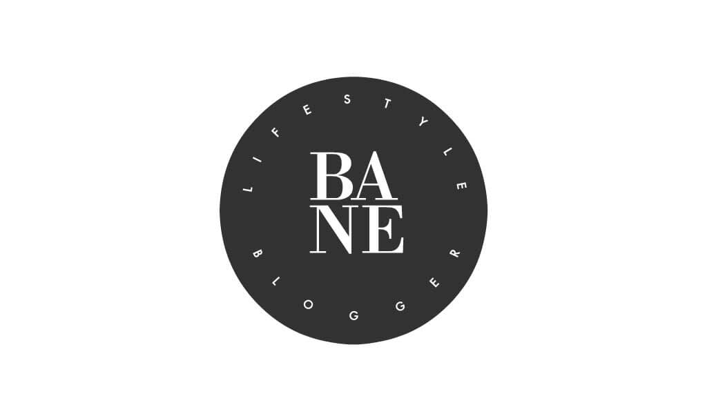
Make striking circular logos with our curved text tool.
Don’t be afraid to use graphics in creative ways.
Use Geometric graphics to create new shapes.
Add easily add your logo to any of our business templates when you save it to Hub.
Text logo design tips

This logo which is for a DIY hand-crafting business, melds stitching imagery with the “Threads” brand name seamlessly (pun intended!). The design, easy to remember and understand, will spark a solid first visual impression that makes a potential customer wonder “What is that?”
Tip #1: Pair fonts and graphics that work well together. Think broadly when scrolling through the graphic options; they can often be repurposed for other jobs than the original intent. Match colors to your brand color by typing in the HEX code. Use the eraser tool liberally: those dashed lines in our example used to be arrows. Arrowheads be gone!

Psst… Click me to customize—I’m a template!
This logo makes good use of our curved text tool, creating a simple, sophisticated design.
Tip #2: Circle graphics and curved text a surefire combo to create classic looking logos.
Character logo design tips

The eye is naturally drawn to simple imagery that is quickly understood at first glance. In this late-night eatery logo, the logo can stand apart from the name of the business, and customers will still recognize it. Cute characters like this owl offer an emotional connection in addition to communicating what the business is about.
A perfect example of logo simplicity is the iconic Nike swoosh. It’s ridiculously simple, but messages themes of speed and power that are recognized by people the world over.
Tip #3: Use graphics not as directed; get crafty! Patch together Geometric graphics to let your creation come to life, like our designer did with this night owl.
Graphic logo design tips

Other logos stand out for being insanely clever, yet understated. Think FedEx. Their logo consists of a bold, unmistakable orange and purple type. But upon further inspection you notice the sneaky arrow they slipped in the negative space between the E and x. Our example above, for a wedding photography business, is clearly a camera. But wait! It’s also a blingin’ ring. Insert some wit in your logo to reflect your brand voice and personality.
Tip #4: This logo is made, again, with a combination of graphics. Look carefully at your font and graphic choices; you may have an opportunity to pull off a double entendre in your final design.
Bonus logo design tip: Once you’ve made a bomb-dot-com logo, start using it to promote your business! PicMonkey has a library of designer-curated templates that include business cards and Facebook covers. Simply save your logo, pick a template you love, and customize it with your brand-new branded masterpiece.
