The unprecedented popularity and dominance of social media marketing has lead some to declare that email is dead. Oh, how wrong they are. The truth is, email remains the most effective mode for reaching people and converting them to customers, far outpacing any social channel out there.
Studies show that an email marketing campaign can have 50 to 100 times the click-through rate of Facebook and Twitter. Even better, email drives more conversions than any other marketing channel. According to one report, 66% of online consumers made a purchase because of an email they received.
Surprising? Maybe. But it makes sense. Everyone has an email account, and they check it every day. Email messages go directly to the recipient, as opposed to a social channel like Facebook, which will deliver your post to a small fraction of your fans. Best of all, you know everyone on your list wants to receive your emails, otherwise, they wouldn’t have signed up or they’d unsubscribe.
Why MailChimp?
With more than 15 million customers sending about 1 billion emails every day, MailChimp’s got to be doing something right. It’s the most popular email marketing service out there, ideal for beginners and more advanced users. For solopreneurs and small businesses with less than 2,000 subscribers, MailChimp offers a free option.
MailChimp takes their Freemium offering seriously and provides excellent service to all their customers, no matter what they’re paying—or not paying. You can chat with a representative online or get common questions answered by reading the content available on their website.
Also key to MailChimp’s success is how easy it is to use. It offers an intuitive dashboard that clearly displays all critical features, a step-by-step guide that walks you through the email campaign-making process, and a drag-and-drop email template editor that makes it easy to dive into email marketing without any prior knowledge or skills.
Make a subscriber list
An email marketing campaign won’t add up to much if you don’t have people to send your emails to. Don’t worry if your list is small at first. MailChimp provides automatically generated sign-up forms that you can put on your website, blog, and Facebook page to gather new recipients and grow your list. There’s also an app for iPad and Android tablets that helps you collect subscriptions in your store, a booth at a tradeshow, or anywhere else you might want to use it.
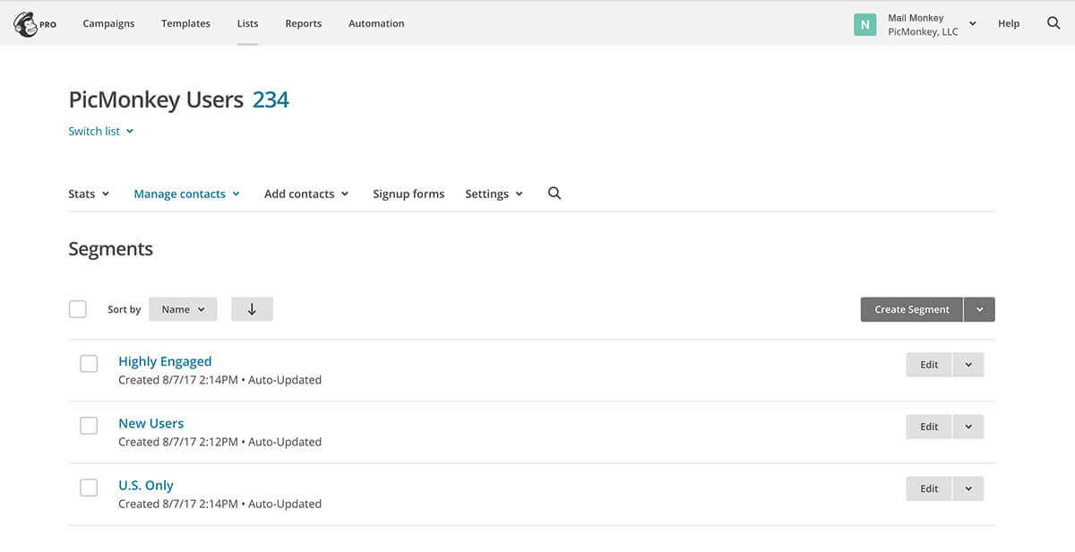
Once you’ve got a solid, robust list, MailChimp allows you to segment it so you can target groups of people with specific messages that are most relevant to them. You can use MailChimp’s pre-built, automatically generated segments or create your own. Group your recipients according to when they signed up, their engagement level, their interests, and demographic information. By segmenting, you’re better equipped to get optimal results and you won’t bother people with messages that they aren’t likely to be interested in.
Tips:
Make sure to ask people to sign up for your email list at opportune times, such as when they make a purchase or download something, or if they attend one of your webinars or online events.
When you create your sign-up form, consider collecting some key demographic information such as gender, age, and location as well as things such as interests and job title.
If you integrate your store with MailChimp using their e-commerce integration feature, you’ll be able to get granular about segmenting according to your customers’ buying history.
Create a campaign
Once you have your list set and segmented, you’re ready to create your campaign. MailChimp has four different campaign options to choose from:
Regular campaign: This is a standard HTML email. The attached plain-text version to avoid appearing as spam and being sent to your recipients’ junk folder.
Plain-text campaign: Sending a simple text-only email without images or special styling is a good way to make people feel like they’re getting a real, personal email from an actual person. You can increase this effect by using punctuation and casual speech that reflects the way that most people communicate via email.
A/B split campaign: MailChimp allows you to send out two versions of the same email so you can try out different subject lines, sender names, timings, and content. This helps you learn more about what the people on your list like and respond to. The information you gather can be used for future campaigns.
RSS-driven campaign: This feature allows you to send content from your own or another RSS feed to a list of subscribers.
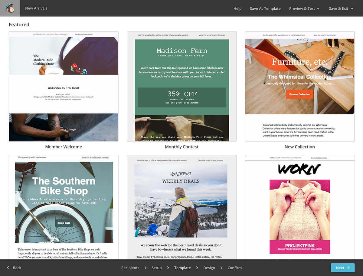
The next step is to design your email. MailChimp offers a wide variety of customizable layouts, prebuilt themes, and templates to help, and drag-and-drop editing makes customization a snap. Email templates are designed for specific purposes, depending on whether your goal is to showcase a product, share news or an announcement, follow-up with a customer, or simply provide information about your company or service. Make sure you have a clear idea about what your goal is before doing this step, since your email’s design is completely dependent on what your intent is.
Design and write content
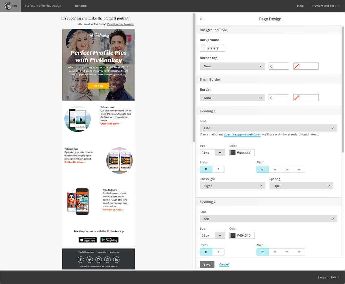
Email provides businesses with the chance to have a more personal relationship with current and potential customers. It’s one of your best chances to get people’s full and undivided attention. But you’ll probably only get it for about 8 seconds, so be sure to make the most of this opportunity by carefully crafting your content.
Subject line: Your subject line is your first shot at getting people’s attention. It’s also the only way you’re going to convince someone to actually open your email, so it’s critical that it’s good. You’ll hear a lot of advice on how to write a great subject line, but we found the C.U.R.V.E. method particularly helpful. Basically, your subject line should have at least two of these five qualities: curiosity, urgency, relevancy, value, and emotion. Now try doing that in 50 characters or less and you’ll be a master email marketer!

Preheader: Right after the subject line comes the preheader, which is your SECOND chance at convincing people to open your email. Also known as preview text, this is the content that appears right after the subject line in most email programs. Many email marketers neglect to pay much attention to this snippet of text, so you’ll be giving yourself a leg up by putting some real thought into what you write. Since subject lines are supposed to be short and sweet, you can use the preheader to expand on the info there, give a little more detail, or even offer up a whole new concept.

Body text: Once you convince someone to open your email, you’re only going to have a very brief window to convince them to read it and respond to your call to action. Therefore, it’s essential to grab their attention immediately with text that is catchy, interesting, and provides value. Whatever your goal is with your email, make sure you convey it as quickly as possible, whether that’s imparting information about a new product, telling people about a special promotion, or solidifying your relationship with a customer. You also want to be sure that the overall length of your email is brief. Of course, it’s going to vary based on your business, the type of email you’re sending, and your goals, but one study shows that emails with a word count of 50 to 125 words perform best.
Personalization: When appropriate, consider using merge tags to add the recipient’s name to your email. While most people know full well that the email they’re receiving is being sent to hundreds or thousands of others, seeing their name at the top still makes them feel like the message is being directed to them. You can also achieve a sense of familiarity by speaking to people directly, such as “We know you love our products” or “Have you heard about our big summer sale?” Some companies choose to put a specific person as the sender of an email rather than the company name, to further the illusion that it’s a one-off email just for the recipient.

Graphics: One of the best ways to catch someone’s attention is with a great graphic. More and more, email marketers are experimenting with imaginative designs that include bold photography, funky typography, striking color, and unique shapes. Some emails are more graphics heavy than others, so feel free to experiment to see what your audience responds to the most. Also keep in mind that sometimes a text-only email works best. For example, if you want to send a personal thank-you message to a customer, foregoing the graphics will make them feel like it’s from a real person.

Call to action: What exactly do you want your recipient to do when they read your email? Purchase a product? Download software? Watch a video? Read an article on your blog? Follow you on Twitter? Whatever it is, make sure it’s clearly stated in your call to action. This can be text that is bolded or underlined like a hyperlink, or it can be a button graphic. While some email marketers put their call to action at the bottom of the email, many experts suggest putting it higher up—either at the top or at least “above the fold” so it can be seen without having to scroll down. Ideally, you’ll give readers the chance to click on that action more than once. You can even reiterate your call with a P.S. at the bottom of your email. But make sure all calls to action have the same ask.
Tips:
Experts say buttons work best, preferably in bold, contrasting colors.
Make sure there’s plenty of white space surrounding the button so it doesn’t get lost.
Using drop shadow on your text will give it a 3D effect that makes it stand out.
Try getting newer subscribers to respond to small calls to action (“follow us on Facebook”) before asking for big actions (“buy now”).
Sending and automation
One of the best things about using a service like MailChimp for your email campaigns is the ability to schedule your sends for specific days and times. This ensures that your emails go out when they need to and relieves you of worrying about hitting send at just the right moment. There are some extra features for paid users as well, such as send time optimization, which helps you figure out the best times to send based on your subscribers’ activity history; Timewarp, which takes subscribers’ time zones into account; and batch delivery, which allows you to send in timed batches instead of a single batch to help you control your website traffic.
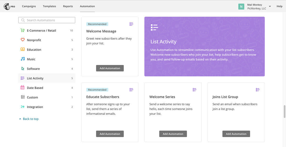
MailChimp also has an automation feature that allows you to automatically send an email or a series of emails after a certain trigger that you specify, such as a date, an event, or an action performed by the subscriber. You can utilize MailChimp’s preset automations, which include things such as a welcome email after signing up or making a first purchase, reward emails for customers that reach a certain level of buying, reminder emails about special sales or promotions, and re-engagement emails to try and win people back after not having made a purchase for a defined period of time. Like scheduling, automation frees you up from staying on top of all this emailing so you can concentrate on creating great emails and running your business.
Tips:
When setting up your emailing schedules and automations, you’ll need to be conscious of how many emails any one person will receive over a defined period of time. You want to send enough to keep them engaged and aware of your company, but not so many that they get annoyed and reach for the unsubscribe button.
Speaking of unsubscribing, be sure to make it as easy as possible for people to unsubscribe by putting a link at the bottom of your email. If someone wants to leave your list, you don’t want to stand in their way by making it a hassle. Additionally, if there’s not an easy way to unsubscribe, your emails will likely be marked as spam.
Before you send out any newly created emails, send a test to make sure everything looks just right. Be sure to test your email on mobile devices, since many people will be opening them on their phones.
Paying customers have access to a tool powered by Litmus that allows you to see how your email will look in more than 40 different email clients.
Analyze your results
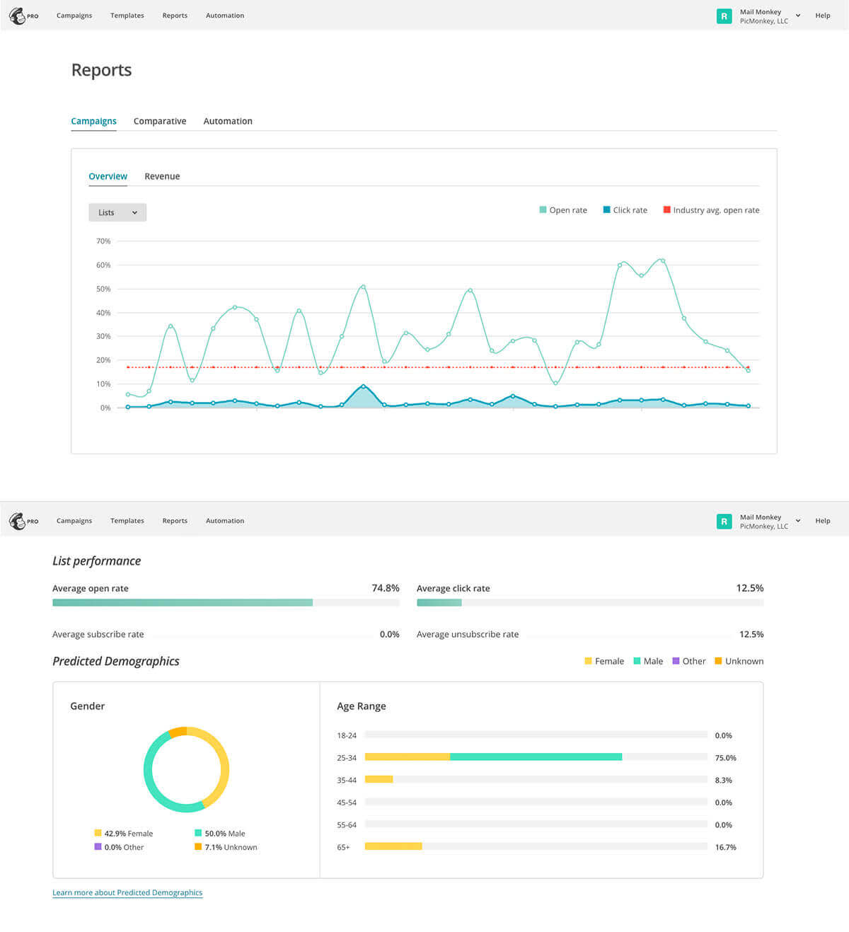
As with any marketing effort, it’s critical to measure and analyze the results of your email campaign to figure out what’s working and what isn’t and then make improvements where necessary. MailChimp has an easy-to-read dashboard and creates reports to help you see and understand how your emails are performing. Reported stats include open rate, click rate, industry averages for opens and clicks, bounce rate, forward rate, unsubscribe rate, top links clicked, where your most engaged subscribers are located, etc. If you want to check your performance, manage your lists, or send campaigns on the go, MailChimp also has a mobile app.
