When I joined PicMonkey, one of the first things I worked on was a survey to our customers. The survey was to help us understand more about why they use PicMonkey, whether their use cases were for work or personal projects, and how they shared and published their creations (e.g., Facebook, Pinterest, print). Having spent seven years at SurveyMonkey, I knew exactly where to find an awesome survey creation tool to get me started.
After drafting a segmentation survey and getting feedback from my team members, I headed into the SurveyMonkey tool to create my survey. I immediately realized that I didn’t have my handy Custom Themes set up yet. At PicMonkey, helping our customers visually represent their personal and professional brands is a huge part of what we do. So the visual branding—things like color schemes, fonts, and logos—had to be on point if we were going to send a survey to thousands of customers asking for their feedback.
Thankfully, SurveyMonkey has Custom Theme tools that you can set up and apply to any survey. With my new comfort level and familiarity with PicMonkey, I found that I was able to quickly get my key brand assets into SurveyMonkey and create a survey that was on-brand and templated for all of my colleagues to use.
Here are are the three pretty simple things I did to create a branded survey theme, using both SurveyMonkey and PicMonkey’s tools. We now use it with every survey we send out!
1. Add brand colors to key survey areas. PicMonkey’s main colors are Tango (HEX: #DD6611) and Sun (HEX: #FAB117). I used Tango for the survey title background and Sun for the page title background.
I used one of our secondary colors, Before Sunrise (HEX #3F4D61), for the question and answer text. And then I used white for the survey title, since it was going to be on a Sun background.
2. Add brand fonts. This was very easy. In the Typography section of the Custom Themes, I changed the default to PicMonkey’s web font: Lato. Presto! Everything was looking and feeling a lot like PicMonkey.
3. Add a logo. There are a few options for placement of a logo, and I really liked the left-of-the-title option.
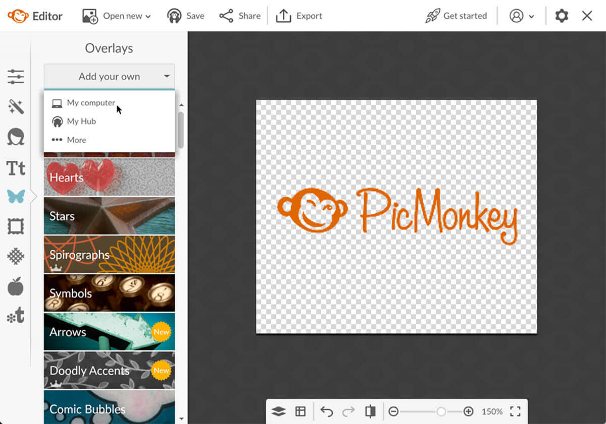
I had an issue though: Our logo is orange (Tango) and my title background was also Tango. I wanted to make the logo white, just like the title font, and needed an image editing and design tool to do so. Of course, I knew just where to find one. I went into the PicMonkey Editor and started with a blank canvas. Next, I made the canvas transparent.
Then I uploaded a transparent (.png) version of our company logo, using the Add your own button in the Graphics tab.

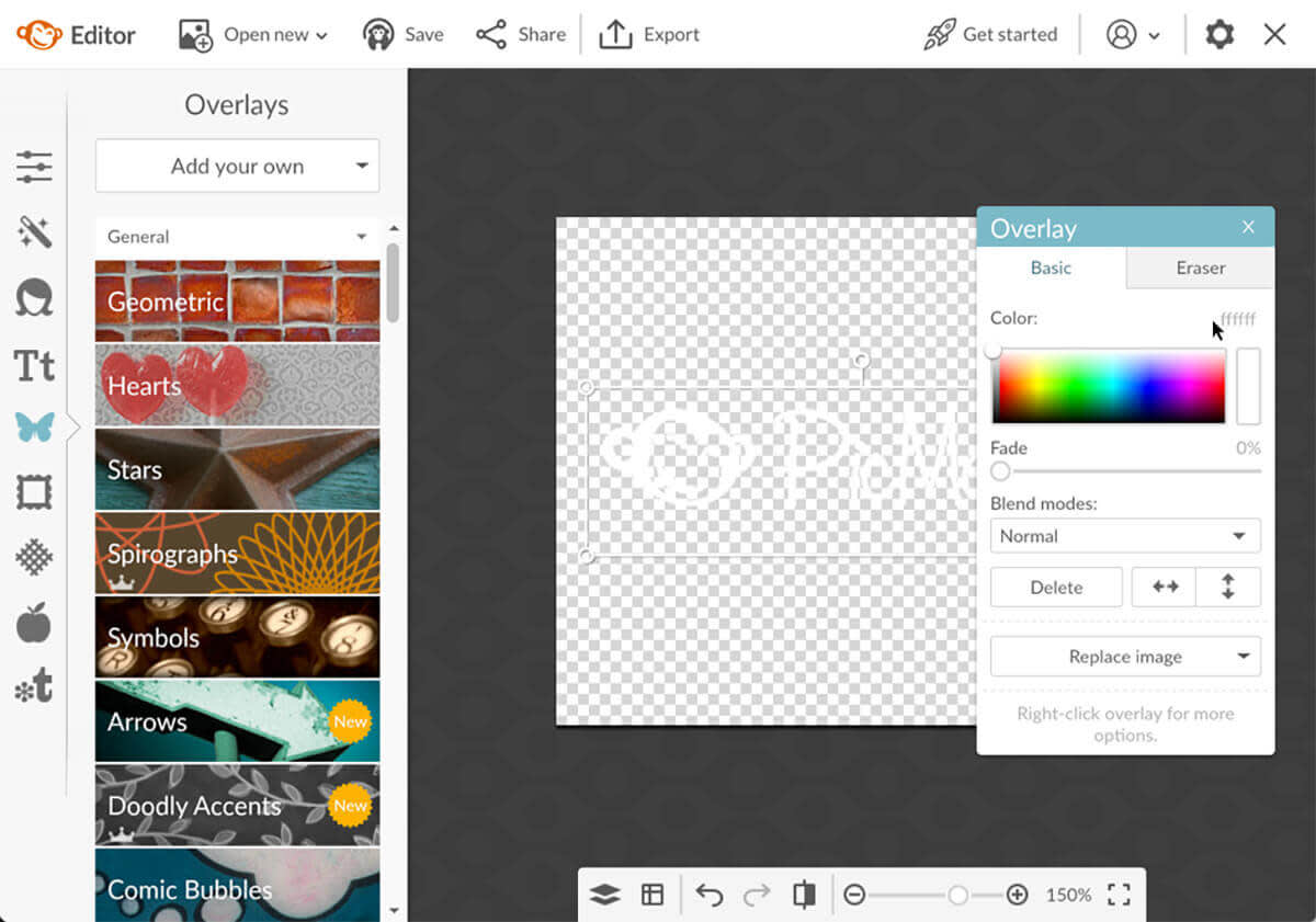
Now to make that logo white instead of Tango. When I clicked on the graphic (our logo), a menu called the Graphic palette came up. I used it to change the color of the logo to white (HEX: ffffff). After making that quick change, I had my white logo that I could Export and then upload into SurveyMonkey.

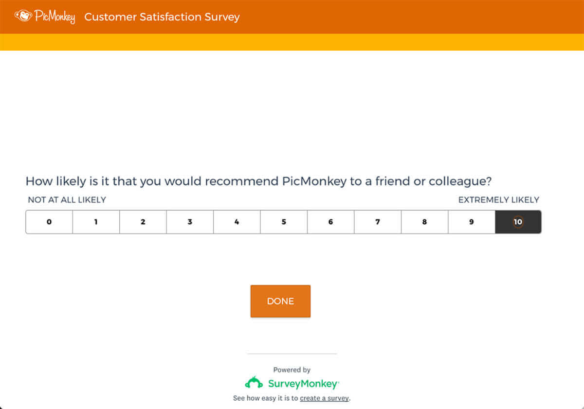
That whole process turned out to be incredibly easy and set us up with a slick, simple, on-brand survey theme to use. Here’s a snapshot of how it turned out:

