When you need to make a point, influence an opinion, or motivate action, one surefire way to persuade your audience, whether they're in a conference room or on Instagram, is to power up your argument with information. But we live in an age of m-a-s-s-i-v-e information overload. People consume an average of 34 gigabytes, or 100,000 words, every day—and that's just in their leisure time.
How can you break through with solid, digestible information that grabs attention and resonates in the minds of your audience? The key is to represent information visually. Charts and graphs make it easier to chunk information and show relationships between concepts, which helps your viewer get to the nut of things faster. Following is a survey of different types of graphs, charts, and some key tips for creating them using easy online design tools, like PicMonkey.
1. Flow chart
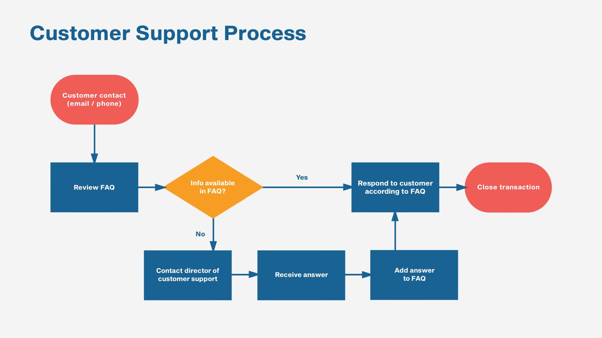
Edit this flow chart template in PicMonkey
A flowchart shows a workflow, a decision tree, or a step-by-step process for solving a problem. Detailed flow charts used in fields such as computer software engineering feature complex symbology that involves specific shapes that designate things like: start, input, process, decision, output, etcetera. But a flowchart can also use basic shapes very generally, or may not use shapes at all.
Tips for creating flow charts
Make sure your flowchart reads from left to right or top to bottom.
Add color coding and symbolic shapes when what you're communicating is more complicated.
White space is important—don't let your chart get overcrowded.
2. Pictogram
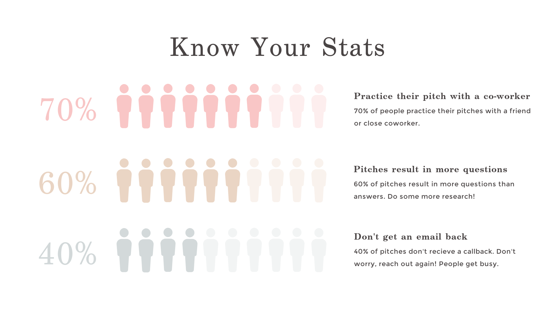
Edit this pictogram template in PicMonkey
Pictograms are good for portraying percentages and ratios, and tend to have a greater capacity to evoke emotions because the objects chosen to represent data are inherently more symbolic than, say, a bar chart. In the example above, the viewer can immediately tap into the heft or paucity of the numbers because they're shown as human beings.
Tips for creating pictograms
Choose icons that are universally understood and visually uncomplicated.
Be consistent in your symbol use; don't switch from people icons to face icons, for example.
Avoid red/green or yellow/blue color combinations because they're harder for colorblind people to recognize.
3. Scatter plot
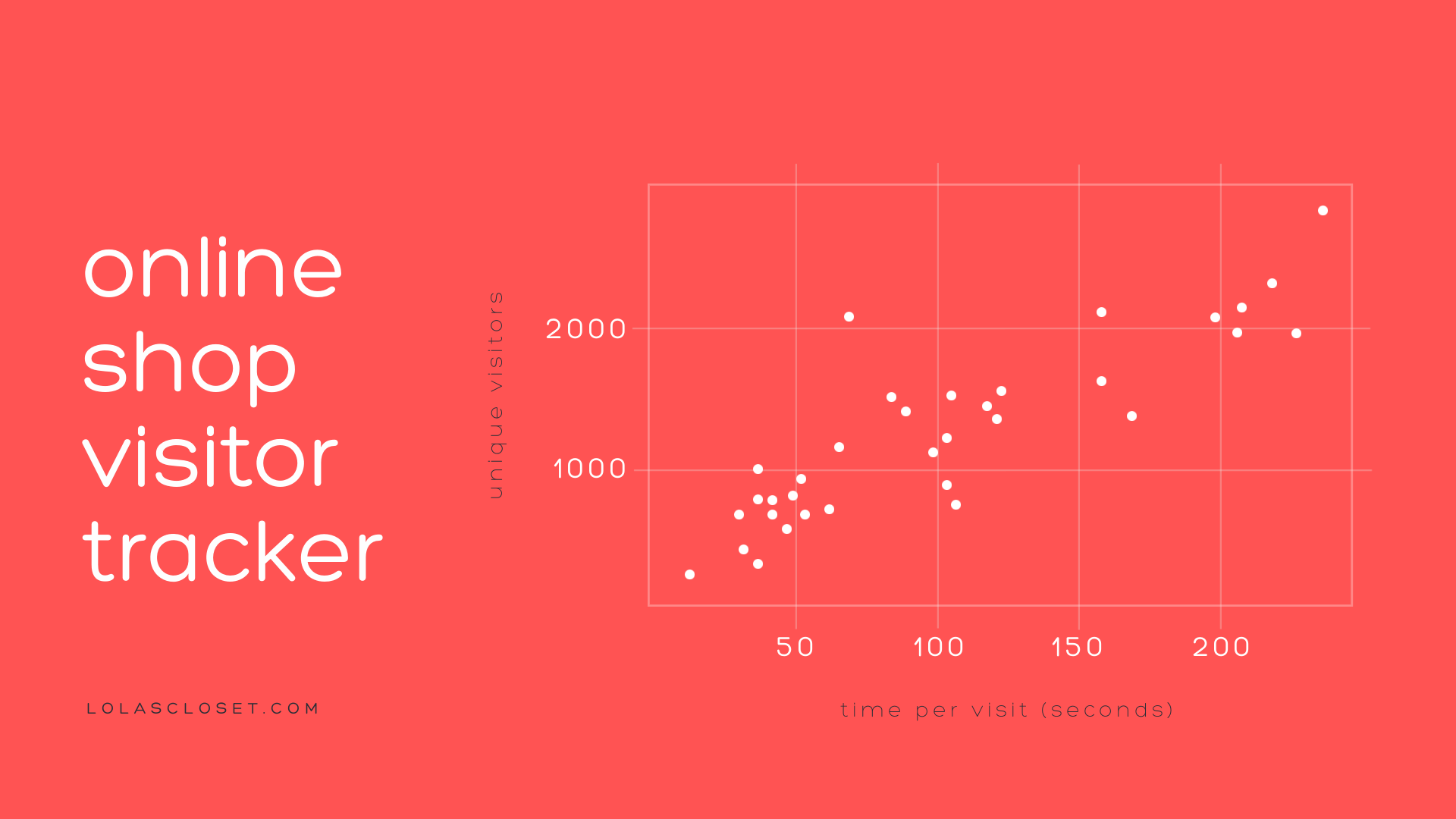
Edit this scatter plot template in PicMonkey
Scatter plots show a dot for every data point, on X and Y axes. This type of graph is useful when you want your viewer to be able to grasp both a visual summary of the information—to see patterns—as well as the discrete bits of data behind it. It's not good for showing data that has gazillions of data points.
Tips for creating scatter plots
Use annotations and color to highlight specific points of interest.
If your scatter plot appears too dense, try a heatmap instead, which helps by adding color to show "binning" of values for each count.
Outliers — data points that are on the outskirts of the normal distribution — tell an important part of the story. Don't leave them out.
4. Gantt chart
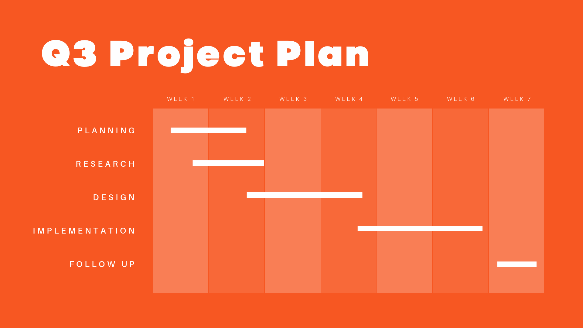
Edit this Gantt chart template in PicMonkey
Gantt charts show activities displayed against time, and they're widely used for project management. Key benefits of using a Gantt chart are predicting how long a project will take to complete, monitoring how projections match against progress, and seeing the "critical path." The critical path is the longest task sequence in the schedule that has zero possibility for adjustment — in essence, it tells you the minimum time necessary to complete the entire project.
Tips for creating Gantt charts
Add tasks in phases, and if it's a complicated project, break down tasks to a granular level.
Add milestones so that you can track deadlines, approvals, and other key deliverables.
If one task cannot be started until the previous one is finished, note it as a dependency.
5. Organizational chart
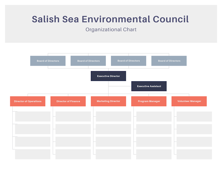
Edit this org chart template in PicMonkey.
Organizational charts are very simple charts that show a hierarchical structure for—you guessed it—an organization. They're most typically organized from top to bottom, and employ simple rectangular shapes, usually with lines between them.
Tips for creating organizational charts
This isn't a branding moment—keep it minimalist and only one page long.
Use a dotted line to show an advisory relationship between a person and higher up that they don't officially report to.
Show the titles for each position, then the person's name.
For brevity, you can show several people with the same title in a single box.
6. Timeline
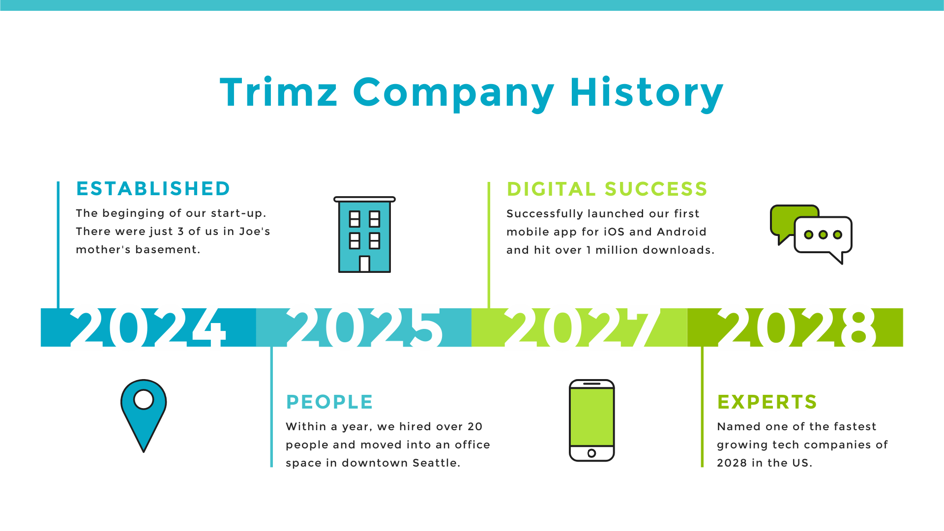
Edit this timeline template in PicMonkey
Timeline charts have evolved past the simple words-and-lines you've seen in old history books. They can be quite visually appealing through the use of color and stylized graphics. Timeline charts are most frequently used to show the history of a thing, place or idea; or an agenda/itinerary — say, five days of a conference or festival.
Tips for creating timeline charts
Try adding graphics — they can dial up the style and scan-ability
Try to find graphics that have a similar style. You can unify disparate graphic styles by changing the colors to adhere to a limited color palette.
If your timeline is complicated, use colors and fonts to show relationships between items.
Text templates are helpful if you want a designer's take on font combinations. Just add one small bit of text in your design and replicate the font choices throughout.
7. Process chart
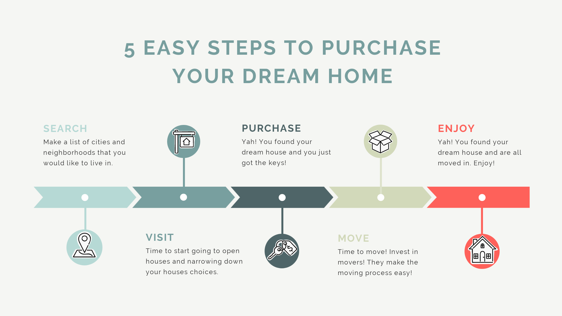
Edit this process chart template in PicMonkey
Process or steps charts are virtually the same as timeline charts, but they're not indexed to particular dates or times; they depict a generalized or ideal sequence of events. And just like a timeline chart, good color, shapes, and font choices will really make your process chart sing.
Tips for creating a process chart
Choose graphics that aren't merely decorative, but carry symbolic meaning.
Use color to distinguish between phases.
Alternate text placement above and below the centerline to allow room for sentence-length tracts of text.
8. SWOT analysis chart
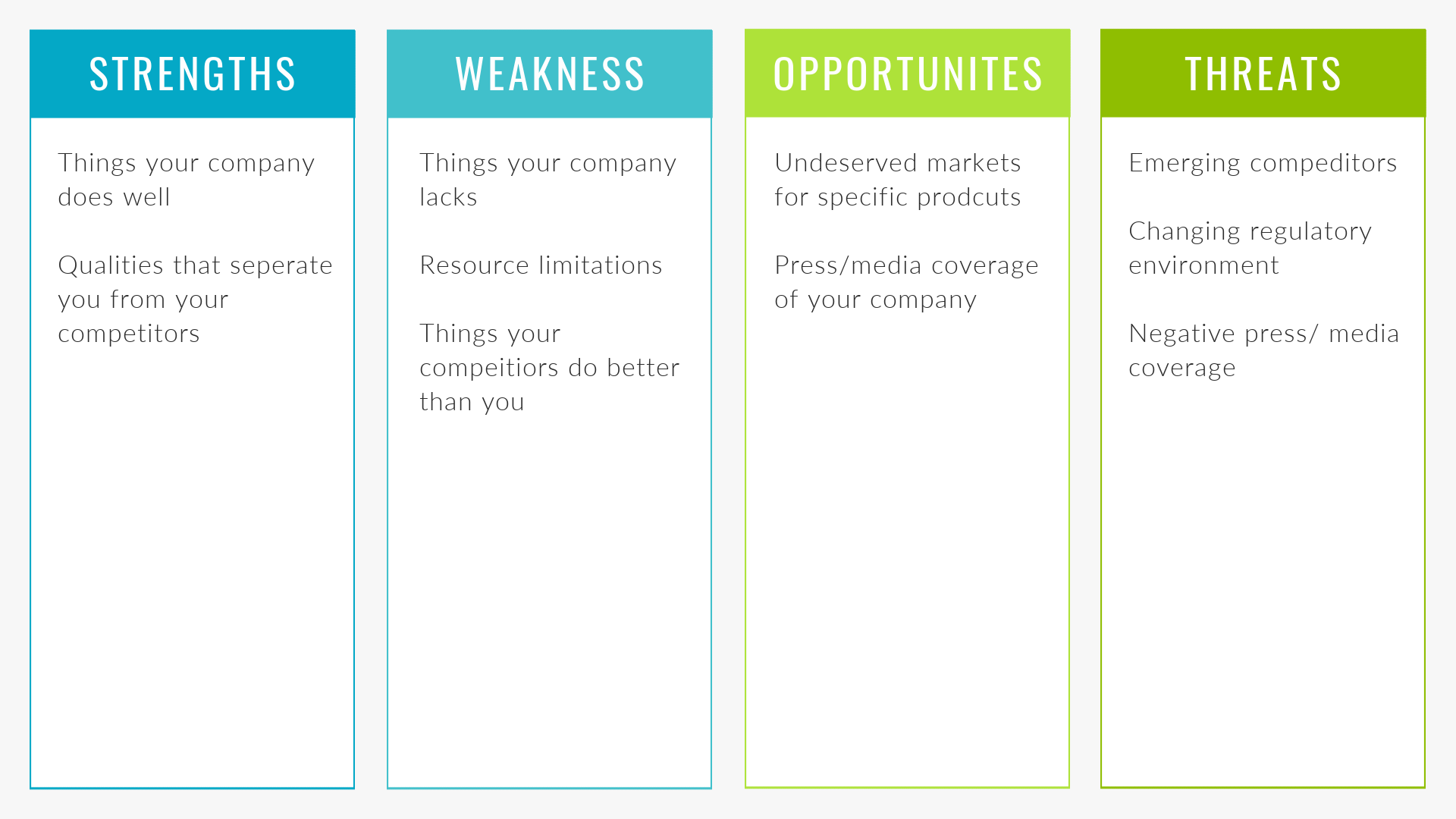
Edit this SWOT analysis template in PicMonkey
SWOT is an acronym that stands for strengths, weaknesses, opportunities and threats. It's something of a standard in organizational planning, because it is highly strategic but also because it surfaces, in a very simple way, what people intuitively know about their work, so they can analyze it and plan a path forward.
Tips for creating a SWOT chart
Hone in on the goal of your SWOT analysis before you begin: are you launching a new product, reviving a brand, angling for a promotion? This will help you stay focused and avoid going thematically astray.
Use a SWOT chart on a whiteboard to facilitate team brainstorming and then distribute a cleaned-up digital version afterward.
Create a vertically oriented chart if you'll mostly use it in longer, printable documents, and create a horizontally oriented chart if you'll use it in a presentation slide deck.
9. Concept map
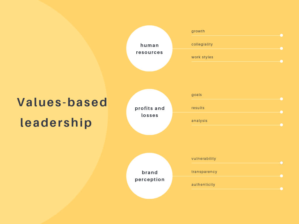
Edit this concept map template in PicMonkey
Concept maps were developed in the 1970's as a way to represent how people understand ideas and information. They're often used in educational settings, and have been adapted for business purposes as well. A defining feature of concept maps is that they show how ideas are related to one another. They're often hierarchical, with the largest concept at the center or top, and show connections via lines or arrows.
Tips for creating a concept map
Start by brainstorming everything that comes to mind, within the topic of your concept map
Lay out all your concepts in a way that organizes how they relate to each other
If desired, you can use linking words and phrases in between the concepts
10. Venn Diagram
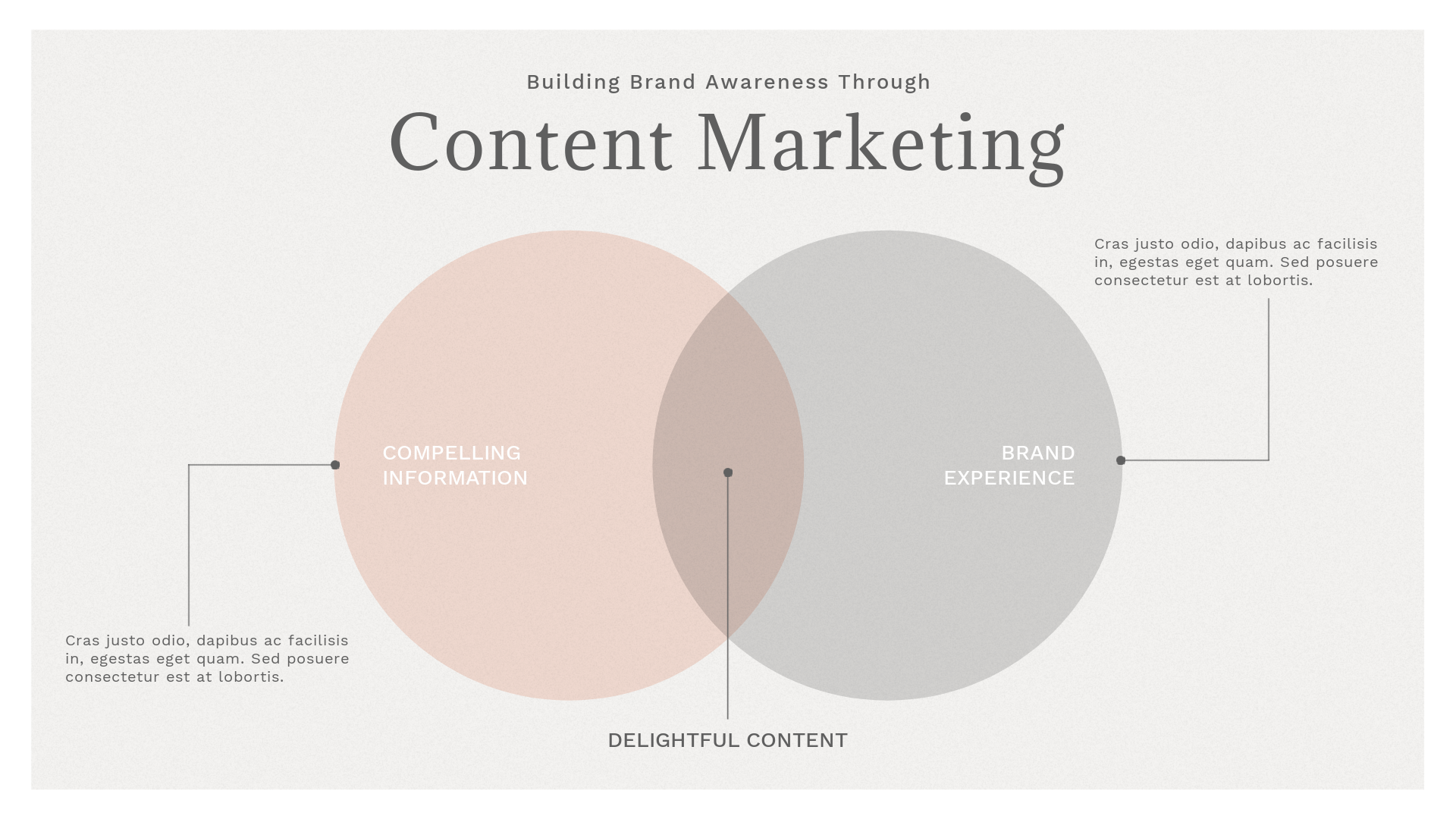
Edit this venn diagram template in PicMonkey
The Venn diagram is particularly good at comparing ideas: showing where they hold commonalities and differences with other ideas, and if they wholly contain or are subsumed by other ideas. Circular shapes are the simplest and most common visualization for this diagram, which is used in business, computer science, teaching, and persuasive communications.
Tips for creating a Venn diagram
Create a circle for each set or concept you are comparing.
Add text to identify the concept of each circle.
Position the circles near or inside others to show relationships.
Where two concepts overlap, add a label to indicate the similarity that it represents.
Try making a graph or chart with PicMonkey
It's no secret that there are a few websites out there, like ours, that help you create graphs, charts, and so much more. But let's talk about why you're gonna love PicMonkey and get you going on a free trial so you can see for yourself.
For starters, PicMonkey offers really good photo editing as well as super solid design. What do we mean by that? Well, other sites just have a limited list of filters that they call photo editing, and tack that onto their design offerings. PicMonkey photo editing, by comparison, is super rich and deep and that makes a difference when you're designing because so many trending looks in design involve photo imagery.
Ever use a "face editing" app to tune up your portrait shots before you add them to a design? You won't need that anymore, because PicMonkey's one of the few design sites that offers legit touch up tools.
While PicMonkey has thousands and thousands of templates to kickstart your designs, we're the only one that also helps you take graphic design to the next level, so you can start from scratch and create some super luxe, stunning looks of your own.
Convinced yet? Don't be — we want you to try it and see!
