Are your social media posts inconsistent? Do you suffer from sleepless nights caused by the knowledge that your business cards are just sitting at the bottom of some big stack? Do your customers feel confusion, disorientation, or dumbfoundedness when looking at the different colors and fonts you use on your flyers? If any of this is happening to you, then you might be suffering from irregular branding. No worries, friend! We’re here to tell you that getting regular is possible.
Having a unified brand look helps busy consumers take a cursory glance at an advertisement/social media page/flyer/etcetera and instantly recognize you. It also helps you set the tone for what kind of company you are and how you want people to view you. PicMonkey’s gonna help you put the brand back together with two of our most helpful tools, Templates and the real-time collaboration features in Hub.
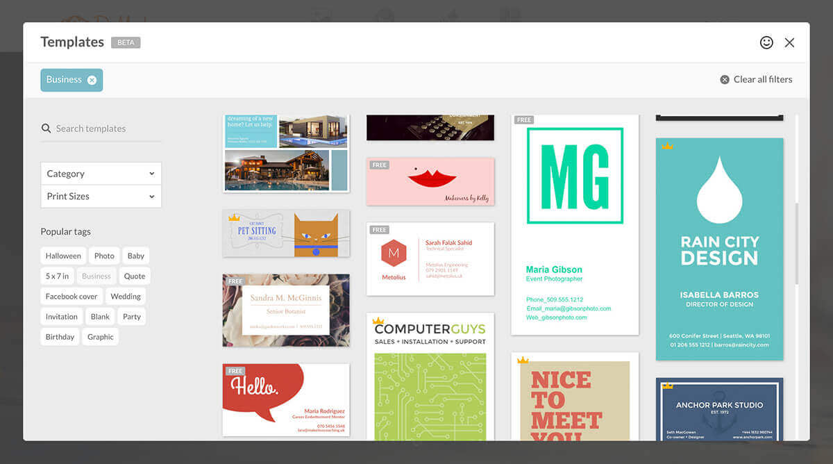
Pick a template, any template

For this example, we’re gonna use Reign Drop, which has a clean, simple design. Reign Drop works well for this example because it has one color (hex code 65c2c0) and one font in various sizes (Montserrat) and from these building blocks we can create a color palette and do some font pairing to create marketing materials that need a more involved design.
Personalize and choose your color palette

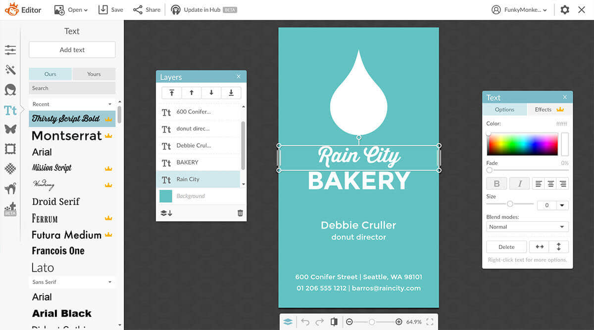
Let’s just say that we’re adapting this business card to suit our fake donut shop, Rain City Bakery. A bakery begs a slightly scripty-er font than Montserrat, so we changed “Rain City” to Thirsty Script Bold. If you want to learn more about designing with fonts, check out our articles about font pairing and font hierarchy to get an idea of how you can play around with your fonts.
If you like any of the colors you’re working with, save the hex code of that color, so you can recreate or complement it in other designs. To find the hex code for an object in a layer, click on it, and it will either show as six digits next to or above the color grid, or you might need to click the color bar next to “color 1” or “color 2.” If you want to find the hex code for a canvas, add a random graphic, and click the eyedropper in the colour tool and hover it over the background. The hex code will appear in the column next to the eyedropper.
File everything in Hub
With your shiny new b-card stored safely in Hub (which as you may recall keeps text and graphics re-editable) you can keep your basic design and adapt it so that it’s personalized for everyone in the company (consistency!). On our Business plan, you can share your space so your teammates can access all the assets, too, using our collaboration tools. You can also easily update the text if you ever change phone numbers or offices. Just open your design from Hub, make your changes and you’re done because Hub automatically saves your work.
Use your new design to create more brand assets

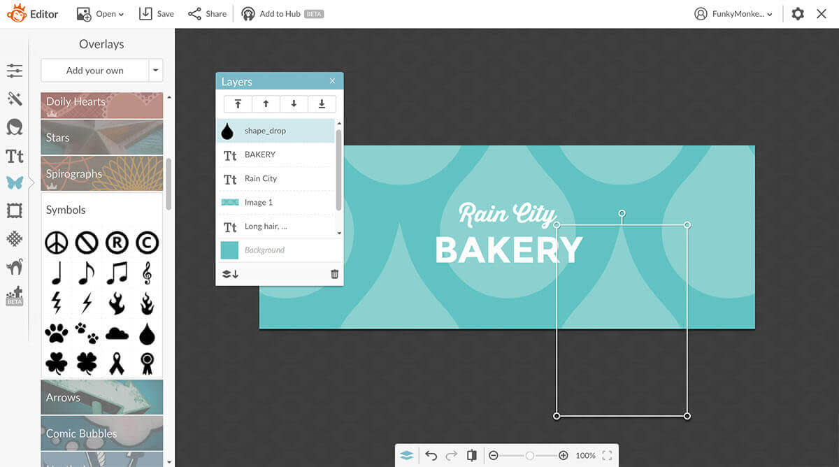
Now that you’ve got a dependable and sturdy design base, you can adapt your creation to fit multiple brand assets. For example, if you want to create a Facebook cover, go back into Templates and select Facebook cover from the Category drop-down menu. Pick a cover that has the text more or less in the spot that you want. The background image doesn’t necessarily matter (unless you want to use it), but you should keep an eye out for things like font placement. We’re going to go with this template because the font matches our business card and the typography looks great.

Delete the image of beautifully stacked firewood and ignore the brief moment of panic when the white text blends with the white background. Go into Edits and under Background where it says, “#ffffff” (that’s hex code for “white”) drop in the hex code that we called out above (#65c2c0). This is gonna turn the cover the same color as the business card.

Since we want it to look similar to the business card, but not exactly the same let’s change a few things up with this design. We’re gonna use the same rain drop graphic that we had on the business card, but this time, let’s make many large raindrops and change the color of the raindrop from white to a lighter blue.

Your image is saved in Hub and you can now update it any time you’d like. For example, if you have a special promotion, or wanna create a similar design using different colors, you or your teammates can get in there and make your changes.

These are different variations of the same template, but they utilize the same branded fonts and stick to a cohesive color palette. (Inspired by rainbow donut sprinkles. Yum!!) Also notice that we’re using a color palette that complements our original blue color.
Adding logos and watermarks
You can use our graphics and text to create your own logo (if you don’t have one already). And once you have a logo, it’s super easy to create your own watermark with the logo. Create your logo in the PicMonkey editor, file it into your shared space so your co-creators can access it, too, and start using it in social media templates or anywhere else you present your brand. Place your watermark on images to assert your brand ownership.
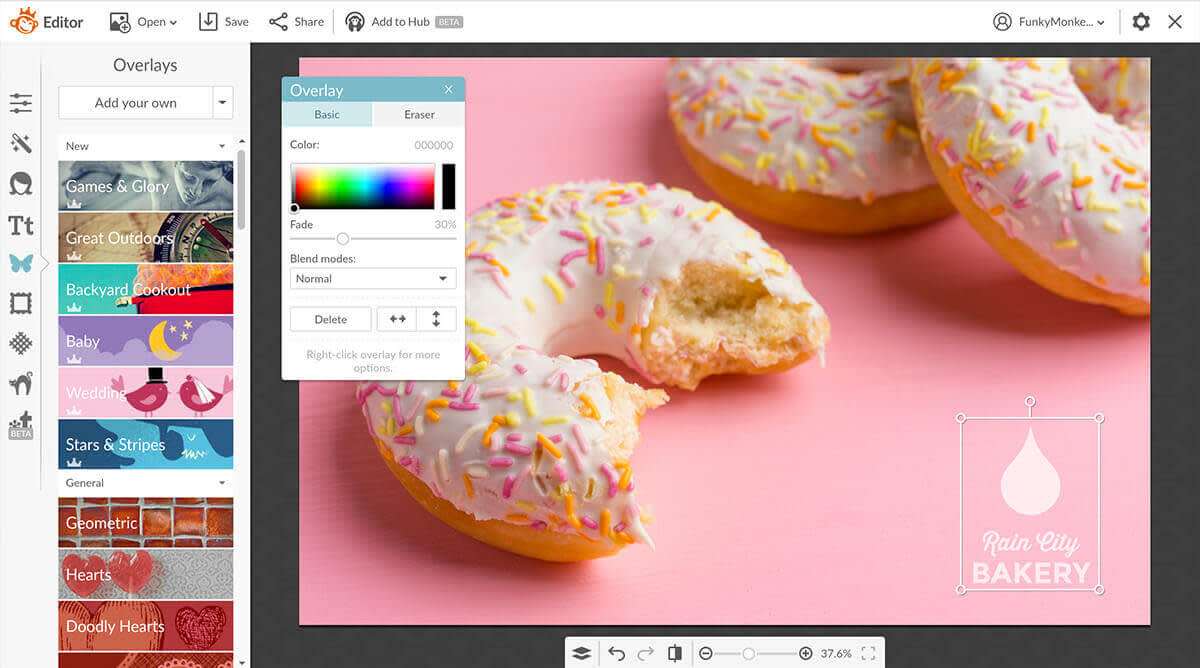
For example, if you want to make a postcard, you can go into the Print sizes category and select the Blank 7 x 5 in template. Right-click to replace the image with your own. To add your watermark, go into Graphics and click the drop-down arrow next to Add your own, select your image from Hub.

Adjust the fade and voilà! You have a sweet looking branded post. The best part is, you can add it to Hub and just keep swapping in new pictures.
We’re excited to see what you make!
