
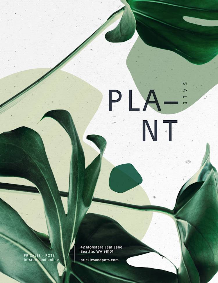
Okay, so you’re building a booming business. Everyone you meet is a prospective client. Every conversation is a lead–and yet–where’s the material to market your events? The verbal word only goes so far in business these days and there’s nothing worse than dangling connections. Having flyers (see also: posters) with information–whether for emails, websites, social media, or grassroots marketing–is crucial. So? It’s time to learn how to make a flyer!
How to make a flyer
This is what the DIY movement is all about. Before we jump into sustainable, empowering, self-sufficient marketing, you’ll want to decide a few things first. The resolution and size of a street pole poster will differ from that of a social media announcement. Intention is everything. Having a clear vision will expedite the creation process.
What’s your flyer’s purpose?
Once you know this, you can begin to picture your flyer's font size and format. Just like the most esteemed artists, every outcome begins with a thought. It’s okay to take time to map things out. Depending on your flyer’s purpose, you’ll be able to play with the specs as you go.
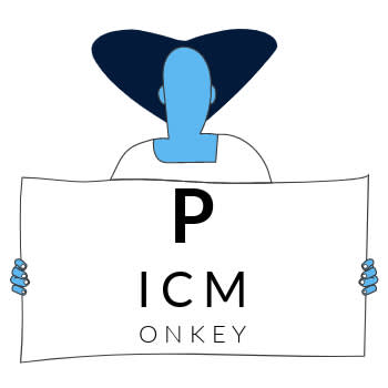
For a standard 8.5” x 11" piece of paper, print readability will change depending on how and where your flyer is being used. Here are recommended font sizes:
| Points | Pixels | Readability |
|---|---|---|
| 150 | 200 | Best for environments like coffee shops and classrooms |
| 48-72 | 64-96 | Readable from 10-20 feet away |
| 30-36 | 40-48 | Readable from 5 feet away |
| 24-30 | 32-40 | Best served as small wall flyers |
| 14-18 | 18-24 | Standard size for the main copy on a handout |
| 10-12 | 13-16 | Effective for the small print in legal documents |
Points? Pixels? Learn the difference between them.
Color psychology is real
Colors prompt frequencies and can therefore make or break marketing. Be sure to choose colors that represent an event appropriately as well as evoke a positive response in your audience.
You could meditate on how you desire your audience to feel when they see your event flyer. Ask yourself, “How would I want to feel if someone else was offering this? What colors prompt that feeling?” And, voila! You have a preferred color palette.
Now that you have an artistic direction, let’s walk you through how to make a flyer in PicMonkey!
Make a flyer from scratch with a blank canvas
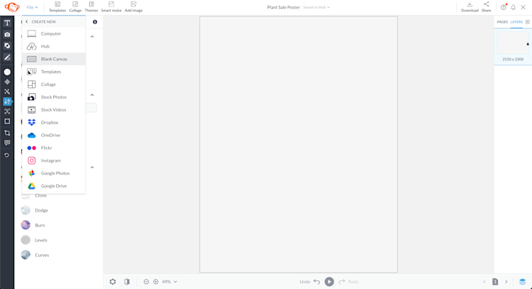
Behind door number one is the start-from-scratch flyer. To find the blank canvas flyer option in PicMonkey, go to File → Create New → Blank Canvas.
Once you open your chosen flyer, the world becomes your oyster. The canvas measures perfectly for an 8.5” x 11 piece of paper; that’s 2550 x 3300 pixels. Since you’re starting from scratch, you have free reign to play. Deem it a poster puzzle.
Customize with graphics & images
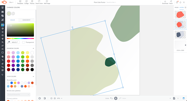
Shapes are the baseline for any graphic design. Go to the Graphics tab (the shapes icon) and search for what you're looking for, or browse by category. All of PicMonkey's graphics are customizable, meaning you can alter their size, positioning, color, and style with ease.
To change the color of a graphic, select it on your canvas and click Change colors on the left Graphic Tools menu. Choose from solid color swatches or trendy gradient colors.
Our gradient colors are hyper-customizable, allowing you to combine up to 3 colors, adjust brightness, and play with the direction they move. Nothing says I’m in complete control of my business more than endless color options.
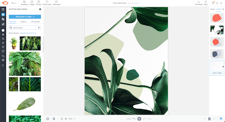
Upload your own images, or browse our massive collection of stock images, courtesy of Shutterstock.
Pro tip: Making a flyer can quickly become very “meta.” Beware of rabbit holes. Use caution and develop an abundance mindset. Give yourself time to explore the offerings before you make decisions. Take notes on colors, graphics, and images that resonate so you don’t get lost in the Matrix. See you on the other side.
Don't forget your text
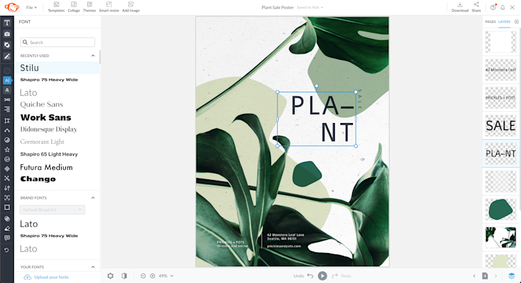
Under the Text tab, you’ll find hundreds of fonts to choose from. Just remember, too many fonts can distract the reader, while complimentary fonts will bounce off the page (and make sure to use the readability chart above!).
Premade text layouts are also available if you’re on the lookout for quick and easy font pairings. Once you find a style that suits you, you can adjust your wording and customize typography size, alignment, spacing, effects, and more with the Text Tools menu.
Download your finished design
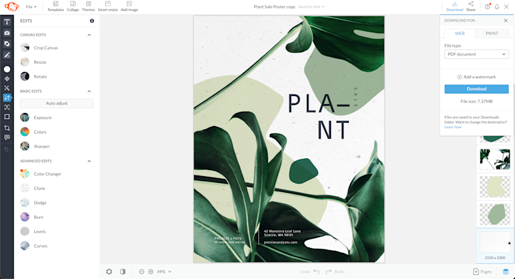
Once you feel you have a balance between fonts, shapes, and colors, you’ll be nearing the end of your first finalized flyer.
When you’re ready to reveal the finished product, click the top right Download button to pick the correct web or print formats for your flyer. If you need to print as a PDF, this would be the perfect time to become a PicMonkey Pro subscriber.
Otherwise, download your design as a JPG or PNG (or GIF/MP4 if it has movement).
Fly high with a flyer template
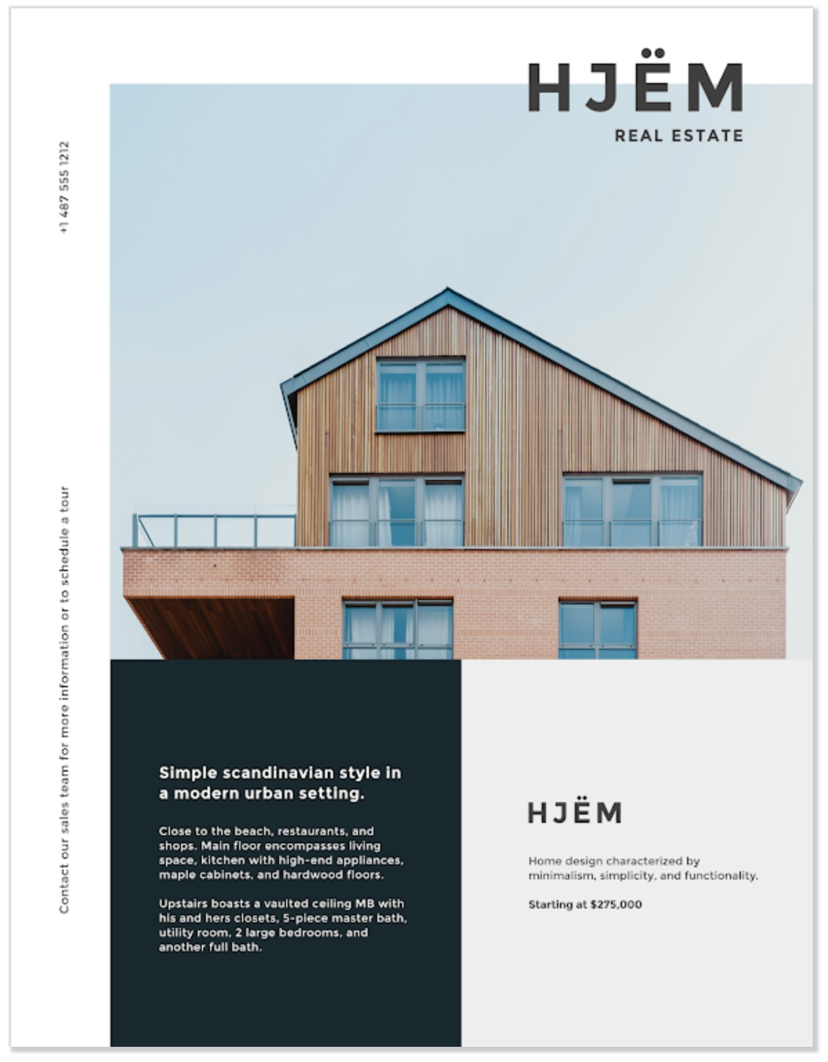
But wait, there’s more! If you’re not into the whole start-from-scratch business, have no fear. There are ample pre-designed flyer templates for you to try. This way, the background layout, colors, and fonts are crafted for you and you just have to switch up the content and graphics!

For this option, take a look at our library of flyer templates and choose a style that best represents your business. Some template options are style-dominant and others have room for more copy. Depending on your event, be intentional about how much information you’d like to feature on the flyer.
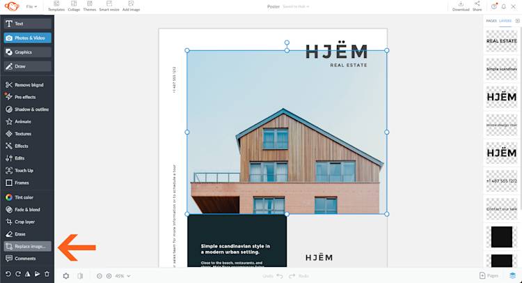
Once you’ve chosen a template, start changing the text, font, and colors as you please. To change images, just select the layer on your canvas, or from the Layers panel, then click Replace image... on the left tools menu. Upload your own images, or pull from our stock.
Just like with a blank canvas, you have limitless design options at your fingertips. Have at 'em, so long as they fit your flyer's style. Are you going for simplicity? A “Wow” factor? The element of surprise? What message are you communicating with your audience?
Conquering flyer making
Here’s the truth. PicMonkey is an epic resource to guide you into the flyer infinity, but you’re the brains behind the operation. As you dive into PicMonkey’s templates, stay close to your intuition. Be focused. Keep breathing. See work as play. Allow the outcome to reveal itself to you. Trust your internal guidance. Be in the flow.
For those who still believe business and creativity belong on opposite sides of the room, let your experience with PicMonkey change that. When people can see you in your marketing, your business will reflect it.
Congrats! You’ve officially learned how to make a flyer. Go forth with confidence and color!
