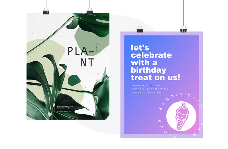
You’ve created a social media profile and website, but now you’re searching for more ways to advertise your brand or event. What’s next?! The almighty power of learning how to make a poster and its strong potential in driving awareness and traffic shouldn’t be overlooked. While promoting online is a great way to increase visibility, there’s nothing quite like coming across a thoughtfully designed poster in a coffee shop, shop window, or on a local bulletin board.
Read this six-step guide to learn how to make a poster. Discover the top tips to creating a poster that drives awareness, increases traffic to your event, and grabs the attention of passersby.
How to make a poster in six steps
Step 1. Determine your poster’s goal and audience

Read on to learn how to make a poster like this!
Before going off and making a design, think about the purpose of your poster. Is it to advertise your business’s upcoming sales? Are you promoting a new club at your college? Different occasions call for different approaches to the poster design.
From there, figure out your target audience. A poster promoting an art club will target a different audience than a poster advertising a holiday sale for a jewelry store. It’s crucial to evaluate who might be interested in your message or event before starting the poster-making process.
Tackling the whys before making your poster enables you to make a larger impact on your audience.
Common poster dimensions to know
Like many printed designs, posters have different dimensions for different applications. The size of your poster heavily depends on the location of your poster, the viewers, the event or message being promoted, and your target audience. Here are some common sizes to keep in mind:
A4 Paper: 8.5” x 11” (2550 x 3300 pixels). These posters (or flyers) are best for printing on your personal printer and placing on smaller bulletin boards and locations.
Small Poster: 11” x 17” (3300 x 5100 pixels). Typically more vertically oriented, this poster size is ideal for placing in local shops and bulletin boards. For best results, print with your local printing shop over printing on a personal printer.
Medium Poster: 18” x 24” (2250 x 3000 pixels). Advertised in larger spaces, this poster size is best for larger walls, windows, or display cases. Use this poster size when your event or message warrants more space and copy.
Large Poster: 24” x 36” (3000 x 4500 pixels). At the larger end of the poster size spectrum, this poster size is ideal for advertising businesses, films, promotions, and events. They are typically displayed in enclosed display cases or in large windows.
Step 2. Get inspired by poster templates
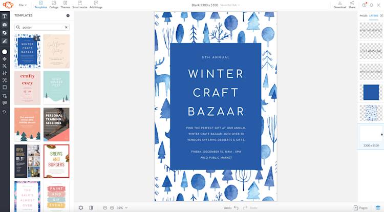
Designing a poster from scratch can be overwhelming. PicMonkey simplifies the poster-making process with stunning templates to choose from—simply head to the Templates tab at the top toolbar and type in keywords such as “poster” to jump-start your poster design.
Additional poster inspiration
For additional poster-making inspiration, search more specific keywords in the Templates search bar, such as “holiday”, “summer”, or “botanical.” Even if the template isn’t exactly catered to your event or message, you can always tweak the graphics, background, fonts, and colors.

Make this holiday sale poster template your own.

Make this Earth Day poster template your own.

Make this summer cookout poster template your own.
Step 3. Customize copy and details
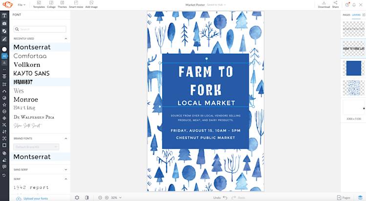
Choose fonts that are easy to read from a distance. Use script and handwritten fonts to a minimum and opt for sans serif, serif, or display fonts instead.
After you’ve chosen your template, click on the text layers and get to work! Type in the specific copy for your poster, then head to the Text tab and select from PicMonkey’s pro library of fonts.
When designing a poster, readability and legibility of your copy is key. There’s nothing worse than attracting viewers to your poster, only for them to be unable to read what is printed on the poster. Keeping this in mind, choose more legible fonts in serif, sans serif, or display styles over more ornate script or handwriting styles.
Step 4. Import or add imagery
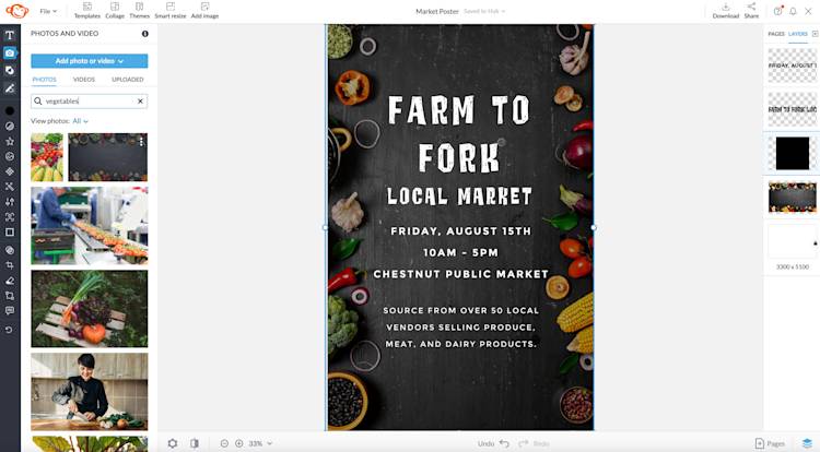
Choose backgrounds and graphics that don’t interfere with the readability of your poster.
Next, head to PicMonkey’s Graphics library for editable illustrations, or head to the Photos & Video library for high-quality stock imagery from Shutterstock. Each library has carefully curated and professional imagery fit for any poster needs.
The imagery used in your poster conveys the context of your poster. If you’re promoting a farmers market, using depictions of vegetables and fruit communicates the local market aspect rather than an image of a person carrying a shopping bag. If you were to see your own poster from afar, is the imagery consistent with the headline and copy details? Keep this in mind when making your poster.
In addition to choosing an appropriate image or graphic that fits the theme of your poster, always choose an image that won’t interfere with the fonts you have chosen. Rather than using a busy and overly-detailed image, opt for simply imagery that packs a punch and gets the message across.
Step 5. Customize color scheme and fonts
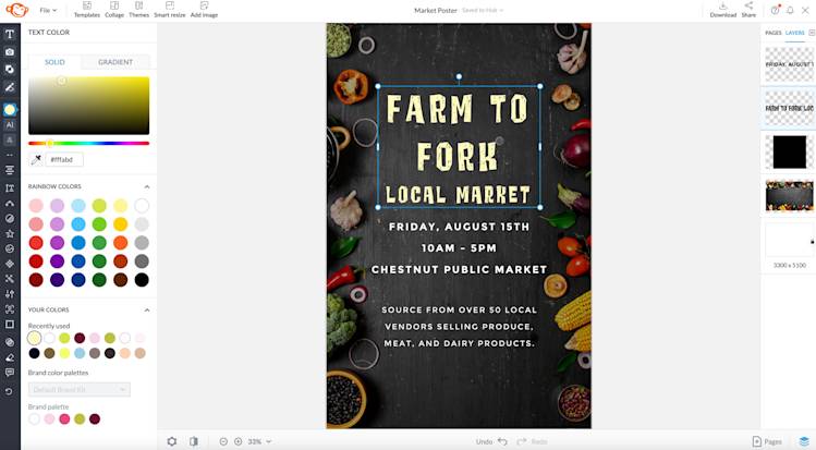
Make your poster’s headline more visible by giving it a contrasting color from the poster background, such as neon yellow against a charcoal background.
Last but certainly not least is injecting color into your fonts or graphics. While the light at the end of the (poster-making) tunnel is almost near, it’s crucial to not skip over the importance of color choice in your design. After all, color psychology is an important component of our decision-making process.
Assess the elements you’d like to edit the colors of, select them one at a time, and go on over to the Color picker tool. Select from an array of default colors or conjure your own colors by moving the color picker around or by entering your own hex code.
While it is tempting to use color for every component of your design, tone it down a notch by sticking to two or three colors—it has more of an effect on your audience than using five or more different colors.
Step 6. Download and share
Once you’ve finished your poster masterpiece head to the Download button at the top toolbar and save as a JPG in High Quality. Share your event or message with the world and keep the poster’s locations in mind when printing them out.
If you’re a Pro Subscriber and are exporting to PDF to send to a print shop, toggle the printer bleed marks by clicking the Settings icon in the bottom toolbar and then going to Alignment > Show bleed marks.
More expert poster design tips
While the steps to making a poster are straightforward, what are the key takeaways and design tips you can keep in mind for future designs?
Establish text hierarchy with color, size, and font styles

Make this sale poster template your own.
The text hierarchy of your poster makes a huge difference on how your poster is perceived. In a poster (or flyer), the heading of your event or message is read initially, then important details such as date and time and contact information, and then the accompanying information about the event or message.
The text within your poster should also be fully legible from a few feet away. At a minimum, set your body copy to 24 point font. Viewers should be able to read your smallest text from a few feet away. The heading or title of your poster should be at least 50+ point font size, depending on your poster’s width and length.

Make this blues music poster template your own.
Another way to establish textual hierarchy is to incorporate color or change the font style for important information.
Get your message across quickly
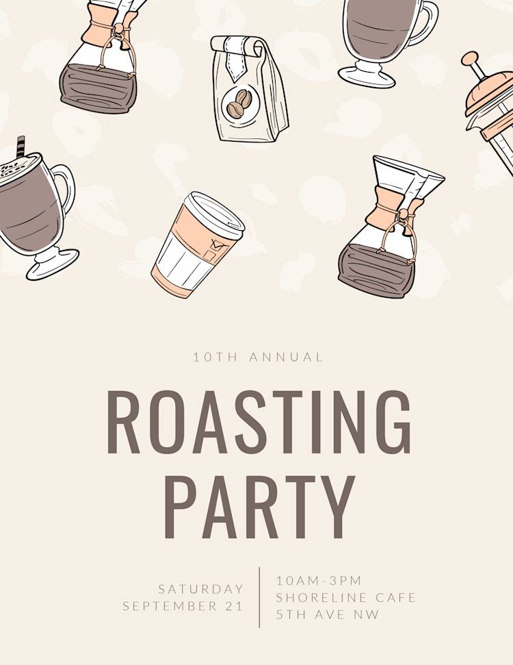
Make this coffee poster template your own.
There’s nothing worse than reading lots of fluff without any key takeaways. Keep your poster copy simple and give your target audience what’s truly needed: a title, a date and time, contact information, and a concise sentence or two about the event or message.
These templates below contain text that is both actionable and simple.
Use quality paper for best results
Posters are a powerful way to market your event or message because they’re tangible and viewable to large amounts of passersby. Another way to step up your poster-making game is by using a high-quality printer and paper.
The poster-making process doesn’t quite end after designing the visuals. Printer ink and paper can also contribute to how your poster is perceived. For example, a poster printed with low-quality ink on a thin piece of paper appears less professional than one that is printed on high-quality cardstock with professional-grade printer ink.
For best results, consult a local print shop with the resources to make your poster stand out amongst others. After all, they’re the experts on handling printed designs and can often give you the best advice based on your poster-making needs.
