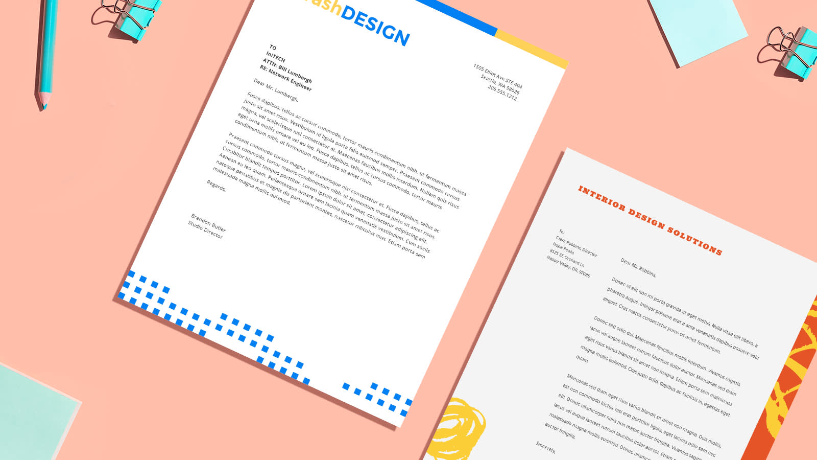
When most people hear the words business marketing, they think, Oof, that’s gonna cost me. It’s true that paid ads, website design, and marketing directors can overwhelm any budget. Not to fear – we’ve compiled ten amazing letterhead design ideas to help you leave polished impressions with your clientele.
Let’s do this.
Top letterhead design ideas for any business
Image is everything in business. Today, one bad review can cost a company its reputation. Whether you’re a new booming startup or looking to revamp your vibe, letterheads have several benefits. They:
Demonstrate professionalism
Provide company logistics (name, phone number, location)
Introduce the company’s logo
Leave lasting impressions
Increase client engagement
There’s no easier way to self-promote than with self-made letterhead designs. While most pitch DIY as the solution to budgeting concerns (and that’s legit), we also know that you know your business best! So? Get crafty with letterheads and brand your materials with unparalleled themes and styles. Use ‘em for the following:
Formal letters or announcements
Envelopes
Stationery paper
Press releases
Contracts
As is true for commercial marketing, brand awareness and recognition come from constant exposure. These letterhead design ideas were made with you in mind, so give them a look!
1. Slick color palettes
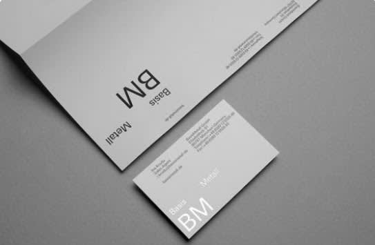
Image: Gino
Sport your brand with logos, colors, graphics, and slogans. Together, black, white, and grey are a classic and easily interchangeable color combo.
As shown above, you can make half of your cards with white lettering and half with black. Do the same with your lettered stationery. Then, pair opposite colors together so your client gets a taste of each. Classic colors promise professionalism.
2. Standout graphics
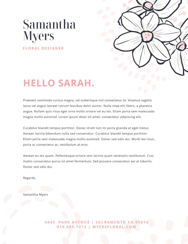
Love this letterhead design? Make it your own in PicMonkey!
Graphics can be the focal point of your letters, so choose wisely. They also help the customer know why you’re reaching out. If you don’t already have a graphic logo, make sure your chosen graphics rep the biz in some way.
Pro Tip: Coordinate graphics with your background. For artistic, creative, and visual companies, consider abstract background designs, shapes, and colors to engage your demographic. For corporate, tech, and analytical companies, consider solids and textures.
3. Letter your envelopes
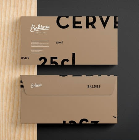
Image: Mu
To humankind, it’s what’s on the inside that counts. Here? The outside mirrors the inside.
Gone are the days where boring, white business envelopes are superior to lettered ones. In business, all blank space is a chance to market yourself, so why wait for folks to open their mail to learn who you are?
In a world of spam and auto-recycled junk, make sure your mail gets opened with a declarative color, logo, and/or standout details.
4. Stop in the name of fonts
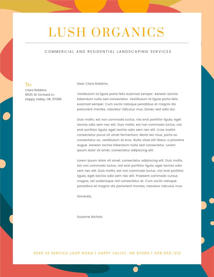
Love this letterhead design? Make it your own in PicMonkey!
These letterhead design ideas are here to assure you there’s not just one way to prompt customer engagement. Truthfully, you may not always know what will resonate – especially if you’re just starting out (or starting over).
Fonts are a great place to start, as they go hand-in-hand with brand recognition. Avoid eyesores with PicMonkey’s countless font options. Or, learn how to upload your own font to match your business’s branding.
Pro Tip: No business ever captures a market forever. Exploratory, playful, and curious mindsets are best when doing something new. Treat every acceptance and every rejection as critical feedback.
5. Funky envelope flaps
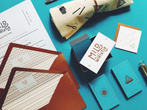
Image: WE AND THE COLOR
Consumers respond to well-thought-out products. Envelope flaps are the first thing people see when opening mail, so use them to your advantage! Logos, funky designs, or bold contrasting colors enhance the mail-opening experience.
Top-notch marketing comes from revolutionizing the ordinary. Turn simplicity into surprise and you’ll have customers for life.
6. Display info wisely
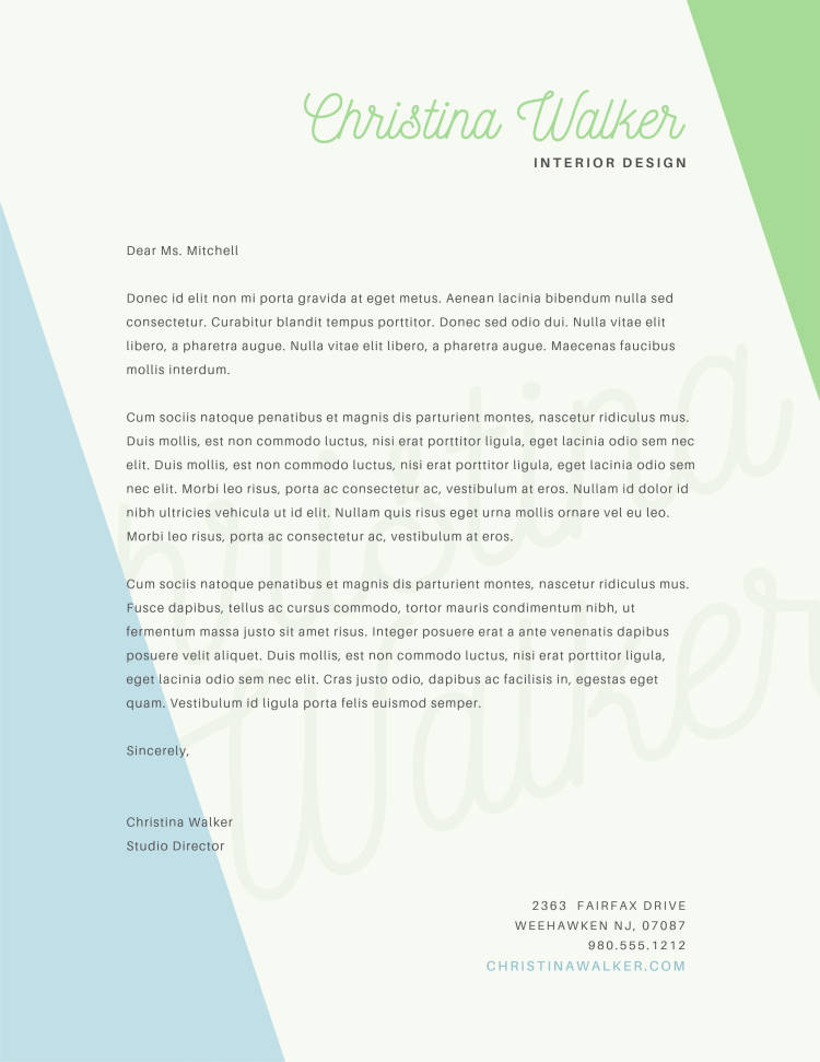
Love this letterhead design? Make it your own in PicMonkey!
Not every piece of paper has to include all of your business info, so consider where to put it. Maybe a business card has your name, title, location, and phone on it, but a formal letter only has your logo.
While effective marketing balances colors, graphics, and logos, offering too much info in a too-busy way can steer people off. Keep folks close with the right amount of info and empower them to feel as though they’re finding you.
7. Primp up the paper quality
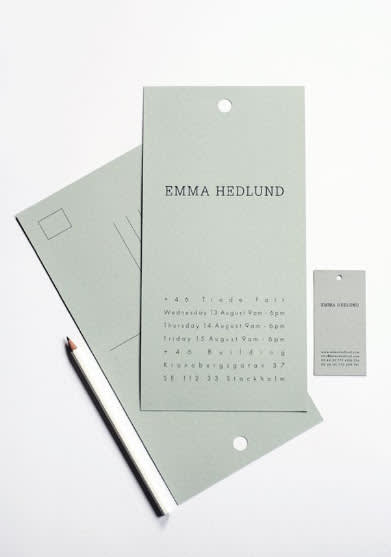
Image: Aesthete Creator
Believe it or not, the quality of your paper matters. Flimsy paper reflects a flimsy business. Strong paper, strong business. Whether your clients have never met you before or you have a long-standing relationship with them, consider card stock, matte stock, or pasteboard for a long-lasting impression.
8. Weigh the white space
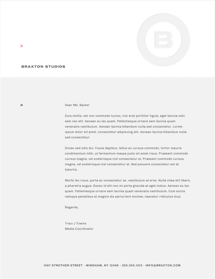
Love this letterhead design? Make it your own in PicMonkey!
Did you know you can influence someone’s mood and behavior based upon the colors you choose? That’s why marketing pros pair color psychology with symbolism to sway the subconscious.
While colors matter, the absence of colors matters equally. Use white space strategically. It lets consumers break from and digest the overall message. Yet, too much space can translate as boring, cold, or forgettable.
9. Letters as logos
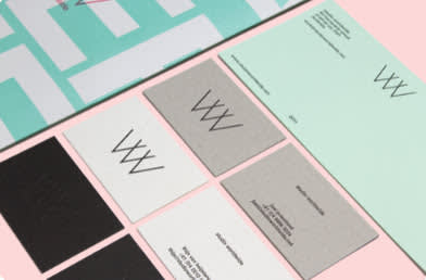
Image: Linda Truong
We trust you know by now that the perfect letterheads balance letters, logos, graphics, text, fonts, and colors. No big deal. BUT! You have oh, so many options with PicMonkey. We’re never gonna tell you it’s gotta be this one way. You’re free birds, friends.
We do have suggestions, though. You can pull a two-for-one with letters that make a logo. This way, you’re not restricted to a color scheme and can apply your logo to all colors. Decide what your central focus should be to pack the biggest punch.
10. Shape it up

Love this letterhead design? Make it your own in PicMonkey!
Letterhead designs don’t have to be busy. Simplify yours with basic shapes to rep your logo. Remember, you only have a select amount of space to state who you are, why you’re reaching out, and how to connect. The aim is to be approachable but professional, friendly but poised.
Pro Tip: Your letterhead design ideas might not come all at once. If you’ve been in business for a while, scope out the marketing materials you already have. No need to start from scratch – get inspired by what’s in place and go from there. If you’re new, consider your message and mission. Which colors, graphics, and text will best introduce you?
While letterheads are valuable for business, they’re also a necessary mode of play. Putting in the time to find the right aesthetic might just be your best investment and one that lasts its lifetime. So enjoy the process!
Letterheads are like a stamp of approval for each piece of paper you send out. Uniformity and consistency create brand recognition. Brand recognition boosts business. Increased business fuels business image. Business image lasts forever.
Okay, time for you to do the thing! Take these classy letterhead design ideas as inspo and hop into PicMonkey to make your own. Start with one of our letterhead templates, or DIY from scratch with a blank canvas. Rock out and don’t forget us once your millions start rolling in!
