PicMonkey's on a site improvement jag, fine-tuning how the site works, based on your feedback and our hopes of making your image editing experience better than you thought it could be. As we roll out changes, you can bet you’ll find updated info right here.
Tip: If you're looking for targeted info on a site feature, do check out our Help articles — they're right there under the Learn button in the top toolbar, and they're organized by category. As always, contact our knowledgeable support team for additional assistance.
October 2021
Pop-up palettes now *officially* in the side tabs and side panel
In March we announced big improvements to the editor screen, with pop-up palettes shifting into the side tabs and side panel. This change has been optional for a while, but now it's *officially* permanent.
We've heard great things from those of you who've worked sans palettes, and we're happy that the change has made workflows more efficient. So what's actually different? All of the features, buttons, and functionality you've come to know and love on the palettes are all still there — just glance to the left!
As always, reach out to us if you need a hand getting started on a project.
July 2021
Access help content as you design
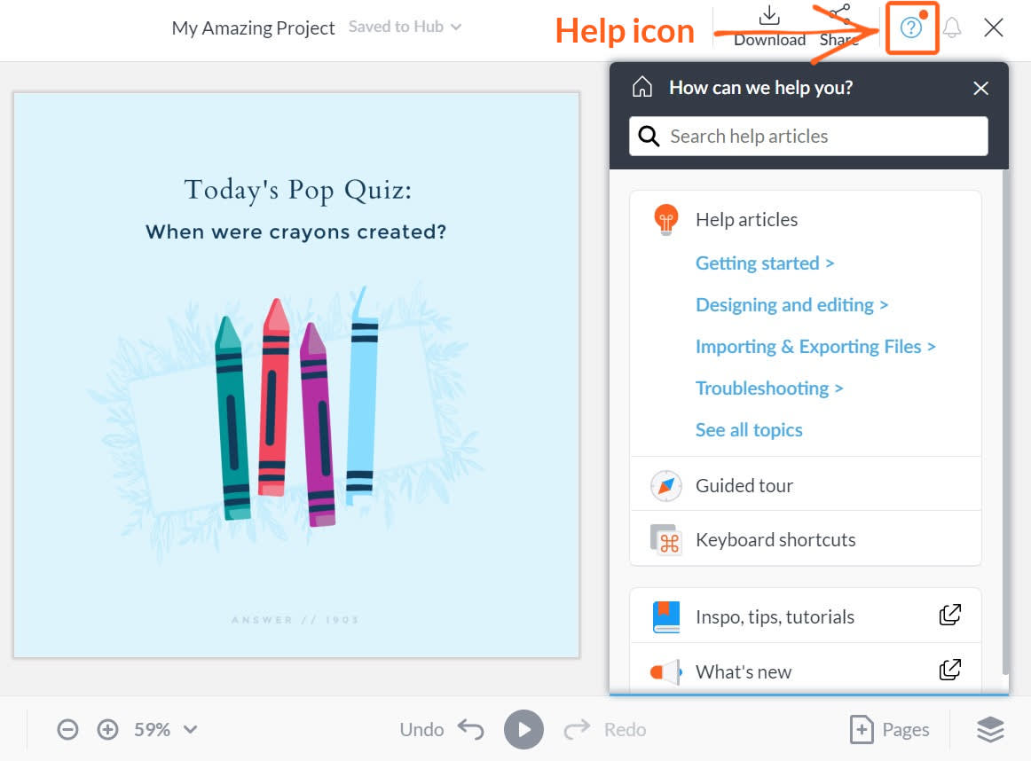
Click the question mark symbol to open the Help menu in PicMonkey.
Here’s a nifty update to help you continue to work efficiently and make the best designs possible: access our vast help content library while you're editing a design in PicMonkey!
Why? Our help content will always live here, but if you don’t have time to scan content before designing or, even more common, a question arises while you’re creating something special, we want to help any way we can. To access help content in PicMonkey, just:
Click the Help icon (circled question mark) on the right side of the top toolbar.
Browse available content, or search by keyword, phrase, or question.
Hover your mouse over an image in an article and it will expand on your screen.
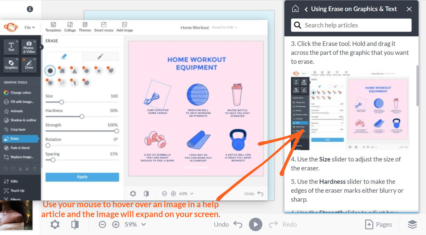
Use your mouse to hover over an image in a help article and the image will expand on your screen.
Anytime we update our help content, it’ll be available to you inside and outside of PicMonkey. If you can’t find an answer to your question, our support team is always here to help.
Grouping tools by functionality
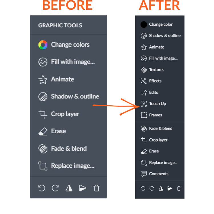
Earlier this year, we implemented big improvements to the editor screen by moving pop-up palettes into the side tabs and side panel. Now we're doing just a bit of refinement. Nothing too serious, so don't sweat it if you've just gotten used to the new look.
We're regrouping our tools in a way that helps streamline your work even more and lets you make the most out of all that PicMonkey has to offer. Previously you'd see a 'menu' after clicking a layer in your design (Background Tools, Image Tools, Graphic Tools, etc.). Moving forward, you'll see all available tools for a selected layer, grouped by functionality.
In our above example, the former Graphic Tools menu has been combined with other tools you might find yourself using as you design. Same tools, just a slightly different look.
Why am I not seeing these changes? You might not have switched to the palette-less mode yet. In PicMonkey, look for the message box on the bottom left side and click Show me to get started.
March 2021
Pop-up palettes moving to the side tabs and side panel
We're making some big improvements to the editor screen—namely, moving the pop-up palettes into the side tabs and side panel. Why? So you have more room to work without pop-up palettes getting in the way of your design. All the features, buttons, and functionality you are familiar with now on the Text palette, Image palette, Graphic palette, Background palette, and so on will still be there—you just need to look left.
This change isn't permanent yet. You can opt in to give it a try and to get used to the new layout because we know it's a big shift for your usual workflow. You can also opt out for a limited time before we 100% implement the change. We are confident, though, that you'll be a fan after taking it for a spin and experiencing working in PicMonkey without the pop-ups getting in your way.
Templates, Collage, & Themes in top toolbar
Note that Templates, Collage, and Themes, which were once in the side tabs on the left, are now located in the top toolbar.
Opting in to try the new editor changes
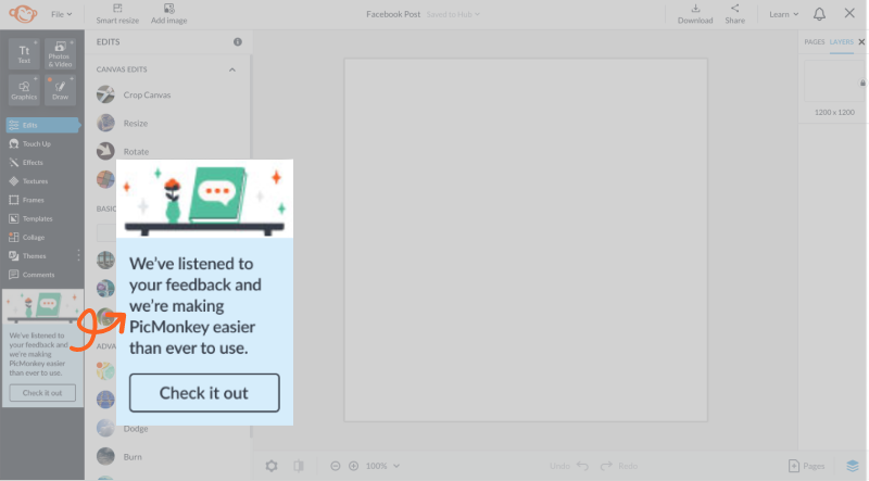
In order to give you time to adjust, we're enabling opt-in and opt-out for the changes to the editor during this phase of the rollout. Check it out, then click the I want this button to opt in. If you want to opt out and go back to the old layout after trying it, go to the Learn menu in the upper right corner and click Palette mode.
Have questions or concerns? We're here to help so please get in touch.
February 2021
Tab column & top toolbar restyle
A before and after of the recent tool bar changes. Everything is still where you expect it to be, it's just laid out a little differently.
We've restyled the top toolbar and the left tabs column in an effort to make way for upcoming improvements to the editor functionality. We know that change can be frustrating and potentially disruptive of your workflow and our intention is to minimize that by keeping you informed as we remodel, while easing our valued users into the forthcoming changes little by little. You'll find all the info here and in the Help & Support section, as always.
The end goal is to relocate all the free-floating palettes (Image, Graphic, Text, etc...) into the side panel in order to make the workspace less cluttered. We will keep you up to date on the improvements, and you'll have a chance to try out the new interface soon.
January 2021
Choose Fit to cell or Fill cell in the Collage tool
The Collage tool has been updated to offer two options for placing an image in a cell:
• Fill cell: This option is the default when you place an image into a cell. The image will automatically size to fill the cell's boundaries. Use the Size slider to zoom in.
• Fit to cell: This option will display the entire image inside of the cell. Use the Size slider to zoom in.
To adjust the cell size, use the handles on the cell's border and drag to increase or decrease the cell. The image will resize accordingly in the cell.
Learn more about using the collage tool: How to Make a Collage
Create subfolders for your private Hub folders
What’s different?
All subscriber levels now have the ability to create subfolders in the private, “Your Hub Folders” section of Hub for better organization of your files. Before this change, creating nested folders was only possible in the “Shared Hub Folders” section of Hub.
If you created subfolders in the private folders section, but did not share them with anyone else, those folders will now appear up above in the private section. If you created shared folders and shared them with others, they will remain in place.
Why the change?
We noticed that many Hub users were creating subfolders in the shared folders section for better organization of their private files, while not actually sharing the contents with anyone else. We enabled the addition of subfolders in “Your Hub Folders” because it was a feature we saw that was needed, and one that many people asked for.
Read the Help & Support article for all the details: Private Hub Folders: Creating Subfolders & Sharing
December 22, 2020: Shine Reduce and improved Skin Smoother
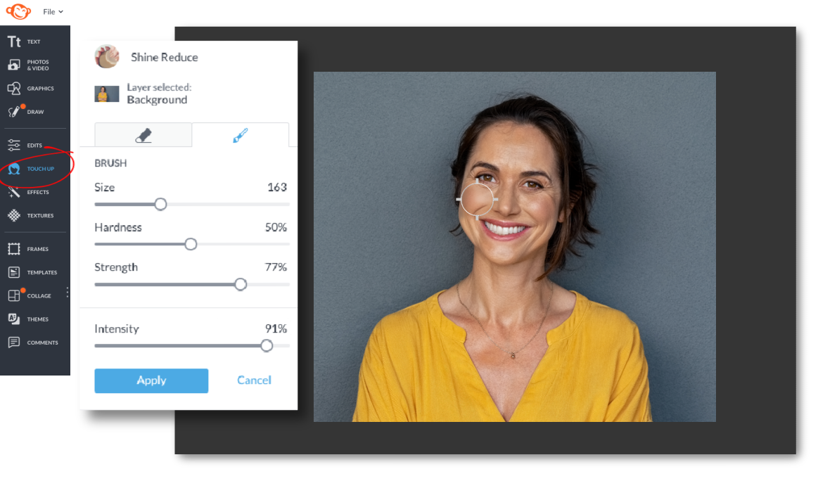
For long-time PicMonkey customers, Skin Smoother (formerly Wrinkle Remover) is worth a fresh look. Some of you told us that it's too subtle, so we amped it up to give you more control. Find it in Touch Up.
And back in town is the beloved Shine Reduce. Sure, it's fashionable to have a glowy shimmer on your cheeks, but sometimes you want a dialed-down matte and we're here for it. Give Shine Reduce a try!
December 9, 2020: Drag to select layers
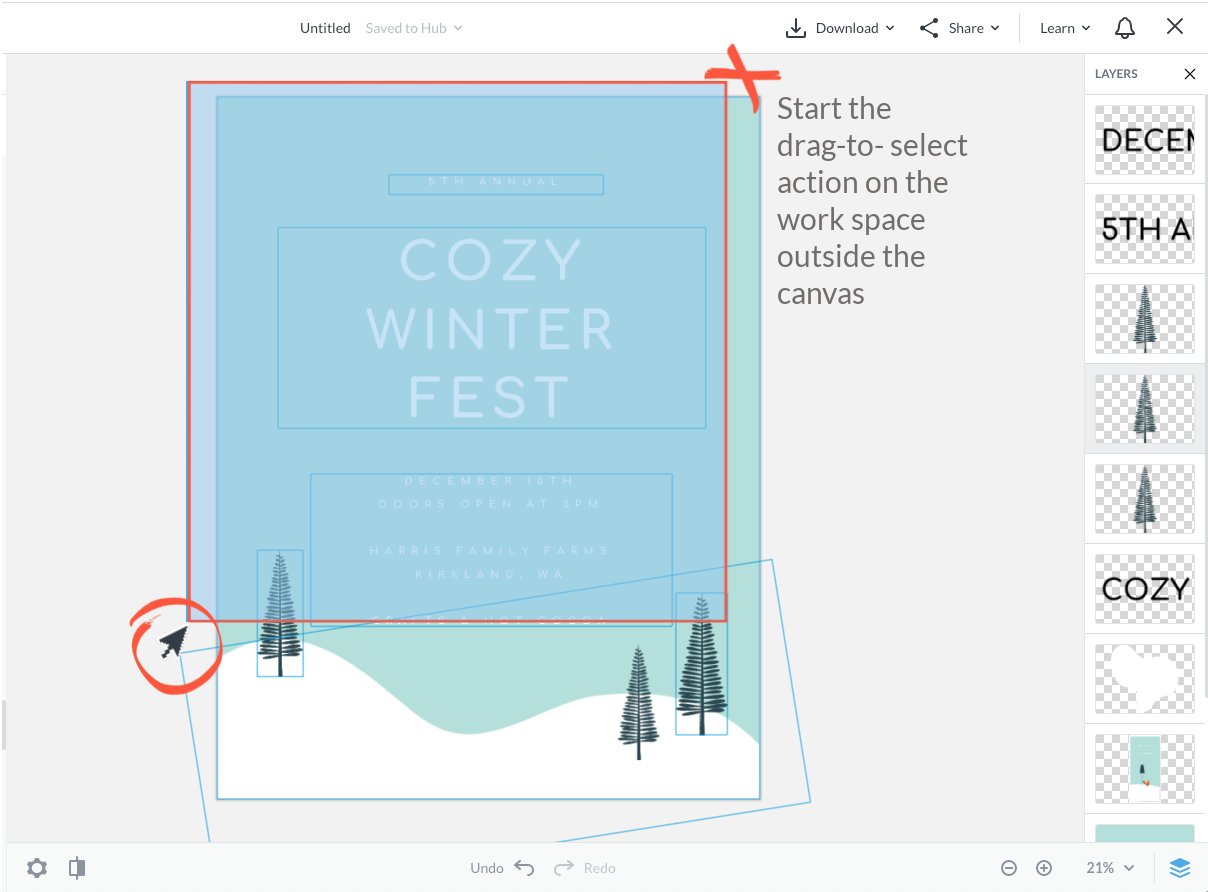
We've just added a new capability to PicMonkey: drag to select layers. If you want to select multiple layers on your canvas quickly, you can drag a selection box over the layers you want.
Start your drag-to-select action either by clicking on the work space outside the canvas, or by clicking on the background layer of your canvas. Release the cursor when you've selected the layers you want. Use the Multiple Layers palette to adjust your selected layers, or apply effects, textures, or edits.
Read more: Drag to Select & Panning | PicMonkey Help & Support
November 2020: Layers palette is now the Layers panel
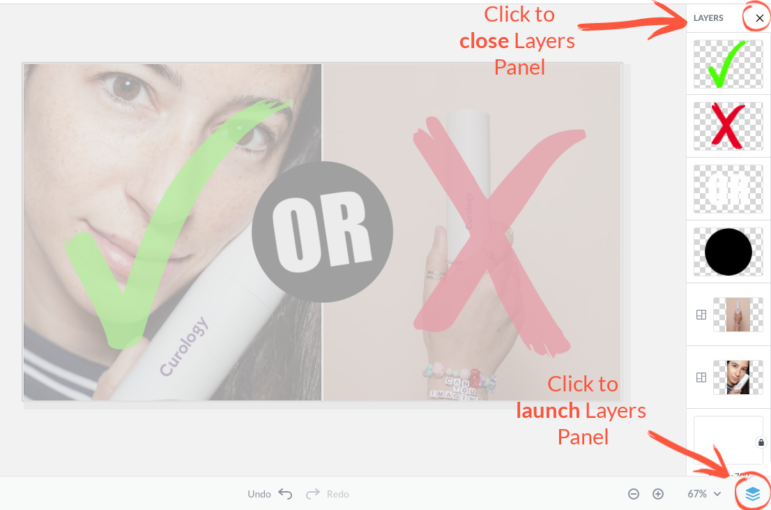
We designed a new Layers Panel to take up less space than the old layers palette, especially for smaller screens.
Learn the details: All About the Layers Panel (formerly the Layers Palette)
Thursday, June 18: Streamlined navigation in the editor
What’s different?
We’ve cleaned up the top and bottom navigation bars, added a File dropdown menu to consolidate the file functions like Create new and Edit a copy, made the editor window “closable,” and moved a couple of the bottom navigation palettes into a single Settings icon.
Why the change?
To make more room for editing to provide to a cleaner, sleeker aesthetic in line with other modern-day software programs.
A sleeker top navigation menu
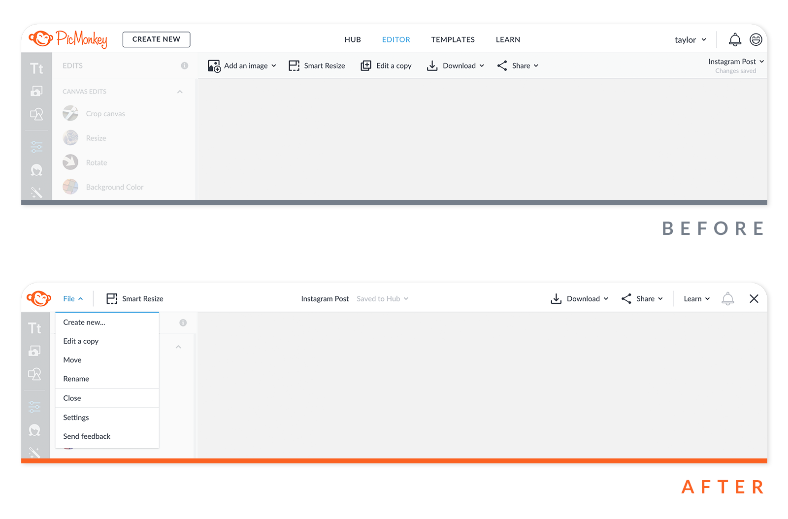
Perhaps the first big change you’ll notice is that the old navigation menu at the top of PicMonkey is now gone. Don’t be alarmed! All that stuff is still right at your fingertips, just tucked away a little better so that you have more room to work.
Top navigation bar
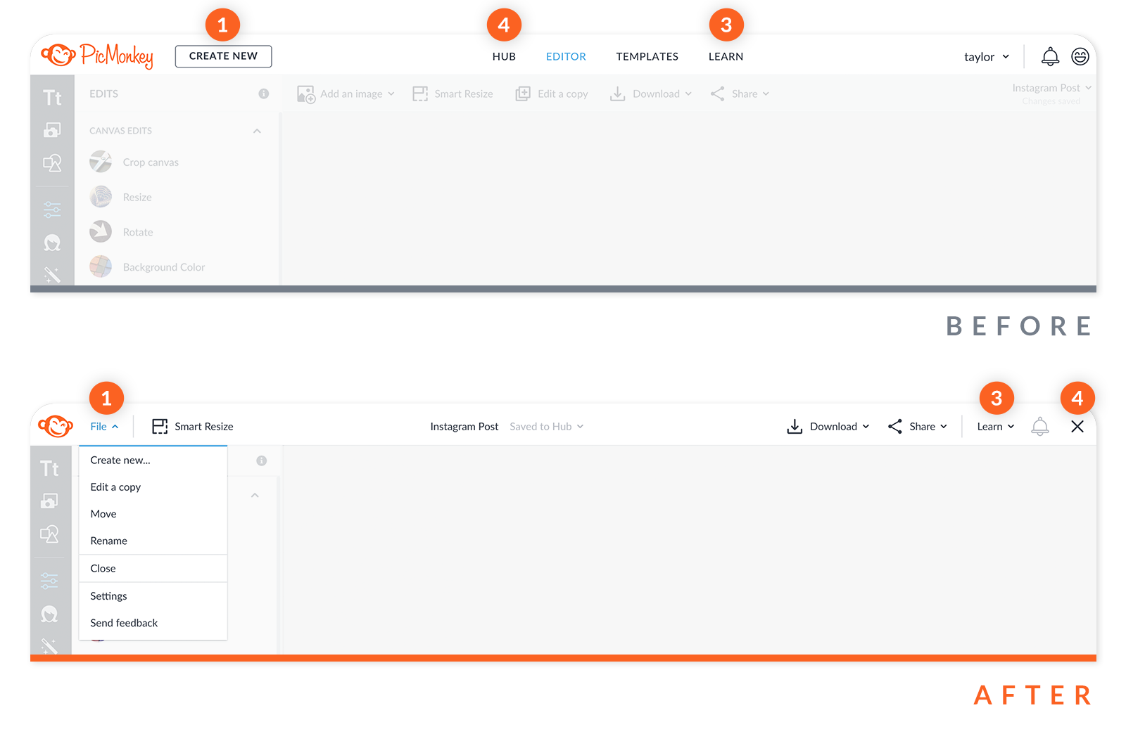
The CREATE NEW button is now in the File dropdown menu. (see #1 below)
HUB is accessible by simply clicking the “X” in the upper right corner (see #4 below).
EDITOR if you’re not in the Editor, then you’re on your homepage. You seriously can’t get lost.
TEMPLATES are accessed from the left tools tab.
LEARN is now its own dropdown menu on the right (see #3 below).
Secondary toolbar
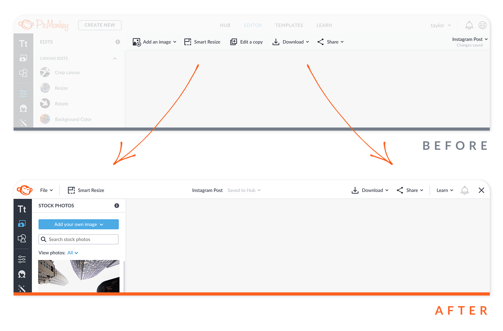
Add an image: Clicking on “Photos” in the left toolbar will show you the “Add your own image” button. From here, you can choose where you want to add a photo from.
Smart Resize: On the new navigation bar, over on the left by the File menu.
Edit a copy: Find it under the File menu (see #1 below).
Download and Share: On the new navigation bar, over on the right side.
Walk me through the new stuff
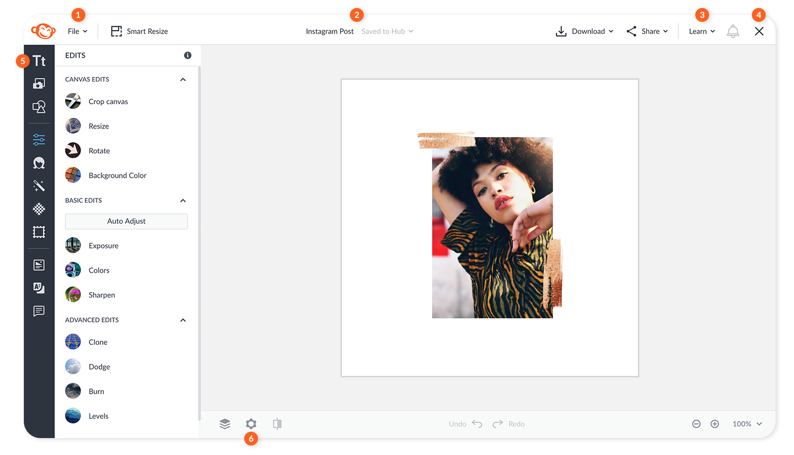
See the corresponding numbered sections below to learn what has changed in these particular areas of the editor.
1. File dropdown menu
The new File dropdown menu consolidates a number of functions that were previously taking up space on the secondary navigation bar. Now when you open the File menu you’ll find “Create new” relocated to here, as well as “Edit a copy”.
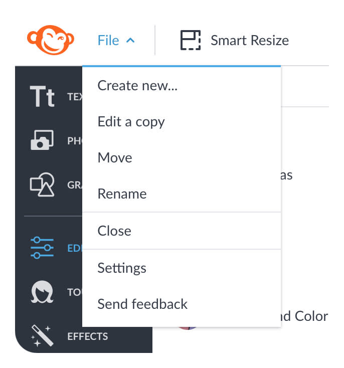
Also, you can move or rename your file from this menu without having to go to Hub. “Close” closes out the editor and returns you to the Homepage (see #4 below), while “Settings” launches the new “Settings icon” (see #6 below) where the Alignment & Grid, and the Workspace palettes are located.
2. File name & save status
The name of the file you are working on has relocated front-and-center on the top navigation bar. Here you can rename the file by clicking on the name. Clicking the “Saved to Hub” caret allows you to move your file into any of your folders, or you can create a new folder for your file.
3. “Learn” dropdown menu
We shifted “Learn” over to the top right and made it a dropdown menu so you can quickly find what you want to know in the blog or in the help sections. Previously “Learn” was on the top navigation bar alongside Hub, Editor, and Templates.
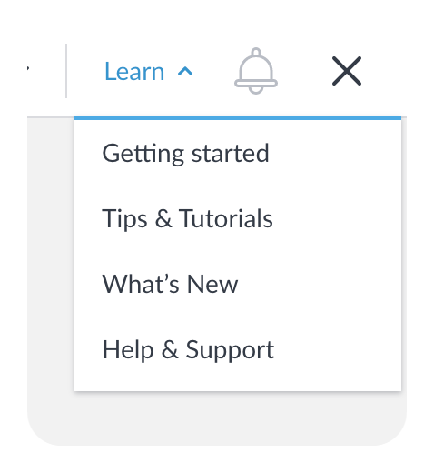
Getting started will take you to the PicMonkey 101 section of the blog where you’ll basic tutorials to get you up to speed.
Tips & Tutorials goes to the main blog page.
What’s New is the page where we announce new features like tools, graphics, and templates.
Help & Support connects you to our searchable help section where you can find answers about your account, technical difficulties, and how stuff works in PicMonkey.
4. “X” to close the editor window
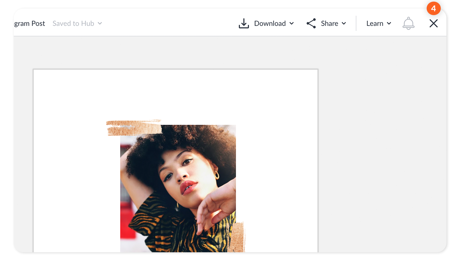
In the upper right corner of the editor window you’ll now see an “X” which will allow you to close the editor window, taking you back to the homepage where Hub is located. You can also close the editor window from the new File dropdown menu (see #1 above).
5. Collapsible tool tabs column
On the left of the editor are all your tools — effects, photos, graphics, templates, etc. — you can now expand and collapse this tabs column to make more room for editing. Just hover on the border until you see the two-way arrow cursor, then click!
6. Settings icon
On the bottom navigation bar in the editor we’ve done away with separate Grid & Alignment and Workspace palettes and instead combined them under one new Settings icon. Use these setting options to configure your canvas, and to customize the work area surrounding your canvas.
7. Account details on homepage
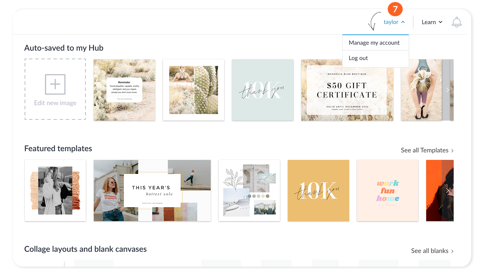
To see your current account settings like subscription level, billing status, and referral program progress, click on your name in the upper right corner of the Homepage.
Monday, May 11: Hub is now your homepage
What’s different?
Hub, your cloud-based storage system in PicMonkey, is not a separate destination anymore. Now when you sign in to PicMonkey, your Hub and your Homepage are one and the same. Easier, right?
Why the change?
So you can jump right into your projects after signing in.
Let's walk through the new stuff
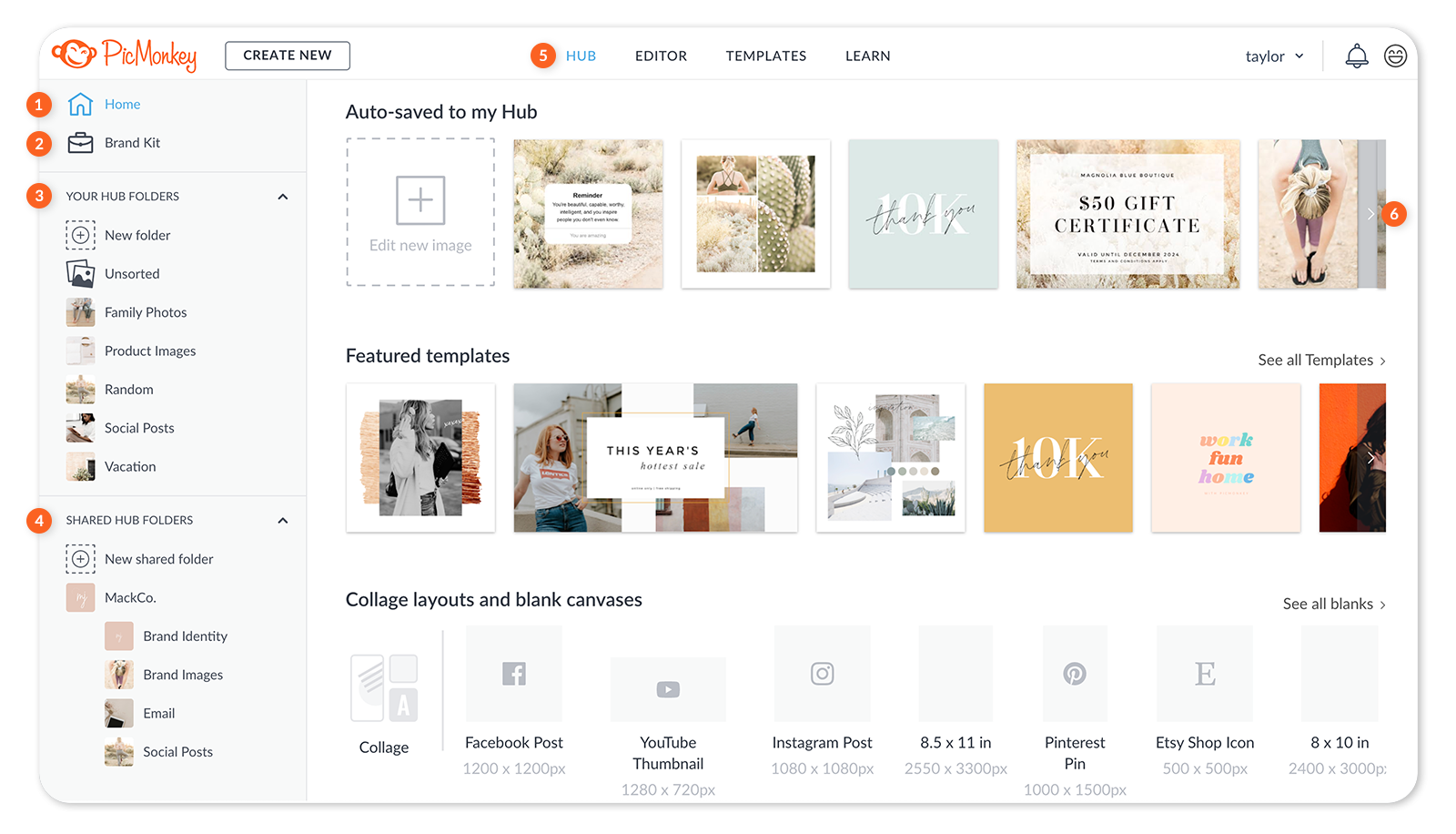
Check out each numbered section below to learn what is new and improved in the corresponding area of your new PicMonkey homepage.
1. The Home icon
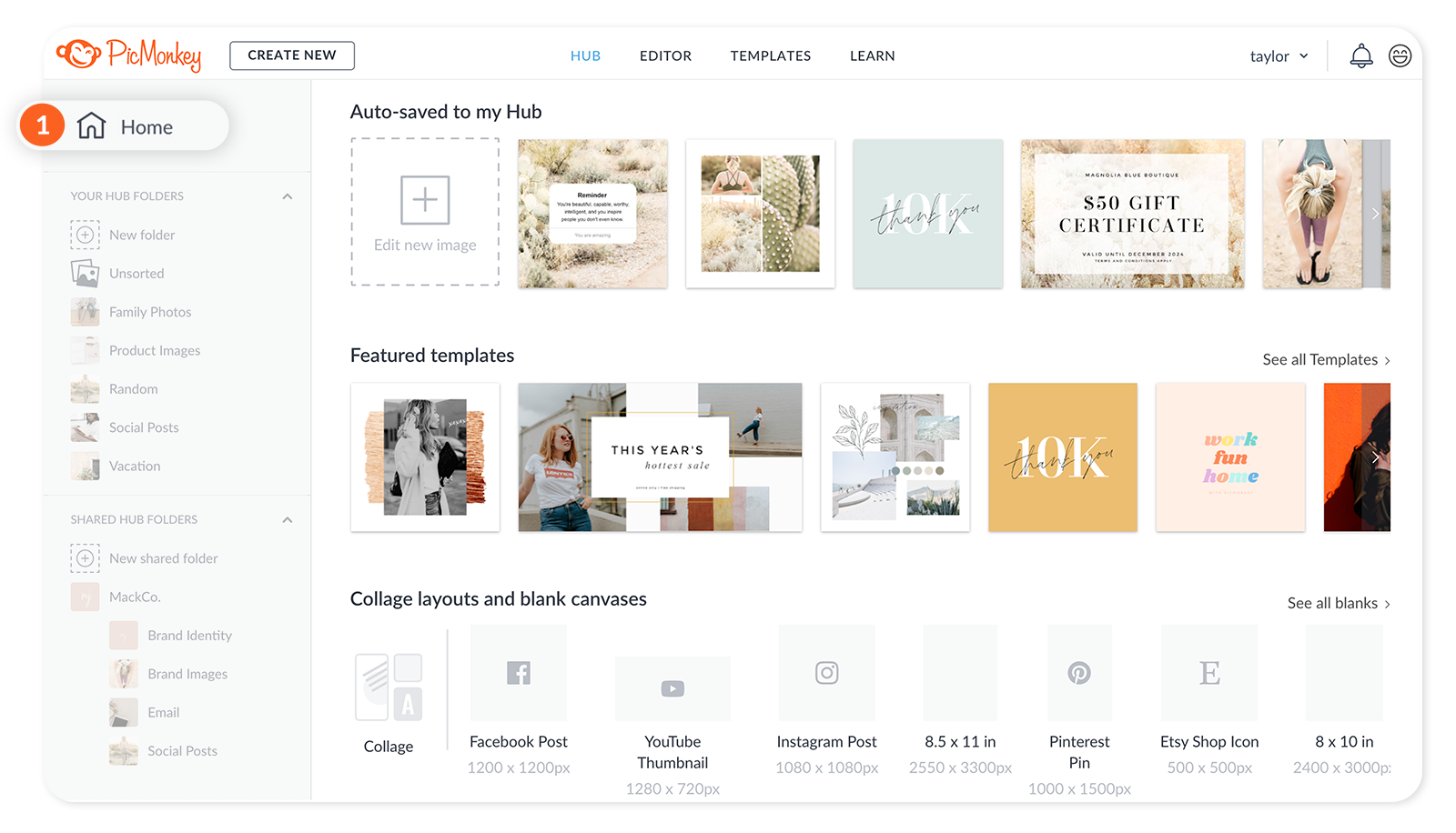
The Home icon is new to the top of the Hub menu. Click it whenever you are in your Brand Kit or in a folder to get back to the main Hub/Homepage. You’ll notice that the “Recents” folder is gone. All your recent projects are in the Unsorted folder, or accessible from the top row — “Auto-saved to my Hub”.
2. Brand Kit
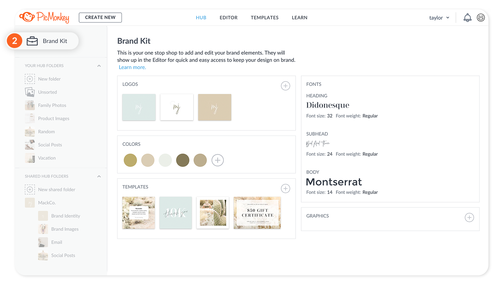
The Brand Kit icon lives at the top of the Hub menu for easy access. When you are in Brand Kit, click the Home icon to return to your main Hub homepage.
3. Your Hub Folders
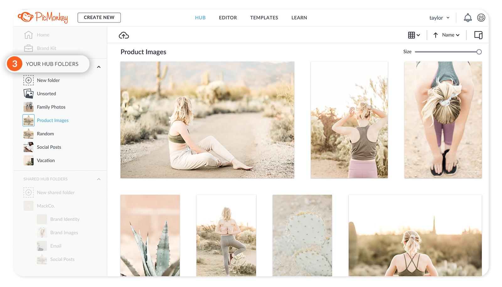
These are still your private folders, viewable for your eyes only. It’s easier to make a new private folder now — just click the “+” sign.
4. Shared Hub Folders
These are your shareable spaces, same as before. You can now collapse the Shared Folders section of the menu by clicking the “^” carat. So space saving!
5. HUB on the top navigation bar
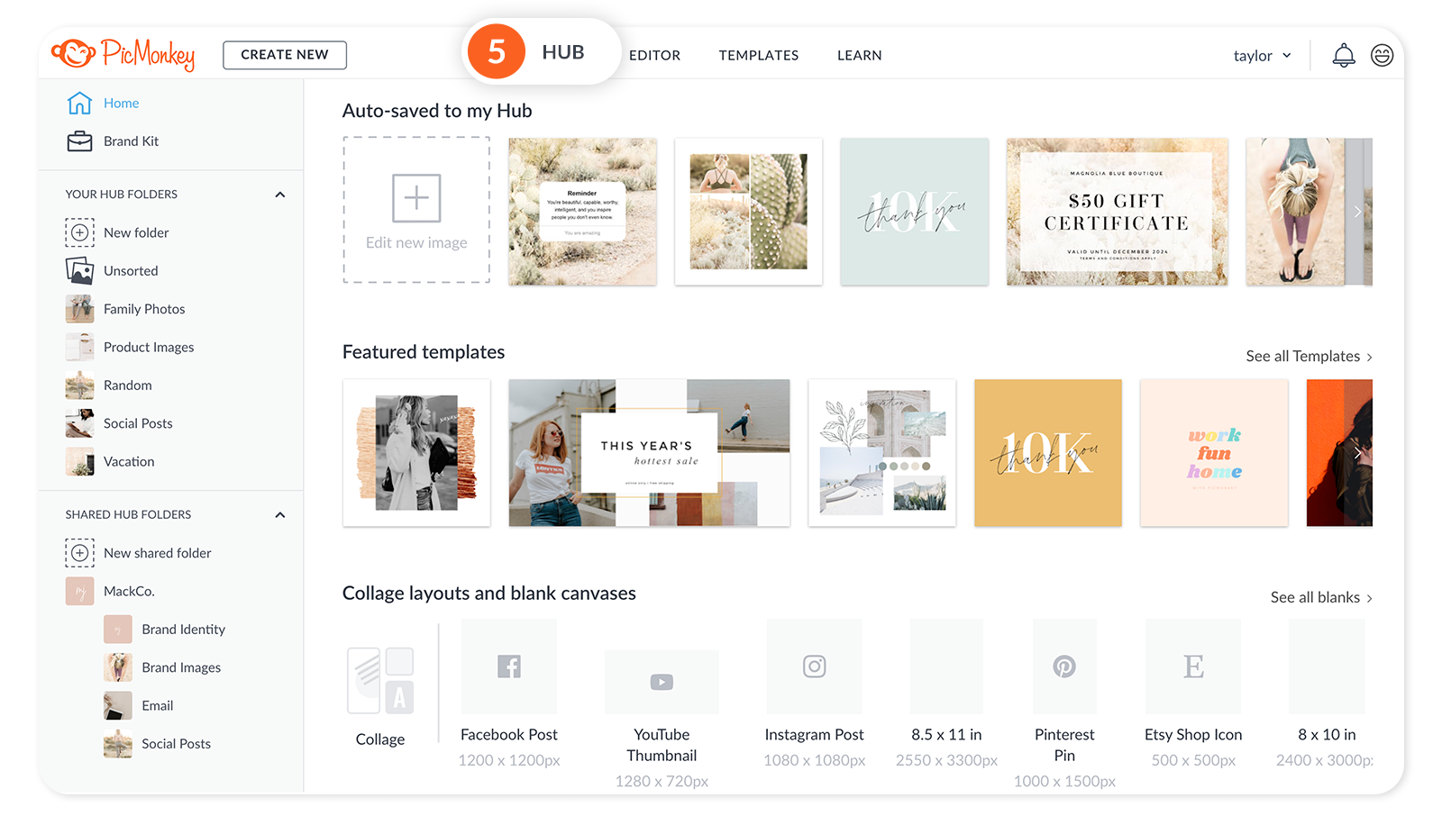
The Hub link on the top navigation still functions as before, but head’s up! With the improvements we’re making, you won’t need this navigation bar anymore, so it’ll be going away to make more space for designing. We will keep you posted.
6. Scroll arrows to view recent projects
Your recents will always be in this top row on your homepage. Click the ”<” and “>” arrows to scroll through your recent projects.
Notification bell tells you what’s new
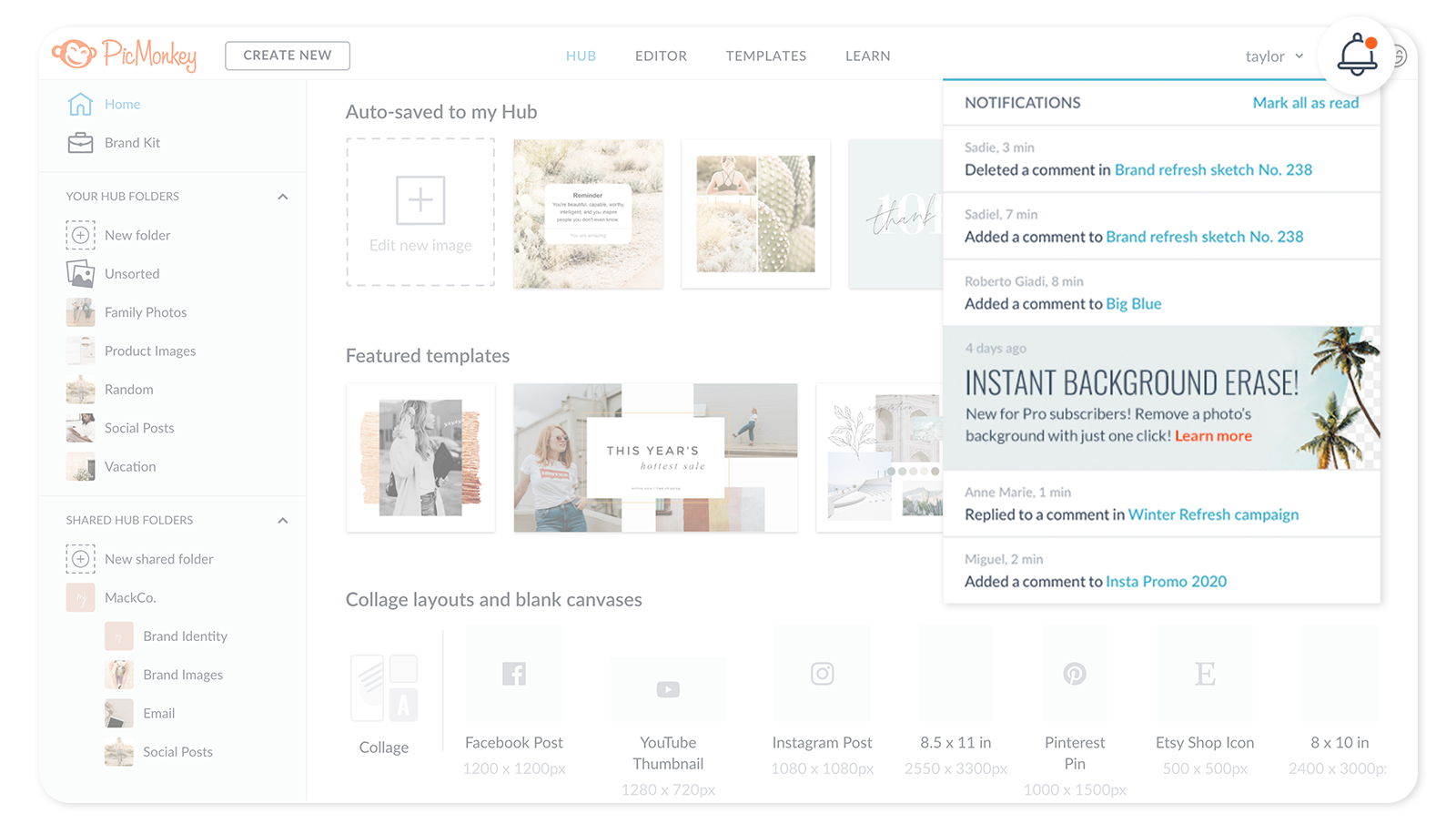
We replaced that huge right panel announcing new features with a trim little notification bell.
When we have something new to tell you, you’ll see an orange dot and you should definitely click it to find out what’s up!
We’ll let you know about new features and link you to tutorials on how to use them.
We’ll announce when we’ve made improvements to the site and link you to this page with further explanation.
And comments left on your shared files will still live here, too.
We’re always striving to serve our customers while adding powerful features to continually increase the value of your subscription. We welcome your feedback, so let us know what you think by clicking that little smiley face icon in the upper right corner next to the bell. Thanks for being a valued PicMonkeyer!
