
It’s true that you never get a second chance to make a first impression. Since thumbnails introduce the video to your audience, crafting a unique design can take your viewership from de minimis to infinite.
Today, we're diving deep into all things video thumbnails, why you need them, and how to successfully create them in just five minutes (or less!). Let's get to it.
What is a video thumbnail?

Love this template? Make it your own in PicMonkey.
Thumbnail is a term that originated with still images. It was initially used to refer to smaller versions of full digital images that could be viewed while browsing several images.
The term alludes to the small size of an image which is similar to the size of a literal human thumbnail. Therefore, a video thumbnail is a still image that functions as a preview image for a video.
Think of it like a book cover. It’s there to entice a viewer to watch your video. You might have noticed that your computer’s operating system uses thumbnails as well. For example, when you’re browsing the images folder, you’ll see that the images are represented in smaller versions of the actual files.
Think of a video thumbnail as a preview of the video and not as a smaller version of the actual video. It is more than that—but, similar to the still-image ancestors—thumbnails should provide an idea of what viewers will see when they choose to watch.
Why use video thumbnails?

Love this template? Make it your own in PicMonkey.
Thumbnails are change-makers when it comes to click rates. Why? For starters, they give your video a professional look.
A good thumbnail entices viewers to watch the entire video. Plus, they look professional and help you avoid YouTube or TikTok choosing one for you.
Having creative control over your thumbnails is what makes your brand, well, yours. Boost engagement with your brand message, fonts, colors, and images for an integrated preview of the video—and your brand.
Beyond those assets, having quality video thumbnails can help you:
Spread your message or content. Showcase your video with a thumbnail that sports a particular aesthetic, theme, and attention-grabbing title.
Increase rankings with video platforms like YouTube. Video thumbnails entice people to click through a video, keep watching it, and also watch other videos from your channel.
Rank on Google. Thumbnails ensure your videos stand out so that when a person searches particular keywords on Google, your video appears!
Build brand awareness. Become instantly recognizable with a strategic and branded look. Choose colors, fonts, and a logo that shows people exactly who you are and what you offer.
Highlight your most important info at once. Include your brand name, video title, and an engaging photo folks can’t pass up. Balance the text with the design and you’re set. (Or, make the text your design with neato text layouts, layers, text masks, and text effects.)
Provide a sound user experience. Don't waste time explaining the video. Simply let the thumbnail say it all for you.
Thumbnails have countless benefits to spruce up you channel, content, and brand recognition. Now, onto sizing!
Sizing guidelines for quality video thumbnails

Love this template? Make it your own in PicMonkey.
All online video-sharing platforms have guidelines on how to format your thumbnails. Knowing proper thumbnail aspect ratios will help you know how the thumbnails appear on a user’s screen. If they’re too small, they appear distorted and if they’re too large, they seem awkward.
Here are some guidelines on how to make a thumbnail for the different platforms:
YouTube thumbnail size: 1280 x 720 px with a width of at least 640 px. Use a 16:9 aspect ratio and no more than 2 MB. Upload as a JPG, GIF, or PNG.
Facebook thumbnail size: 1280 x 720 px max and 470 x 246 px minimum. Thumbnails smaller than the minimum will appear distorted. Have an aspect ratio of 1.9:1. The recommended size is 1200 x 675 px.
Instagram thumbnail size: 161 x 161 px with a max of 1080 x 1080 px and a 1:1 aspect ratio. You can also go for 1080 x 608 px with an aspect ratio of 1.9:1 or 1080 x 1350 px with an aspect ratio of 4:5.
IGTV thumbnail covers: 420 x 654 px and 1240 x 1920 px with an aspect ratio of 1:1.55 for square posts or 9:16 for full size. Select a JPEG file and go no more than 4 MB.
Twitter thumbnail size: 640 x 360 px with an aspect ratio of 1:1 or 16:9. The ideal size is 1200 x 675 px and should preferably match the video size. No more than 5 MB and upload in either JPEG, GIF, or PNG format.
TikTok thumbnail size: 144 x 144 px, at a max of 162 x 162 px. PNG is the move here.
Now, we know that's a lot of math-ing, but no need to stress too hard...
With PicMonkey, you can adjust specs as you go. Whether you start with a blank canvas or a YouTube thumbnail template, you'll have pre-made sizes at the ready.
Pro subscribers also have access to Smart Resize, our one-click canvas resizer that converts your thumbnail to match all platform requirements. Phew!
Simply having an idea in mind can save you time in the long run.
Top 12 video thumbnail best practices

Love this template? Make it your own in PicMonkey.
Since thumbnails are the first thing viewers know about your content, they gotta look sharp. Here are the top best practices to learn before you create a thumbnail on your own.
1. Introduce the video subject
Viewers should not be confused about what to expect. Provide clear expectations and a sneak-peek preview to keep folks coming back for more.
2. Include the video title
Quite simply, make it catchy. But steer away from clickbait! Short and sweet is always a green light. The title will either encourage or discourage someone from watching your video.
3. Bring out the brand
Introduce yourself. Who are you? What do you offer? Where else can people follow you?
While you don't have a ton of space to convey this message, consistent posting should give viewers a strong sense of your personality. Include your logo so folks can associate the video with your brand.
4. Be compatible for all devices
Keep in mind that people view videos from either a smartphone, computer, or tablet. Mobile device usage—as it pertains to video watching—has increased 233% (!!) in the last 10 years.
With ever-changing workplace dynamics and heightened remote work these days, we know people are scrolling content non-stop. Don't miss out on the dominant population—mobile device users.
5. Use emotions-based images
Utilize close-ups of faces that convey emotion. Prompting emotional resonance in audiences is the tell-tale sign of effective marketing. Create relatable experiences in one thumbnail image with a “wow” face, friendly smile, or mysterious demeanor.
Make it as authentic as possible. Viewers love authenticity. Just make sure it’s relevant to your content. You won’t regret it!
PS—this is a great time to take advantage of PicMonkey's endless stock photo library if you don't have images that come to mind. (More on this soon.) Visuals make or break so make yours count!
6. Post on the daily
Okay, well, maybe not daily. But consistently enough for loyal followers to expect up and coming video releases.
Pair a consistent posting schedule with a consistent brand look and watch those likes rise to the top. Consistency is what builds channels and increases viewership.
7. Take advantage of whitespace
Use whitespace to create a clean and professional thumbnail. The rule of thumb (literally) is that less is always more—even in design. Simple designs give off a feeling and look of excellence.
For a thorough breakdown of YouTube thumbnail mastery, be sure to check out How to Make a YouTube Thumbnail next!
8. Optimize PicMonkey's assets
Use color to make your image more appealing. PicMonkey’s background assets let you lighten up backgrounds, add solid colors or gradients, play with textures, remove backgrounds (for Pros), and more.
9. Craft your text
Optimize text with PicMonkey’s diverse text tools. Insert image fills, customize font properties, pair fonts together, play with typography, use Shadow & Outline, and so much more!
Whatever you design, feel free to consult this color theory tutorial to learn which colors will impact your audience the most.
10. Image selection
Emotions-based images don't mean much if you don't use clear, high-quality images, too. PicMonkey’s stock photo library is chock-full with millions of image options.
In the tool, simply click Photos & Video, type in a keyword, then click your favorite option. Drag and drop onto the canvas, then customize accordingly! You can also upload personal pics if you have ‘em. Once your images are on the canvas, use PicMonkey’s professional photo editor to adjust lighting, color, contrast, saturation, and more.
11. Avoid clickbait
As mentioned, clickbait is a big no-no. Some channels are notorious for using clickbait to attract views and followers, but they’re often dishonest and inaccurate.
While this may get folks to click on the video, your brand reputation may suffer.
12. Design for the first 20 seconds
The first 20 seconds of a video are your hook. Design accordingly. In fact, some digital platforms require that ads are even shorter than that to cater to the ever-dwindling attention span of humanity. *Sigh.*
If you're not feeling inspired by those first 20 seconds, reconsider your angle. Give viewers a glimpse of the crucial moments that add value to them so they can't help but click that Play button.
How to make a video thumbnail fast
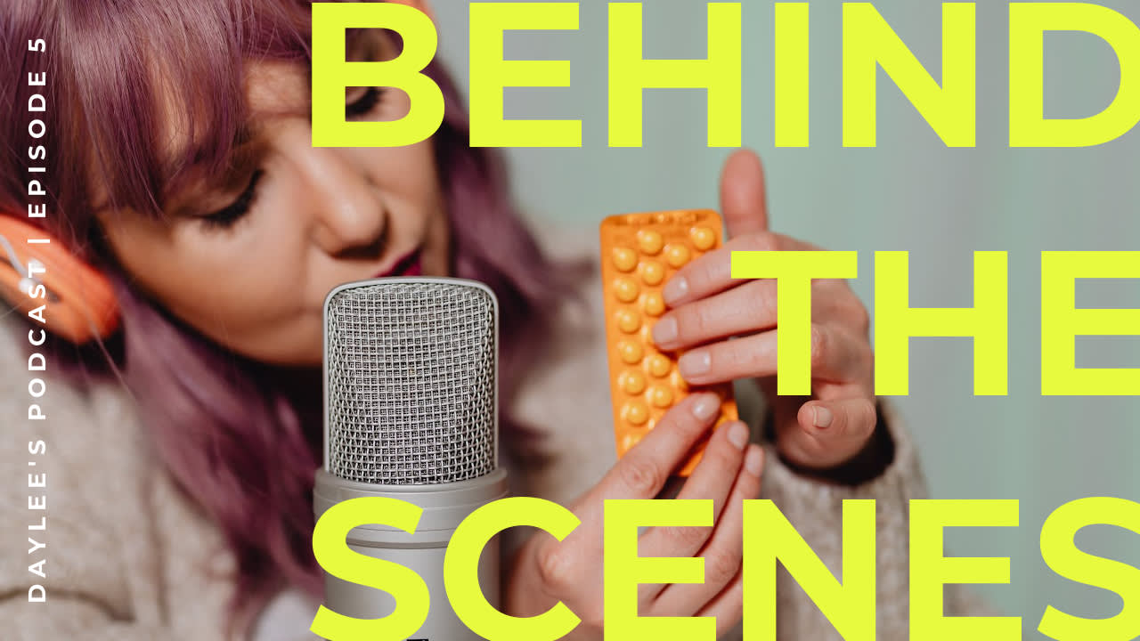
Love this template? Make it your own in PicMonkey.
Creating a video thumbnail doesn’t have to be complicated, especially with PicMonkey by your side. Follow these simple steps to successfully create and customize your thumbnail fast as fast can.
First things first, capture the image! Take still images by taking a photo or recording a five-second steady frame where you hold your phone over the image to then screenshot later. You can also strike a pose in your video. Do your finest!
Make sure you get several options for the recorded steady frames so that you can select the best one. If you choose to take a photo separately, you can use a self-timer to take a snap photo of yourself. Say cheeeese! Once you've got your image ready, choose a tool to customize your thumbnail. Of course, we're partial to PicMonkey's pre-set thumbnail formats and templates—totally free for you to try. Once you've picked your fave, simply:
Select or swap background colors and textures.
Edit your image with the Edits tab, then add effects.
Add text and text effects, then add any relevant graphics.
Download in PNG, PDF, or JPEG, then upload to your preferred platform! Easy.
Fine-tune the colors and additional elements. As you proceed with each step, you’ll notice tabs popping up for particular customization options. Follow each accordingly to achieve the look you desire.
Other unique assets include rotating images, drawing, clipping masks, or overlays. Let it be known that zero design experience is necessary, as PicMonkey happily meets you exactly where you are.
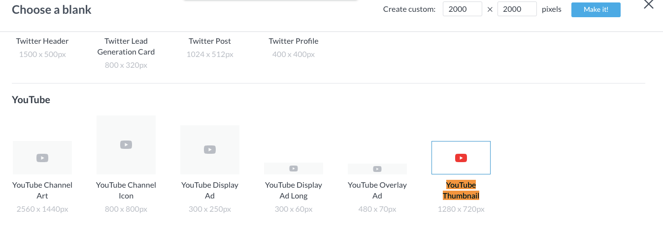
Blank canvas options are perfect for quick branding customization.
To find that pre-set size for the canvas, simply click File > Create new > Blank Canvas or Templates. For blank canvases, search (CTRL or Command + F) “Thumbnail” and click to open. Or, if you know your specs off-hand, type them into the Create custom toolbar, then click Make it!

Templates are easily customizable and inspiring if you need a place to start.
To find those ready-made templates inside the tool, start with any size. From there, type “thumbnail” or "YouTube thumbnail" into the search bar, or scroll to find the category.
Select your favorite, and start crafting! Note that the canvas will be instantly resized to match the thumbnail specs.
Once you’re done, export your thumbnail and upload it to whichever platform you want. Sweet!
How to add a graphic to your thumbnail
Still images from videos can be combined with graphic elements to create compelling thumbnails. The process of adding a graphic to your cover is quite simple. After you edit your image, use the Graphics tab to insert and customize any graphic.
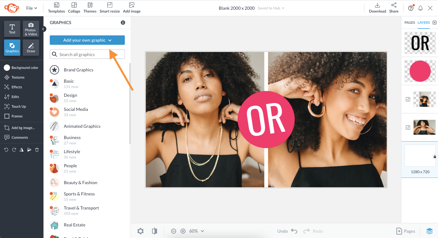
Peruse PicMonkey's epic graphics library, or upload your own for a personal touch.
Drag it to the canvas, change the colors, adjust the size, and done! Use ours or upload your own by clicking Graphics > Add your own graphic.
It helps to understand the value of graphic overlays for successful video thumbnail graphics.
Alright, Creators! We’re confident you have all you need to give your videos a necessary boost. Utilize these tips and tools that we covered here on how to make thumbnails that evoke emotion and draw attention to keep your viewers eagerly awaiting your next posts. You got this!
