Though we live in a skim-reading culture, we promise this one’s worth the read. Skimming articles is the by-product of a fast-paced, high-stimulation, tech-driven culture. Everything happens fast. It’s easy to think that infographics might enable this culture since visuals encourage that all-too-familiar mindless scrolling thing we do. The truth is that infographics can slow things down and help people process information properly. Check out these top 10 infographic examples and get inspired for your next infographic design.
Pro tip: The contents of this article are best digested if truly read.
Trendy infographic examples for any occasion

Customize this infographic design in PicMonkey.
Yes, infographics are a trendy way to convey a message, but they’re also a crucial business strategy. Not only are humans 65% visual learners, but we retain 80% of what we see. We can thank the subconscious mind–the reactive, invisible, 90-98% of our brain–for that.
Ever wonder why elements of that horror movie you watched wind up in your dreams? Everything we see gets stored in the brain in some way, shape, or form. Note: we’ll talk about the importance of a healthy media diet at a different time, but just know that visuals matter. A lot. Read on for the trendiest infographic examples to inspire your next visual post.
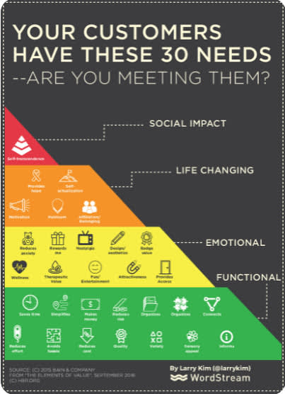
1. Maslow’s hierarchy of (business) needs
Infographics use symbols to educate. Cue elementary school. Remember first learning words by way of pictures? Symbols help the brain retain information. An effective infographic sports its symbols wisely, like the one below.

Image: Mariposa Rae
This infographic takes symbols one step further. It was designed with conceptual symbolism–not just graphic symbolism–by mirroring Maslow’s hierarchy of needs. Now, those who know Maslow and basic psychology have subconsciously made a connection, prompting inherent value. Smart marketing.
2. Top travel tips

Customize this infographic example in PicMonkey.
Take your readers on virtual vacay with this infographic style. Yes, color schemes are Marketing 101, but they’re also backed by neuroscience. We, mortals, experience life through our senses. Every time we see colors, they trigger stored memories. So? Want to go to the beach? Same. Use sandy color schemes and flamingo-laden graphics so everyone can party together.
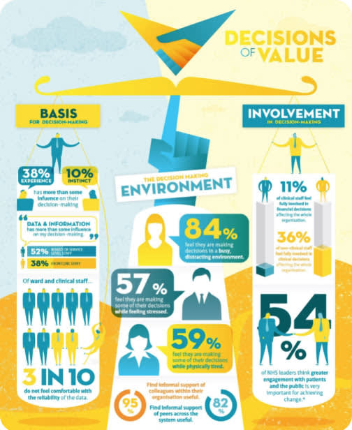
3. How to make a decision

Image: Decisions Made
Only infographics could make analyzing the decision-making process visually appealing. This infographic proves that having balanced numbers, letters, and colors packs a punch. Remember, colors evoke feelings, so consider how you want your audience to feel before splashing contrasting colors around.
4. Make wine on time

Customize this infographic design in PicMonkey.
Timeline infographics are effective for many reasons. While they typically involve more words than pictures, the spacing makes it digestible – especially with a compelling topic. Timeline infographic examples are effective for business presentations, classrooms, or even to frame significant milestone posters at work.
5. Sell what you're selling online

Image: Volusion
What makes for an approachable infographic? Space, character, and digestible content. The truth is that our attention span as a species is rapidly decreasing. We subconsciously decide in a split-second whether or not we can focus on something – all before we set our eyes on the content. So, choose an approachable template. Consider, what gets your point across in a friendly, welcoming way?
6. Helpful habits

Customize this infographic example in PicMonkey.
Infographics integrate the written word and pictures with snazz and pizazz. Take advantage of PicMonkey’s 6,000 (!!!) graphics by finding the Graphics tab on the left menu. Don’t hold back on the whimsy, seasonal, or celebratory graphics to enhance your masterpiece. Remember, style inspires. The right infographic could even make the alphabet seem interesting.
7. Visual puzzles can grow your business

Image: KOTIMART
Nothing says slow down like a visual puzzle, map, or game. Color coding each section with distinguished shapes and sizes guides the reader accordingly. Welcome to Chutes and Ladders 2.0 – SEO style!
8. Self-care or bust

Customize this infographic design in PicMonkey.
Believe it or not (believe it), infographics are a great way to remember the basics. If we knew that tiny, animated cupcakes had so much influence, we would’ve started making infographics decades ago.
Pro Tip: Make a digital cupcake, then go get yourself a real one. Infographics are best created in healthy environments, preferably ones with dessert rewards and self-pats on the back.
9. Tell a story

Image: Rachel Barry
It’s true that knowledge is power, but what makes knowledge stick is a story. Use statistics, graphics, and content to compel–and propel–the reader.
There are ample ways to tell a story and it doesn’t have to be expressed through words. Ask yourself: what story does my infographic tell? How can I thread it throughout? You might find the threads through consistent color palettes, emotional content, or symbols.
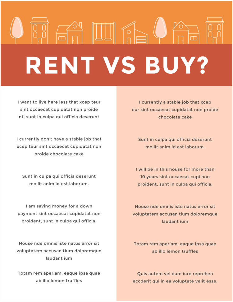
10. Compare and contrast topics

Customize this infographic design in PicMonkey.
Infographics are a great place to compare and contrast topics. Unlike formal English essays, infographics are a short and sweet space to highlight the most important points. Like a formal essay, however, you want your infographic to be cohesive, fluid, and have a strong message. These infographic examples are more word-dominant than others, so make sure to map out the intention for yours before you get started.
Making infographics in PicMonkey

When you're ready to make your own infographic, doing so in PicMonkey is the fastest way to glory. Simply:
Start with an infographic template or DIY with a blank canvas.
Use the tools on the left to customize your design with graphics, symbols, colors, and text.
Download as a JPG, PNG, or PDF (a PicMonkey Pro feature).
Woo! Now that you’ve mastered the infinite functions of infographics, you can start pumping out some of your own. Let these infographic examples inspire your dreamiest designs. So long as you remember that info + graphic = infographic (and we’re pretty confident that you will), you can create to your heart’s content. Now go and make us proud.
