Whether you’ve just mastered a six-month internship, five-day training, or 72-hour immersive masterclass, it always feels amazing to be recognized. Non-monetary achievements are best shown by way of certificates, trophies, framed photos, or other memorable tokens. PicMonkey’s free certificate templates run the gamut from sophisticated and nuanced to playful and bright. Customize for your kid’s themed birthday, your classroom, or your business course! The applications are endless and we really can’t wait to give you the scoop. Let’s get into it.
Make a certificate in 4 quick steps
Need your certificates before the fam gets home? Here’s the short ‘n sweet version.
Open up a blank certificate template or select a pre-designed certificate template.
Customize with solid colors or color gradients, textures, effects, graphics, and more!
Download in JPG or PNG (or PDF for Pro subscribers).
Upload to social or email, or print to circulate!
If you’ve got a moment longer, here are the ins and outs of mastering the art of the certificate template.
Certificate template sizes
Most of us know what it’s like to receive a certificate of achievement. That alone can aid your stylistic choices. To start? Sizing.
Ultimately, certificate sizes are all about preferences. Since you’re celebrating an accomplishment, don’t shy away from size! Bigger can certainly be better in this case.
Common certificates are your standard 8.5” x 11” size. If you go for this option, you can customize the page horizontally or vertically depending on your aesthetic preferences.
If you’d like something beyond your average computer paper size, you can choose among the following popular options too:
8.5” x 14”
11” x 14”
11” x 17”
Of course, the 8.5” x 14” will be longer than your standard 8.5” x 11”. The 11” x 14” is similar to a small poster and the 11” x 17” is a bit longer than that. If you need a quick reference for how to convert inches to pixels (or vice versa), check out our nifty conversion chart below!
Pixels to Inches Conversion Chart
| SIZE IN INCHES | SIZE IN PIXELS |
|---|---|
| 3 X 5 | 900 X 1500 |
| 4 X 6 | 1200 X 1800 |
| 5 X 7 | 1500 X 2100 |
| 8 X 8 | 2400 X 2400 |
| 8 X 10 | 2400 X 3000 |
| 8.5 X 11 | 2550 X 3300 |
| 9 X 16 | 2700 X 4800 |
| 11 X 14 | 3300 X 4200 |
| 11 X 16 | 3300 X 4800 |
While you don’t have to memorize these specs in the least, it helps to have some reference. And don’t stress — once you jump into the PicMonkey editor, you’ll be able to adjust sizes at the ready with our infamous Resize Tool.
Certificate uses and lifespan
Thinking a step or two ahead can help you choose the right certificate size. Are you planning on framing them? Laminating? If you don’t have a post-print plan, know that a flimsy 8.5” x 11” piece of computer paper may not last that long — especially if it’s going home to parents in an already mixed up, loose-leaf-paper flooded backpack.
However, sophisticated awards don’t have to be expensive. If you want to pick up some inexpensive but classic-looking frames for a group of kids or students, go for it! Don’t let your hard work go to waste. Presenting certificates with protected frames can grant a longer lifespan (and greater emotional impact). In this scenario, everyone wins.
Types of certificate templates
One last thing before we dish out the best free certificate template designs around (we promise). While subtle, there are different types of certificates and you’ll want to distinguish yours before you start.
You can choose among the following options (or create your own!). There are certificates for:
(Outstanding) achievement
Completion
Participation
Honor
Excellence
Recognition
Employee of the month
Group superlatives
Alright! Knowing the type of certificate you’re gifting will inform your template’s text. And speaking of templates…
Top 10 certificate template ideas and design tips

Celebrate with this template! Make it your own in PicMonkey.
Kids are smart. They can tell the difference between a generic, easily replaceable free certificate template and one that stands out and feels unique to them. Given that certificates are given to specific people for specific reasons, you want to put a little extra oomph (or intention) in there to help folks feel special.
You can make all templates the same for uniformity, or, you might make subtle changes to each template, like switching up the colors or text effects. Obviously, you don’t want kids comparing too much, but it may not hurt to have a few circulating themes throughout the group.
Your certificate details can directly impact someone’s experience of the conference, class, ceremony, or whatever you’re celebrating. As you craft your certificate template, you’ll want to balance the following creative components:
Wording
Effects
While you don’t have to use all of the above components, use this guide to make sure you have everything in there you desire. And if you’re missing something, check back and see what sorts of details you can add. Now, for the moment we’ve all been waiting for: fill in certificate templates!
1. Abstract patterns
Celebrate with this template! Make it your own in PicMonkey.
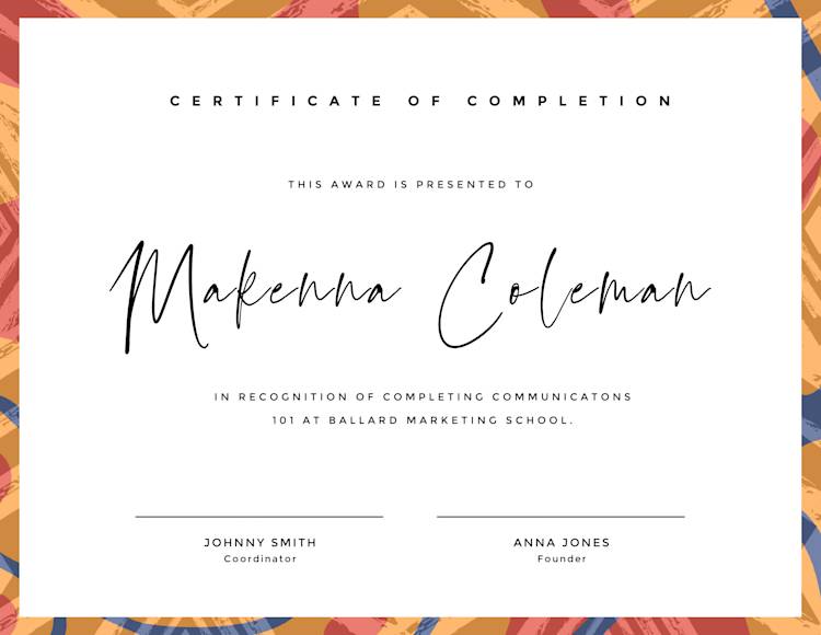
Add a simple abstract pattern to make the rest of your certificate pop! Simply click the Textures tab and search whichever pattern you desire! We chose Botanical.
As far as the order of text, you’ll want to include the following:
Header
Introduction to the recipient
Recipient’s name
Type of recognition
Signatures
The words you use are entirely customizable, but sticking to some chronology reads best. For dramatic effect, you can include as much white space as you desire, so long as it looks and feels balanced. Typically, the recipient’s name is the largest text on the page — as this is about them, after all.
2. Complementary color palettes

Celebrate with this template! Make it your own in PicMonkey.
Knowing your contrasting and complementary color schemes can come in handy for your fill in certificate templates. The yellow accents for the recipient’s name and sailboat graphic pair well with this shade of blue. Plus, these colors emanate the energy of cool waters.
Depending on your school, organization, or certificate theme, use them to inspire your graphics and design choices!
3. Elegant font pairs
Celebrate with this template! Make it your own in PicMonkey.
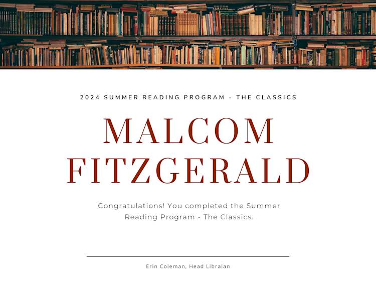
Got a book club or reading program to celebrate? We’ve got you covered! Certificates are the perfect time to learn which font pairs go hand-in-hand. Sure, you can eyeball it, but if you don’t want to get lost in our sea of a thousand fonts, it helps to know what already works (we’ve done the prep work for you).
Since there are multiple sections for text, ultimately, you can use however many fonts you want. Make them all the same, put two or three together, whatever floats your boat! Just be sure not to make things too busy with a classic case of fonts-gone-wild. Support your font choices with a literary image and done!
4. Color gradients you can’t pass up
Celebrate with this template! Make it your own in PicMonkey.
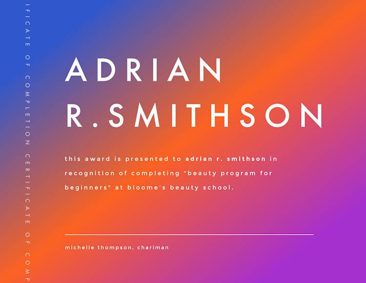
Want something fun and colorful? Check out our fantastic color gradients to brighten up any event. While this certificate isn’t structured conventionally—like that you’d find in a collegiate frame—it holds similar sentiments. Plus, you can choose which direction your color gradients move for max impact. Add two or three colors for an unparalleled design.
Not sure which colors to use? Know that colors do hold meanings and evoke moods. So whichever you choose, make sure they cater to your demographic and that they’re appropriate for the occasion.
5. Get fancy with Foil

Celebrate with this template! Make it your own in PicMonkey.
If you’re going for luxury, do it up with PicMonkey’s stunning Foil texture! Texturize and fanc-ify your creation in the Textures tab. Click Foil and select your favorite background.
Your text and graphic colors can be informed by your background. Start with one element and build from there.
6. Solid color swag
Celebrate with this template! Make it your own in PicMonkey.
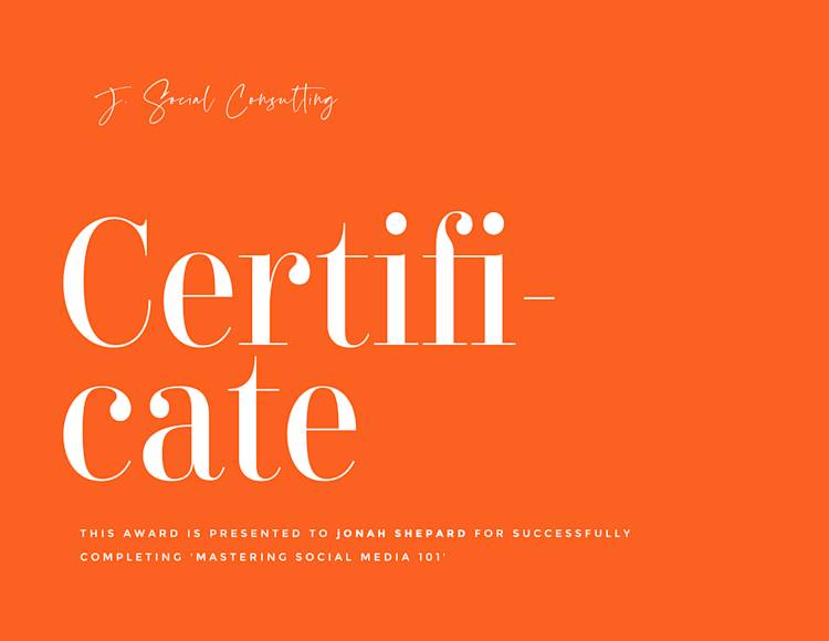
While we mentioned that for certificates, bigger can feel better, that doesn’t necessarily mean more is better regarding design elements. If you’re going for simplicity, choose an eye-catching solid color and a few complementary fonts. Unlike the other certificate templates shown, here, the recipient isn’t the largest text, but you can certainly make it that way if you prefer.
And if you like the solid color vibe but this one’s a bit too, uh, orange, see what other colors you can pair with it to even out the feel.
7. Graphics and shaped accents
Celebrate with this template! Make it your own in PicMonkey.
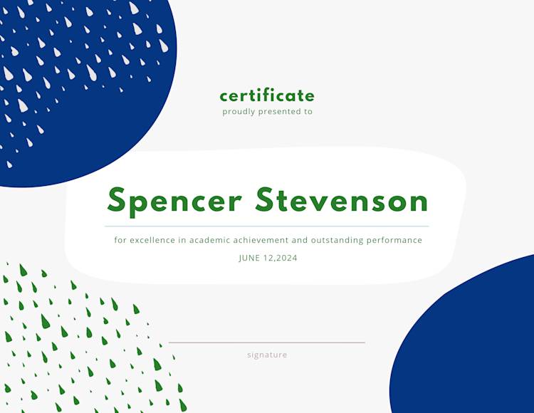
If you’d like to enhance the conventional certificate template, graphics and shaped accents are the way to go! Plus, these nebulous and abstract shapes leave room for interpretation. What types of subjects does this person excel in? Robotics, science, geometry? Using symbols to convey your message—similar to art—increases emotional impact.
To play with these shapes and graphics, simply click on the Graphics tab from the lefthand menu. Select Design and scroll to find brush marks and patterns of all kinds similar to the teardrops above. For the circular and rectangular-ish shapes, revisit the Graphics tab and select Basic for conventional, abstract, and doodly shapes (plus animated shape options for the Pros!).
8. Wild watercolor textures

Celebrate with this template! Make it your own in PicMonkey.
No need to print on colored paper when you’ve got the slick Watercolor background texture! Simply go to the Textures tab and select Watercolor. Choose the last option and voila! Instant masterpiece.
Keep in mind, you don't have to settle for just one texture or effect. If you’re like Yeah, that’s a good start, but I want more…select Edits in the Edits tab to boost, soften, sharpen, or adjust exposure. Or, if you want to layer another texture or effect on top, go for it! Layered designs, when done correctly, can make a forever memory.
9. Branding colors
Celebrate with this template! Make it your own in PicMonkey.
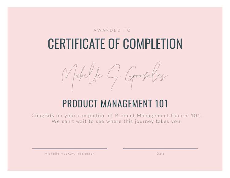
If you’re an established organization or company, you may not need any design inspo other than your brand colors! Whether your primary or secondary brand color palette, two or three distinct colors is all you need for an upscale look.
The certificate will mention the organization, but you can also add a small logo or brand name as your official stamp of approval.
10. Themed certificates
Celebrate with this template! Make it your own in PicMonkey.
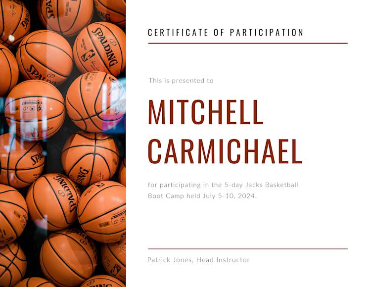
If you’re offering certificates for sports camp, contests, summer school, dance class, or anything similar, you can make your certificate pop with a themed image. If not an image of the sport or activity itself, you can also personalize each certificate template with a picture of you and your camper, student, workshop attendees, or whomever else.
To get the two cells as shown above, click Collage on the top toolbar and find the designated layout. You can adjust cell sizing by dragging the corners to fit. Then, you can upload your image on the left by clicking Photos & Video from the left toolbar. Select Add photo or video. You’ll be prompted to upload from your computer. From there, you can size and edit accordingly.
Pro tip: Want a fun image but don’t have one in mind? No sweat! Scroll and select from our millions of professionally-shot stock photos to capture the look you’re going for.
While some folks say the devil’s in the details, we actually don’t agree. We think the divine is in the details since they can influence one’s whole experience. For example, it’s nice to include the exact date the reward was received, but it’s also nice to date the actual experience. That way, your kids, students, clients, or whoever can collect their certificates with fond memories of certain ages.
How to make a certificate with a blank canvas
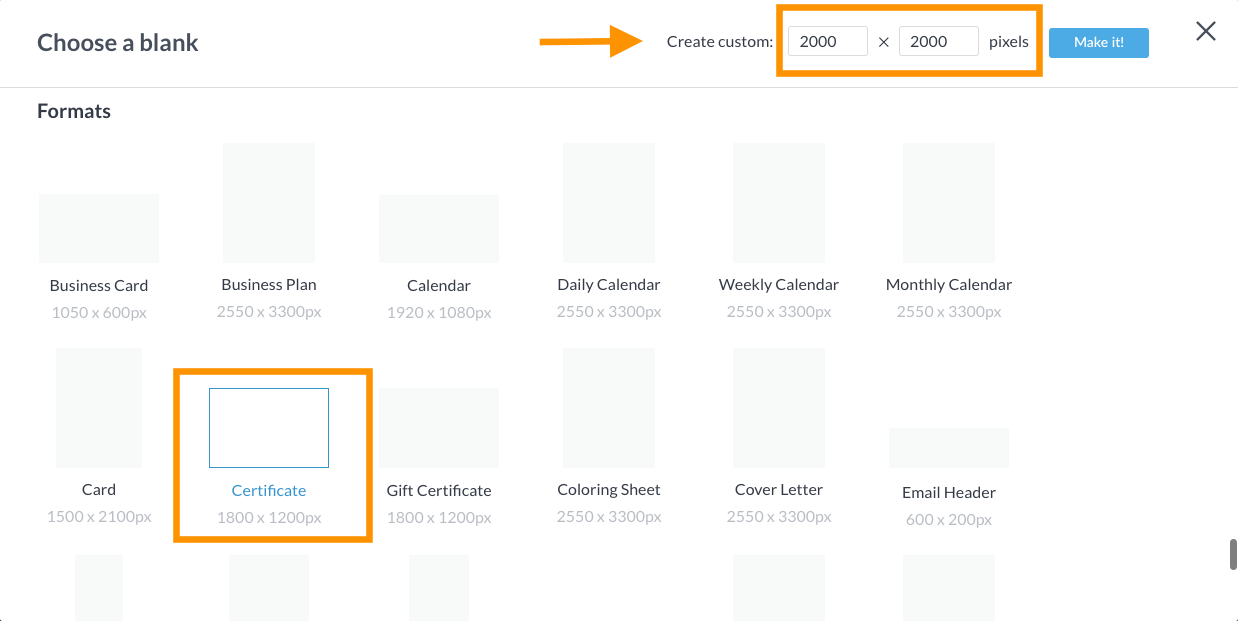
Celebrate with a blank canvas! Make it your own in PicMonkey.
To find blank certificate templates, simply select Create new from the homepage. Select Blank Canvas and scroll to find the certificate option under Formats. If you already know your specs, you can set them in the Create custom option up top. Once you’re ready to rock, click Make it!
Remember, you can start with any size in the beginning if you’re unsure. Start building to get those creative ideas out, then find the Edits tab on the lefthand menu, click Resize and set those specs right before you’re done. Instant recalibration — boom.
Get the look
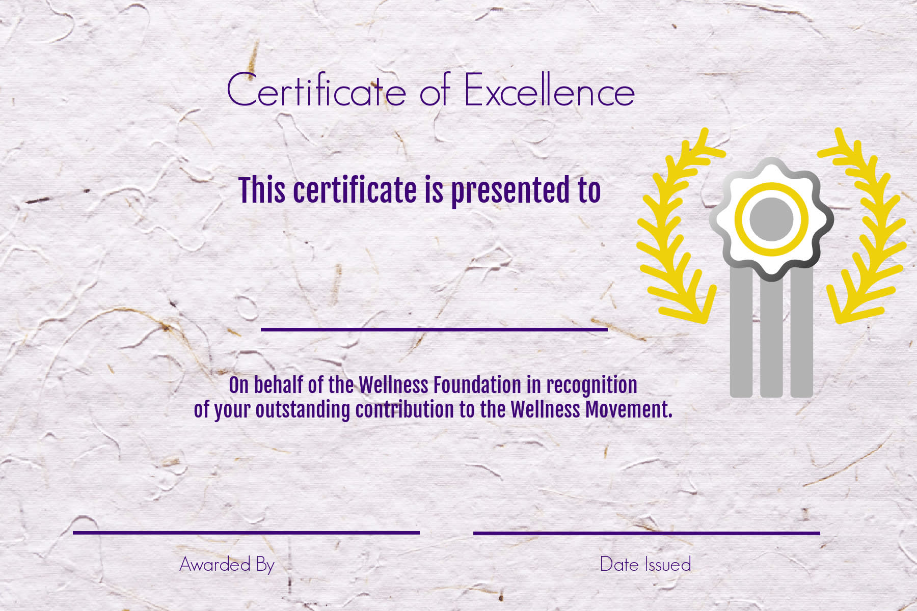
Remember the components we mapped out earlier that make for a balanced design? Just like you have an intro, body paragraphs, and conclusion for an essay, certificates have an arch as well. You’ll have your header, intro, recipient name, organization name, reason for the certificate, and official signature(s) to close.
To get this look, follow these swift steps:
Go to the Textures tab and select Paper.
Click a textured background and edit however you see fit (we kept ours as is).
Go to the Text tab on the lefthand menu and click Add text. (You can always use our pre-set text layouts, but we found Geo Sans Light and Fjalla One to do the trick.) We have thousands of fonts, so you’re welcome to scroll, but having some direction can spare you some time.
Go to the Graphics tab, search “Award”, and select whichever prize ribbon, trophy, or badge that suits your needs.
Customize colors with solids or gradients, fill in the details, and done!
Download in PNG or JPG format (or PDF for Pros), upload to social, email, or print!
If you teach a course rotation or have recurring campers, units, or clients, know that your designs will be forever saved in our friendly cloud storage, Hub, for future design needs. It auto-saves (and we love it for that) but make sure to keep your OG version so new edits don’t override old ones (unless you want them to). And if you need to keep your creations handy for quick access, be sure to organize them in subfolders so you can check back quickly for new printing cycles.
Design on the go with the PicMonkey mobile app
And speaking of checking back quickly, gotta jet without finessing your masterpiece(s)? Stress not! Since Hub stores everything you make on the app as well, pick up and put down your creations with ease. Finish them in line at the doctor’s office, or while you’re cheering on your kids at soccer. Wherever you are, and whatever device you have, your creations can follow you for your convenience.
Don’t have PicMonkey mobile yet? Well, what are ya waiting for? Let your creations flow with the click of a button (the one below, to be exact).

Get the PicMonkey mobile app!

Last-minute printing tips
Almost there, friends! Don’t let your designs be all for naught. Here are a few notes about how to print your fill in certificate templates.
To avoid that flimsy, average printing paper, you can choose:
Parchment paper
Linen paper
Laid paper
Cardstock
Parchment paper has that antique, sophisticated look. Linen paper has a slight textured feel. Laid paper has a finely ripped aesthetic. For a less sophisticated occasion, you can also use a thick cardstock.
If your design has a white background, you can toy with colored paper. However, since you likely chose a unique background image or texture (one that paper can’t replicate), you can stick to white or neutral paper for the best outcome.
If you’re printing in bulk, it never hurts to consult a local professional print shop for assistance depending on what’s most cost-effective for you. Printing at home is great if it’s occasional and you have the colored ink to do so. If you’re worried about bleed space, you can leave ⅛” around all sides as you customize your print settings.
Whew, PicMonkey people! We’re certain you’ve mastered the basics and beyond when it comes to certificate template designs. Here’s your (verbal) certificate of completion! Nice work.
Now, get clear about your design concept, use your intuition, and don’t forget to celebrate your own successes, too. Go send out those high praises, prompt some smiles, and keep sharing your light!
